
如何在Bootstrap 4中实现不同屏幕大小的卡片标题行为
如何在Bootstrap 4中实现不同屏幕大小的卡片标题行为
提问于 2018-03-20 06:00:46
我刚开始网页设计的时候,是否可以根据不同的屏幕尺寸在引导4中改变font-size of 卡的标题和卡的图像大小。因为它对于小屏幕尺寸来说太大了。
这是我的HTML代码
<div class="col-lg-4 col-md-4 col-sm-4 col-xs-10">
<img class="card-img-top-a mx-auto d-block mt-5" src="img/a.png">
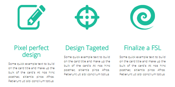
<h5 class="card-title text-center mt-5 font-weight-bold">Pixel perfect design</h5>
<p class="card-text px-auto text-justify">Some quick example text to build on the card title and make up the bulk of the card's At nos hinc posthac, sitientis piros Afros. Petierunt uti sibi concilium totius</p>
</div>
<div class="col-lg-4 col-md-4 col-sm-4 col-xs-10">
<img class="card-img-top mx-auto d-block mt-5" src="img/b.png">
<h5 class="card-title text-center mt-5 font-weight-bold">Design Tageted</h5>
<p class="card-text px-auto text-justify">Some quick example text to build on the card title and make up the bulk of the card's At nos hinc posthac, sitientis piros Afros. Petierunt uti sibi concilium totius</p>
</div>
<div class="col-lg-4 col-md-4 col-sm-4 col-xs-10">
<img class="card-img-top mx-auto d-block mt-5" src="img/c.png">
<h5 class="card-title text-center mt-5 font-weight-bold">Finalize a FSL</h5>
<p class="card-text px-auto text-justify">Some quick example text to build on the card title and make up the bulk of the card's At nos hinc posthac, sitientis piros Afros. Petierunt uti sibi concilium totius</p>
</div>下面是我如何管理p{}的CSS代码示例。
那么,我是否必须为card-title做同样的事情,或者如果有其他的方法去做呢?
@media (min-width: 0px) { p{font-size: 0.7rem;}}
@media (min-width: 576px) { p{font-size: 0.6rem;}}
@media (min-width: 768px) { p {font-size: 0.8rem;}}
@media (min-width: 992px) { p {font-size: 0.8rem;}}
@media (min-width: 1200px) { p {font-size: 1rem;}}
对于不同屏幕大小的图像,我应该做些什么?
.card-img-top{
  width: 80px;
  height:80px;
}
谢谢你的建议!
回答 2
Stack Overflow用户
发布于 2018-03-20 06:47:54
试试这段代码。但是你必须调整文本和标题的大小,但是这对你来说是可行的。
.card-img-top {
  width: 80px;
  height: 80px;
}

@media (min-width: 0px) {
  .responsive-text {
    font-size: 0.7rem;
  }

  .responsive-title {
    font-size: 20px;
  }
}

@media (min-width: 576px) {
  .responsive-text {
    font-size: 0.6rem;
  }

  .responsive-title {
    font-size: 0.7em;
  }
}

@media (min-width: 768px) {
  .responsive-text {
    font-size: 0.8rem;
  }

  .responsive-title {
    font-size: 0.7em;
  }
}

@media (min-width: 992px) {
 .responsive-text {
    font-size: 0.8rem;
  }

  .responsive-title {
    font-size: 0.7em;
  }
}

@media (min-width: 1200px) {
  .responsive-text {
    font-size: 1rem;
  }

  .responsive-title {
    font-size: 0.7em;
  }
}<div class="col-lg-4 col-md-4 col-sm-4 col-xs-10">
<img class="card-img-top-a mx-auto d-block mt-5" src="img/a.png">
<p class="card-title text-center mt-5 font-weight-bold responsive-title">Pixel perfect design</p>
<p class="card-text px-auto text-justify responsive-text">Some quick example text to build on the card title and make up the bulk of the card's At nos hinc posthac, sitientis piros Afros. Petierunt uti sibi concilium totius</p>
</div>
<div class="col-lg-4 col-md-4 col-sm-4 col-xs-10">
<img class="card-img-top mx-auto d-block mt-5" src="img/b.png">
<p class="card-title text-center mt-5 font-weight-bold responsive-title">Design Tageted</p>
<p class="card-text px-auto text-justify responsive-text">Some quick example text to build on the card title and make up the bulk of the card's At nos hinc posthac, sitientis piros Afros. Petierunt uti sibi concilium totius</p>
</div>
<div class="col-lg-4 col-md-4 col-sm-4 col-xs-10">
<img class="card-img-top mx-auto d-block mt-5" src="img/c.png">
<p class="card-title text-center mt-5 font-weight-bold responsive-title">Finalize a FSL</p>
<p class="card-text px-auto text-justify responsive-text">Some quick example text to build on the card title and make up the bulk of the card's At nos hinc posthac, sitientis piros Afros. Petierunt uti sibi concilium totius</p>
</div>
Stack Overflow用户
发布于 2018-03-20 06:29:38
rem相对于文档的根元素(即默认情况下的html...and )工作
html {
  font-size: 16px;
}因此,使用这个概念,尝试只更改html字体值,而不是所有元素字体.
html {
  font: 16px Verdana
}

h1 {
  font-size: 3rem;
}

h2 {
  font-size: 2rem;
}

@media (max-width:400px) {
  html {
    font-size: 12px;
  }
}<h1>foo</h1>
<h2>bar</h2>
用于编辑的小提琴拉链
页面原文内容由Stack Overflow提供。腾讯云小微IT领域专用引擎提供翻译支持
原文链接:
https://stackoverflow.com/questions/49377259
复制相关文章
相似问题
腾讯云开发者

Copyright © 2013 - 2026 Tencent Cloud. All Rights Reserved. 腾讯云 版权所有
深圳市腾讯计算机系统有限公司 ICP备案/许可证号:粤B2-20090059  粤公网安备44030502008569号
腾讯云计算(北京)有限责任公司 京ICP证150476号 | 京ICP备11018762号