
网格容器(如引导容器)
所以,我想创建一个页面布局,如下所示:
例如,在Bootstrap中,我可以简单地写:
<div class="container">
  <!-- Content here -->
</div>
一切都会好起来的。
是否有一个很好的清洁解决方案来做这样的事情材料-UI?默认情况下,网格系统创建全宽度的流体容器。
回答 4
Stack Overflow用户
发布于 2018-03-13 13:51:17
这可以使用网格组件和响应断点来实现。看看文档中的布局,网格页面。
下面是一个示例:
const styles = theme => ({
  demo: {
    height: 240,
    background: "#f00",
    [theme.breakpoints.up("lg")]: {
      width: 1170
    }
  }
});

class ResponsiveGrid extends React.Component {
  render() {
    const { classes } = this.props;
    return (
      <Grid container justify="center">
        <Grid
          container
          className={classes.demo}
          alignItems="center"
          justify="center"
        >
          <Grid lg={12} item>Content Here</Grid>
        </Grid>
      </Grid>
    );
  }
}
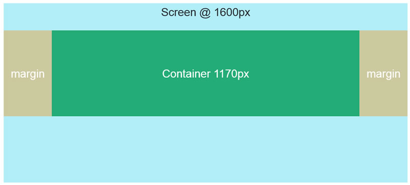
export default withStyles(styles)(ResponsiveGrid);我们定义了一组样式,这些样式作为classes支柱添加到组件中,使用withStyles。demo类使用theme为主题的lg断点创建媒体查询。对于lg或更大的视图,宽度将设置为1170。
大视口被认为介于1280到1919 px之间。这些都是默认的,是基于材料设计标准的。
Stack Overflow用户
发布于 2018-11-25 03:21:34
我通过创建一个定制的CSS文件并从.container文件粘贴到bootstrap-grid.css类中来解决这个问题。
custom-style.css
.container {
  width: 100%;
  padding-right: 15px;
  padding-left: 15px;
  margin-right: auto;
  margin-left: auto;
}

@media (min-width: 576px) {
  .container {
    max-width: 540px;
  }
}

@media (min-width: 768px) {
  .container {
    max-width: 720px;
  }
}

@media (min-width: 992px) {
  .container {
    max-width: 960px;
  }
}

@media (min-width: 1200px) {
  .container {
    max-width: 1140px;
  }
}然后简单地将这个custom-style.css文件导入到ReactJS项目的index.js文件中。
import 'path/to/your/custom-style.css';在material中,预定义组件有自己的填充设置,当将它们与我们的自定义.container类结合时,它可能会提供额外的不需要填充,为了克服这个问题,我们可以像这样在同一个custom-style.css文件中编写助手类。
// padding helper classes
.p-0 {
  padding: 0 !important;
}

.pt-0 {
  padding-top: 0 !important;
}

.pb-0 {
  padding-bottom: 0 !important;
}

.ptb-0 {
  padding-top: 0 !important;
  padding-bottom: 0 !important;
}在安装之后,我们可以使用自定义类,就像在html标记中使用它一样,但在使用className属性时使用React。
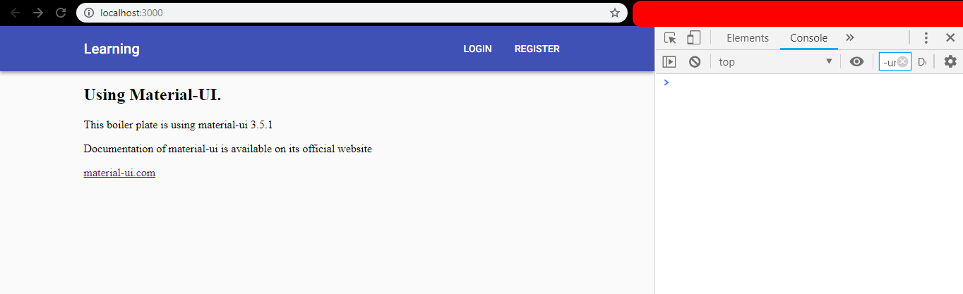
<Grid container>
  <AppBar position="static">
    <div className="container">
      <Toolbar className="p-0" >
        <Typography variant="h6" color="inherit" className={classes.grow}>
          Learning
        </Typography>
        <Hidden xsDown>
          <Button color="inherit">Login</Button>
          <Button color="inherit">Register</Button>
        </Hidden>
        <Hidden smUp>
          <IconButton className={classes.menuButton} color="inherit" aria-label="Menu">
            <MenuIcon />
          </IconButton>
        </Hidden>
      </Toolbar>
    </div>
  </AppBar>
</Grid>现在它正确地对齐了,就像引导.container类一样。
Stack Overflow用户
发布于 2020-03-20 02:01:31
如果您正在寻找类似于引导程序的.container,那么我将使用Material <Container />标记。作为起始包装器/容器,我不使用<Grid />标记。
<Container maxWidth="lg">
  <!-- Content here -->
</Container>https://stackoverflow.com/questions/49251454
复制相似问题
腾讯云开发者

Copyright © 2013 - 2026 Tencent Cloud. All Rights Reserved. 腾讯云 版权所有
深圳市腾讯计算机系统有限公司 ICP备案/许可证号:粤B2-20090059  粤公网安备44030502008569号
腾讯云计算(北京)有限责任公司 京ICP证150476号 | 京ICP备11018762号