
使用dplyr对因子级别上的理货数据进行排序。
我有一个数据文件df
    structure(list(sample = structure(c(4L, 2L, 1L, 4L, 1L, 2L, 3L,
3L, 3L, 1L), .Label = c("A1", "B1", "C1", "D2"), class = "factor"),
    genotype = structure(c(4L, 2L, 2L, 2L, 4L, 4L, 1L, 2L, 3L,
    1L), .Label = c("germline_private", "germline_recurrent",
    "somatic_normal", "somatic_tumour"), class = "factor"), n = c(5L,
    4L, 3L, 3L, 2L, 2L, 2L, 2L, 2L, 1L)), class = c("grouped_df",
"tbl_df", "tbl", "data.frame"), row.names = c(NA, -10L), vars = "sample", drop = TRUE, .Names = c("sample",
"genotype", "n"), indices = list(c(2L, 4L, 9L), c(1L, 5L), 6:8,
    c(0L, 3L)), group_sizes = c(3L, 2L, 3L, 2L), biggest_group_size = 3L, labels = structure(list(
    sample = structure(1:4, .Label = c("A1", "B1", "C1", "D2"
    ), class = "factor")), class = "data.frame", row.names = c(NA,
-4L), vars = "sample", drop = TRUE, .Names = "sample"))head(df)
sample event_no genotype
A1 1 somatic_tumour
A1 2 germline_recurrent
A1 3 germline_recurrent
A1 4 somatic_tumour
A1 5 germline_recurrent
A1 6 germline_private在本例中,我希望统计每个样本中基因型出现的次数,然后进行排序,以便按照 events的数量对样本进行排序。
我现在拥有的是:
library(tidyverse)

df <- df %>%
  group_by(sample, genotype) %>%
  tally %>%
  arrange(-n)
然后,我想按~基因型绘制每个样本的这些计数:
p <- ggplot(df)
p <- p + geom_histogram(aes(sample, n), stat = "identity")
p <- p + facet_wrap(~genotype)
p
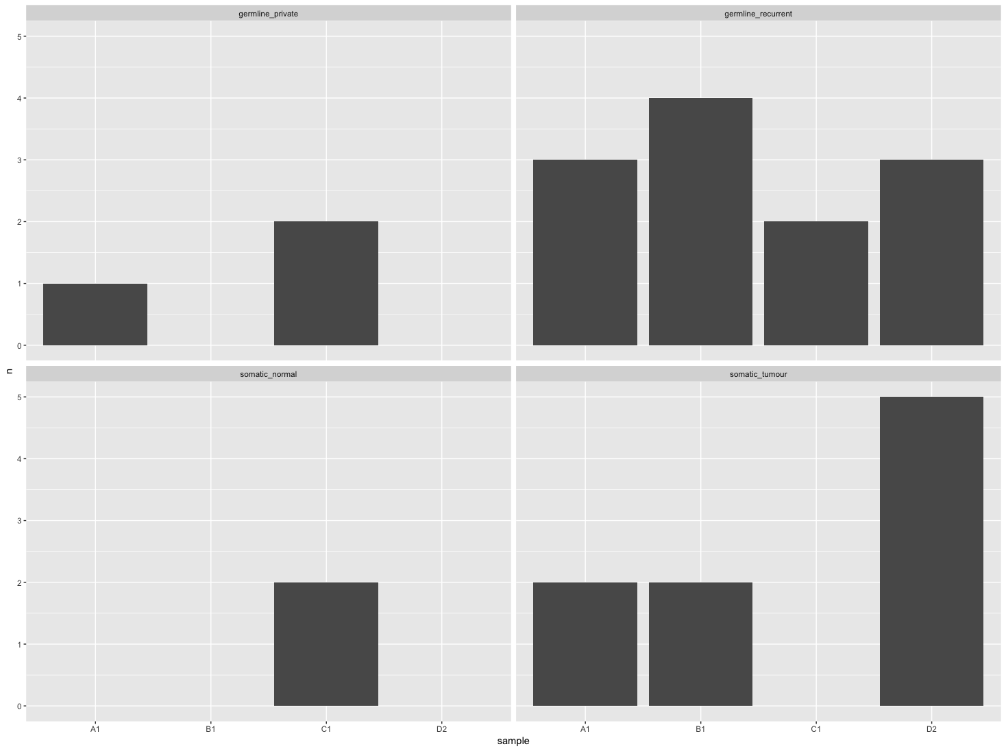
但是,我希望所有面板中的样本按照右下角图(somatic_tumour)中的计数进行排序。
回答 2
Stack Overflow用户
发布于 2018-03-02 13:11:36
下面是一种创建new_n的方法,方法是用0替换除somatic_tumour之外的所有somatic_tumour的n,并对2n进行排序,即
library(tidyverse)

df %>%
 group_by(sample, genotype) %>%
 tally() %>%
 mutate(new_n = replace(n, genotype != 'somatic_tumour', 0)) %>%
 arrange(-new_n, -n) %>%
 select(-new_n)
这给了,
A tibble: 11x3#组:样本4样本基因型n 1 A1 somatic_tumour 2 2 B1 somatic_tumour 2 3 D2 somatic_tumour 2 4 B1 germline_recurrent 4 5 A1 germline_recurrent 3 6 D2 germline_recurrent 3 C1 germline_private 2 8 C1 germline_recurrent 29 C1 somatic_normal 2 10 A1 germline_private 1 11 D2 somatic_normal 1
Stack Overflow用户
发布于 2018-03-02 13:18:35
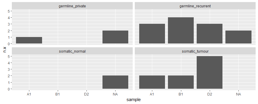
您还可以使用left_join来添加每个示例中somatic_tumour出现的次数。之后,使用somatic_tumour观测的somatic_tumour列来创建有序向量。因此,x轴相应地排列。
library(dplyr)
library(ggplot2)
df %>%
  left_join(df %>% filter(genotype == "somatic_tumour") %>% select(n, sample),
            by = "sample") %>%
  arrange(-n.y, -n.x) %>%
  ungroup() %>%
  mutate(sample = ordered(sample,
                          df %>% filter(genotype == "somatic_tumour") %>%
                            arrange(n) %>%
                            select(sample) %>%
                            as_vector(.))) %>%
  ggplot() +
  geom_histogram(aes(sample, n.x), stat = "identity") +
facet_wrap(~genotype)注意:这里介绍了NA标签,可能是由于小样本造成的。
https://stackoverflow.com/questions/49069199
复制相似问题
腾讯云开发者

Copyright © 2013 - 2026 Tencent Cloud. All Rights Reserved. 腾讯云 版权所有
深圳市腾讯计算机系统有限公司 ICP备案/许可证号:粤B2-20090059 ![]() 粤公网安备44030502008569号
粤公网安备44030502008569号
腾讯云计算(北京)有限责任公司 京ICP证150476号 | 京ICP备11018762号