
无法在更改浏览器大小时阻止文本重新定位
无法在更改浏览器大小时阻止文本重新定位
提问于 2018-02-24 16:44:44
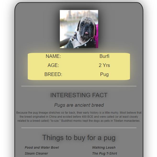
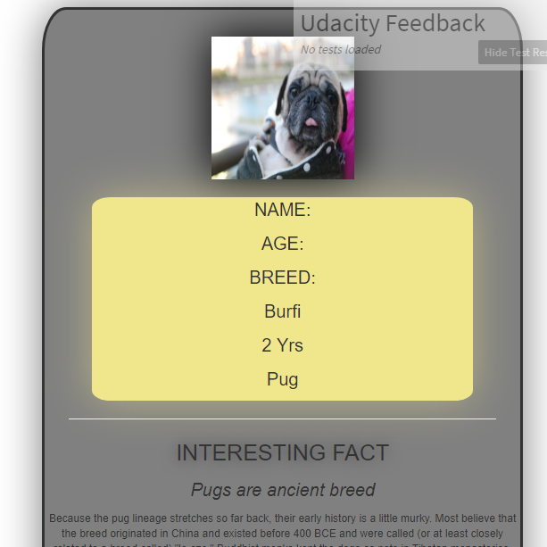
我正在尝试建立一个animalCard网页。我可以阻止帧div调整大小。但是我怎样才能阻止div内部的文本重新定位。下面是我的网页大小调整前后的快照。
调整大小后:
我找了很多这个。尝试将我的整个身体内容放在一个div中以修复宽度。下面是我的代码:
.cardFrame{
  border: solid;
  border-radius: 5%;
  text-align: center;
  margin-left: 30%;
  margin-right: 30%;
  background-color: grey;
  margin-top: 10px;
    position: absolute;
	min-width: 539px;
	box-shadow: 0 0 80px grey;


}

#imageSize{
  height: 160px;
  width: 160px;
  align-self: center;
  margin-top: 30px;
  /*border: solid rgba(0,0,0,.5);*/
  border-width: thick;
  box-shadow: 0 0 80px black;
}
.infoContent{
  margin-top: 20px;
  position: relative;
  width: 80%;
  display: inline-block;
  border-style:hidden;
  border-radius: 5%;
  background-color: rgb(240,230,140);
    box-shadow: 0 0 80px rgba(240,230,140,.5);


}

.info{
  font-size: 20px;
  width: fixed;
  /*text-shadow: 0 0 30px rgba(0,0,0,.5); */
}

.line{
  margin-left: 5%;
  margin-right: 5%;
}
#if{
  font-size: 25px;
  text-shadow: 0 0 30px rgba(0,0,0,.5);

}
#fact{
  font-size: 20px;
}
#factDescription{
  font-size: 12px;
}

.listContent{
  font-style: italic;
  font-weight: bold;
  text-align: left;

  list-style-type: none;
}

#listItems{
  font-size: 30px;
  text-shadow: 0 0 30px rgba(0,0,0,.5);
}<!DOCTYPE html>
<html>
<head>
<meta name="description" content="Animal Card Project">
<meta name="Author" content="Gaurav Thantry">
<meta name="keywords" content="html, CSS">
<meta name="viewport" content="width=device-width, initial-scale=1.0">
<link rel="stylesheet" href="css/stylesheet.css">
<link rel="stylesheet" href="https://maxcdn.bootstrapcdn.com/bootstrap/3.3.7/css/bootstrap.min.css">
<title>AnimalCard</title>
</head>
<body>
<div style="position: absolute, text-align: center">
<div class="cardFrame">
<img src="images/burfi.jpg" id="imageSize" alt="my pet's pic">
<div class="row infoContent" text-align="center">
<div class="col-md-6 info">
<p>NAME:</p>
<p>AGE:</p>
<p>BREED:</p>
</div>
<div class="col-md-6 info">
<p>Burfi</p>
<p>2 Yrs</p>
<p>Pug</p>
</div>
</div>
<hr class="line">
<p id="if">INTERESTING FACT</p>
<p id="fact"><em>Pugs are ancient breed</em></p>
<p id="factDescription">Because the pug lineage stretches so far back, their early history is a little murky. Most believe that the breed originated in China and existed before 400 BCE and were called (or at least closely related to a breed called) "lo-sze." Buddhist monks kept the dogs as pets in Tibetan monasteries.</p>
<hr class="line">
<p id="listItems">Things to buy for a pug</p>
<div class="row">
<div class="col-md-6">
<ul class="listContent">
<li><label>Food and Water Bowl</label></li>
<li><label>Steam Cleaner</label></li>
<li><label>Collar and/or Harness</label></li>
<li><label>Baby/Dog Gate</label></li>
</ul>
</div>
<div class="col-md-6">
<ul class="listContent">
<li><label>Walking Leash</label></li>
<li><label>The Pug T-Shirt</label></li>
<li><label>Deshedding Brush</label></li>
<li><label>Treats</label></li>
</ul>
</div>
</div>
<p text-align="center">Created by @Gaurav Thantry</p>
</div>
</div>
</body>
</html>
回答 2
Stack Overflow用户
回答已采纳
发布于 2018-02-24 17:16:17
您使用的是.col-md-6,这使得它只在中屏幕和大屏幕上有两列。如果您总是希望键/值并排,请使用col-xs-6或col-sm-6。您正在使用的css框架的文档将包含更多关于网格的详细信息,以及它们用于在特定屏幕大小下应用特定宽度的类。
关于任何其他引导相关问题的参考,以下是您当前使用的版本的文档。
Stack Overflow用户
发布于 2018-02-24 17:10:22
只需将.info元素上的.info更改为col-6即可。(这与col-xs-6相同)。这将确保所有设备都有两列,从超大屏幕到超大屏幕。
有关更多信息,请参阅此处:https://getbootstrap.com/docs/4.0/layout/grid/#grid-options
页面原文内容由Stack Overflow提供。腾讯云小微IT领域专用引擎提供翻译支持
原文链接:
https://stackoverflow.com/questions/48965160
复制相关文章
相似问题
腾讯云开发者

Copyright © 2013 - 2026 Tencent Cloud. All Rights Reserved. 腾讯云 版权所有
深圳市腾讯计算机系统有限公司 ICP备案/许可证号:粤B2-20090059  粤公网安备44030502008569号
腾讯云计算(北京)有限责任公司 京ICP证150476号 | 京ICP备11018762号