
用2个数组创建直方图图
用2个数组创建直方图图
提问于 2018-02-10 04:54:52
如何用R中的数据创建直方图?
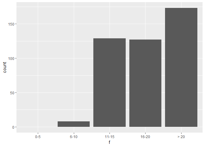
f = c('0-5', '6-10', '11-15', '16-20', '> 20')
counts_arr = c(0, 8, 129, 127, 173)现在,counts_arr[0]与f[0]相关联。
所以我试图让f在X轴上,counts_arr值在Y轴上
回答 2
Stack Overflow用户
回答已采纳
发布于 2018-02-10 05:54:22
barplot(counts_arr, names = f)Stack Overflow用户
发布于 2018-02-10 06:00:04
已经有了解决这个问题的方法,但我已经用ggplot2准备了一些东西,尽管如此,我仍在发布。
library(ggplot2)
#> Warning: package 'ggplot2' was built under R version 3.4.3
library(forcats)
#> Warning: package 'forcats' was built under R version 3.4.3

# dataframe provided
df <-
  base::cbind.data.frame(
    f = c('0-5', '6-10', '11-15', '16-20', '> 20'),
    counts_arr = c(0, 8, 129, 127, 173)
  )

# plot
ggplot2::ggplot(data = df, mapping = aes(x = forcats::fct_inorder(f), y = counts_arr)) +
  geom_bar(stat = "identity") +
  labs(x = "f", y = "count")
由reprex package创建于2018-02-10 (v0.1.1.9000)。
页面原文内容由Stack Overflow提供。腾讯云小微IT领域专用引擎提供翻译支持
原文链接:
https://stackoverflow.com/questions/48717382
复制相关文章
相似问题
腾讯云开发者

Copyright © 2013 - 2026 Tencent Cloud. All Rights Reserved. 腾讯云 版权所有
深圳市腾讯计算机系统有限公司 ICP备案/许可证号:粤B2-20090059 ![]() 粤公网安备44030502008569号
粤公网安备44030502008569号
腾讯云计算(北京)有限责任公司 京ICP证150476号 | 京ICP备11018762号