
CSS旋转笑脸加载器
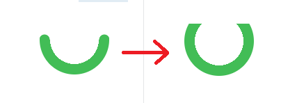
我想用纯CSS复制下面的gif动画,有可能吗?如何复制?我也对其他适当的方法持开放态度。
下面的片段是我到目前为止所得到的,它只是一张静止的脸。
body {
  background: #fff;
  margin: 50px;
}

.loader {
  position: relative;
  border-radius: 50%;
  box-sizing: border-box;
  width: 80px;
  height: 80px;
  background: linear-gradient(to bottom, #fff 50%, #51cf66 50%);
}

.loader:before {
  content: "";
  position: absolute;
  left: 10px;
  right: 10px;
  top: 10px;
  bottom: 10px;
  border-radius: 50%;
  background: #fff;
}

.dot {
  position: absolute;
  width: 10px;
  height: 10px;
  border-radius: 50%;
  background: #51cf66;
}

.dot:first-child {
  left: 10px;
  top: 10px;
}

.dot:last-child {
  right: 10px;
  top: 10px;
}<div class="loader">
<div class="dot"></div>
<div class="dot"></div>
</div>

回答 3
Stack Overflow用户
发布于 2018-01-12 23:51:58
更新2020
一个新的优化版本,代码更少,我将使微笑的边缘更加现实:
.smile {
  margin: 30px;
  width: 100px;
  height: 100px;
  border-radius: 50%;
  background:
    radial-gradient(circle closest-side,#42bd56 99%,transparent)
       -35px 42px/calc(100% - 15px) 15px repeat-x,
    linear-gradient(#fff,#fff) top/100% 50px no-repeat,
    radial-gradient(farthest-side,transparent calc(99% - 15px),#42bd56 calc(100% - 15px));
  position: relative;
}

.smile:before,
.smile:after{
    content: "";
    position: absolute;
    width:100%;
    top: calc(50% - 7px);
    height: 15px;
    background:radial-gradient(circle closest-side,#42bd56 99%,transparent) -7.5px 0/200% 100%;
    transform:rotate(calc(var(--o,0deg) - 50deg));

}
.smile:after {
  --o:-80deg;
}

.smile:hover {
  animation: rotateS 1.2s linear;
}
.smile:hover:before,
.smile:hover:after{
  animation: inherit;
  animation-name:rotateE;
}

@keyframes rotateS {
  50% {
    transform: rotate(360deg);
    background-size: calc(90% - 15px) 15px,100% 30px,auto;
    background-position:-25px 22px,top,0 0;
  }
  100% {
    transform: rotate(720deg);
  }
}


@keyframes rotateE {
  30%,70% {
    transform:rotate(calc(var(--o,0deg) - 180deg));
  }
}Hover to animate
<div class="smile">
</div>
一个用于播放代码的科德芬演示
旧答案
下面是解决方案,下面是一步一步的解释
.smile {
  margin: 30px;
  width: 100px;
  height: 100px;
  border-radius: 50%;
  background:
    radial-gradient(circle ,#42bd56 10%,transparent 11%)  43px 0px,
    radial-gradient(circle ,#42bd56 10%,transparent 11%) -43px 0px,
    radial-gradient(circle , #fff 35px, transparent 35px),
    linear-gradient(to bottom, #fff 50%, transparent 50%),
    #42bd56;
  background-repeat:no-repeat;
  position: relative;
}

.smile:before,.smile:after{
    content: "";
    position: absolute;
    width: 100%;
    top: 50%;
    margin-top: -7px;
    height: 15px;
    background:
      radial-gradient(circle,#42bd56 15%,transparent 16%) 43px 0px;
    transform:rotate(-50deg);

}
.smile:after {
  background:
    radial-gradient(circle at center,#42bd56 15%,transparent 16%) -43px 0px;
  transform:rotate(50deg);
}


.smile:hover {
  animation: rotateS 1.5s linear;
}

.smile:hover::before {
  animation: rotateL 1.5s linear;
}
.smile:hover::after {
  animation: rotateR 1.5s linear;
}

@keyframes rotateS {
  0% {
    transform: rotate(0deg);
    background-size: auto,auto,auto ,100% 100%, auto;
  }
  50% {
    transform: rotate(360deg);
    background-size: auto,auto,auto, 100% 50%, auto;
  }
  100% {
    transform: rotate(720deg);
    background-size: auto,auto,auto, 100% 100%, auto;
  }
}

@keyframes rotateR {
  0% {
    transform:rotate(50deg);
  }
  30%,70% {
    transform:rotate(-40deg);
  }
  100% {
    transform:rotate(50deg);
  }
}

@keyframes rotateL {
  0% {
    transform:rotate(-50deg);
  }
  30%,70% {
    transform:rotate(-180deg);
  }

  100% {
    transform:rotate(-50deg);
  }
}Hover to animate
<div class="smile">
</div>
在这个解决方案中,我将只使用一个元素。我将依赖多个背景,线性梯度和径向梯度,并使用伪元素。
微笑
我将使用一个线性梯度和一个带有背景颜色的径向梯度来创建主形状,然后我将为圆角添加2个小的径向梯度:
.smile {
  margin: 50px;
  width: 100px;
  height: 100px;
  border-radius: 50%;
  background:
   radial-gradient(circle,#42bd56 10%,transparent 11%)  43px 0px,
   radial-gradient(circle,#42bd56 10%,transparent 11%) -43px 0px,
   radial-gradient(circle, #fff 35px, transparent 35px),
   linear-gradient(to bottom, #fff 50%, transparent 50%),
  #42bd56;
  background-repeat:no-repeat;
  position: relative;
}<div class="smile">
</div>
现在,要旋转微笑,我将使用旋转,并改变大小的线性梯度。正如你在GIF中所看到的,在旋转过程中,曲线会增加,所以通过改变线性梯度的大小,I会增加它。
正如您注意到的,圆角的小径向梯度在增加后是隐藏的,所以我们也可以考虑同时移动它们,但是我不会这样做,这样代码就不会变得复杂。
下面是动画(悬停以激活):
.smile {
  margin: 50px;
  width: 100px;
  height: 100px;
  border-radius: 50%;
  background:
   radial-gradient(circle at center,#42bd56 10%,transparent 11%)  43px 0px,
   radial-gradient(circle at center,#42bd56 10%,transparent 11%) -43px 0px,
   radial-gradient(circle at center, #fff 35px, transparent 35px),
   linear-gradient(to bottom, #fff 50%, transparent 50%),
   #42bd56;
  background-repeat:no-repeat;
  position: relative;
}

.smile:hover {
  animation: rotateS 1.5s linear;
}

@keyframes rotateS {
  0% {
    transform: rotate(0deg);
    background-size: auto,auto,auto ,100% 100%, auto;
  }
  50% {
    transform: rotate(360deg);
    background-size: auto,auto,auto, 100% 50%, auto;
  }
  100% {
    transform: rotate(720deg);
    background-size: auto,auto,auto, 100% 100%, auto;
  }
}<div class="smile">
</div>
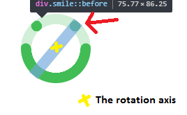
眼睛
对于眼睛,我将使用伪元素和径向梯度来创建圆。我不会简单地创建一个边界半径的圆圈,因为我也需要将它们在与微笑相同的轴上旋转。
因此,我们的想法是使其完全宽度,并使用径向梯度,使圆在最右/左。通过这样做,我可以很容易地控制他们的位置与旋转,并确保他们停留在需要的位置,无论是什么,旋转程度。
.smile {
  margin: 50px;
  width: 100px;
  height: 100px;
  border-radius: 50%;
  background:
   radial-gradient(circle at center,#42bd56 10%,transparent 11%)  43px 0px,
   radial-gradient(circle at center,#42bd56 10%,transparent 11%) -43px 0px,
   radial-gradient(circle at center, #fff 35px, transparent 35px) ,
   linear-gradient(to bottom, #fff 50%, transparent 50%),
   #42bd56;
  position: relative;
}

.smile:before,.smile:after{
    content: "";
    position: absolute;
    width: 100%;
    top: 50%;
    margin-top: -7px;
    height: 15px;
    background: radial-gradient(circle,#42bd56 15%,transparent 16%) 43px 0px;
    transform:rotate(-50deg);

}
.smile:after {
  background:radial-gradient(circle,#42bd56 15%,transparent 16%) -43px 0px;
  transform:rotate(50deg);
}<div class="smile">
</div>
现在,对于动画,我将保持第一个旋转,也将旋转眼睛,但我将添加一些动画到眼睛,使他们向相反的方向移动,并创造一个错觉的微笑在他们上面。所以我会简单地给眼睛增加一个负旋转,使它们看起来移动得更慢,从而超越微笑,创造所需的效果:
以下是完整的动画:)
.smile {
  margin: 50px;
  width: 100px;
  height: 100px;
  border-radius: 50%;
  background:
   radial-gradient(circle at center,#42bd56 10%,transparent 11%)  43px 0px,
   radial-gradient(circle at center,#42bd56 10%,transparent 11%) -43px 0px,
   radial-gradient(circle at center, #fff 35px, transparent 35px) ,
   linear-gradient(to bottom, #fff 50%, transparent 50%),
   #42bd56;
  background-repeat:no-repeat;
  position: relative;
}

.smile:before,.smile:after{
    content: "";
    position: absolute;
    width: 100%;
    top: 50%;
    margin-top: -7px;
    height: 15px;
    background: radial-gradient(circle,#42bd56 15%,transparent 16%) 43px 0px;
    transform:rotate(-50deg);

}
.smile:after {
  background:radial-gradient(circle,#42bd56 15%,transparent 16%)  -43px 0px;
  transform:rotate(50deg);
}


.smile:hover {
  animation: rotateS 1.5s linear;
}

.smile:hover::before {
  animation: rotateL 1.5s linear;
}
.smile:hover::after {
  animation: rotateR 1.5s linear;
}

@keyframes rotateS {
  0% {
    transform: rotate(0deg);
    background-size: auto,auto,auto ,100% 100%, auto;
  }
  50% {
    transform: rotate(360deg);
    background-size: auto,auto,auto, 100% 50%, auto;
  }
  100% {
    transform: rotate(720deg);
    background-size: auto,auto,auto, 100% 100%, auto;
  }
}

@keyframes rotateR {
  0% {
    transform:rotate(50deg);
  }
  30%,70% {
    transform:rotate(-40deg);
  }
  100% {
    transform:rotate(50deg);
  }
}

@keyframes rotateL {
  0% {
    transform:rotate(-50deg);
  }
  30%,70% {
    transform:rotate(-180deg);
  }

  100% {
    transform:rotate(-50deg);
  }
}<div class="smile">
</div>
在这个解决方案中,为了简单起见,我使用了一个线性转换,但是可以将它更改为任何易度函数,使其具有类似于GIF的转换。
Stack Overflow用户
发布于 2018-01-12 20:21:33
嗯,对于这种类型的动画,从CSS中调整SVG将是首选的。
您使用的技术来绘制一个完整的CSS笑脸依赖于一个线性背景来调整线的“长度”,这将是荒谬的资源密集型尝试动画(以增加长度)时旋转。
最近,我可以用纯CSS来调整您的代码,但是没有SVG是这样的,希望它有帮助。
body {
  background: #fff;
  margin: 50px;
}

.smiley{
  position:relative;
  width: 70px;
  height: 70px;
}

.loader {
  position: relative;
  border-radius: 50%;
  box-sizing: border-box;
  width: 70px;
  height: 70px;
  background: linear-gradient(to bottom, #fff 50%, #51cf66 50%);
  animation: rotate 2s infinite;
}

.loader:before {
  content: "";
  position: absolute;
  left: 8px;
  right: 8px;
  top: 8px;
  bottom: 8px;
  border-radius: 50%;
  background: #fff;
}

.dot-left, .dot-right {
  position: absolute;
  width: 10px;
  height: 10px;
  border-radius: 50%;
  background: #51cf66;
}

.dot-left {
  left: 4px;
  top: 10px;
  animation: dissapearL 2s infinite;
}

.dot-right {
  right: 6px;
  top: 10px;
  animation: dissapearR 2s infinite;
}

@keyframes rotate{
  from{
    transform:rotate(0);
  }
  to{
    transform:rotate(720deg);
  }
}

@keyframes dissapearL{
  0%{
    transform:scale(1);
  }
  10%{
    transform:scale(1);
  }
  15%{
    transform:scale(0);
  }
  45%{
    transform:scale(0);
  }
  50%{
    transform:scale(1);
  }
}

@keyframes dissapearR{
  0%{
    transform:scale(1);
  }
  15%{
    transform:scale(1);
  }
  20%{
    transform:scale(0);
  }
  65%{
    transform:scale(0);
  }
  70%{
    transform:scale(1);
  }
}<div class="smiley ">
<div class="loader">
</div>
<div class="dot-left"></div>
<div class="dot-right"></div>
</div>
Stack Overflow用户
发布于 2018-01-17 16:34:24
尽管这个笑脸动画只能使用CSS实现,但正如其他人所说,SVG显然是一个更好的选择,主要原因如下:
- 动画渐变并不是性能最好的渐变
- 不添加非语义标记,在微笑的两边进行圆圈是非常困难的。
- SVG是一个工具,用来绘制这种形状和动画他们也。它使它们更易于维护,代码更易于阅读和理解。
这就是说,我以你的笑脸动画为例。
这就是看起来的样子:

下面是代码(从代码演示中简化):
svg {
  width:100px;
  height:auto;
  display:block;
  transform:rotateZ(0deg);
  margin:0 auto;
}
.smile, .eyes {
  stroke:teal;
  stroke-width:1.3;
  stroke-linecap:round;
  fill:transparent;
}
svg:hover {animation:rotate 1.2s cubic-bezier(0.65, 0.000, 0.75, 1.000);}
svg:hover .smile{animation: smile 1s cubic-bezier(0.2, 0.000, 0.8, 1.000);}
svg:hover .eyes{animation: eyes 1s cubic-bezier(.7, 0.000, 0.4, 1.000);}

@keyframes rotate { to { transform:rotateZ(720deg); } }
@keyframes smile { 50% { stroke-dasharray:20,5.1327;} }
@keyframes eyes  { 70% { stroke-dasharray:1,0,.5,23.6327;} }

h1 {text-align:center;color:teal;}<svg viewbox="0 0 10 10">
<circle class="smile" cx="5" cy="5" r="4" stroke-dashoffset="-.5" stroke-dasharray="11.5,13.6327" />
<circle class="eyes" cx="5" cy="5" r="4" stroke-dashoffset="-15.5" stroke-dasharray="0,6.6327,0,17.5" />
</svg>
<h1>Hover me !</h1>
笑脸和动画是如何制作的?
这个微笑是由两个SVG圆元素 (一个用于眼睛,一个用于微笑)和中风-达沙雷属性来创建眼睛和微笑。
动画:
svg是使用CSS动画在悬停时旋转的,而笔画-dasharray属性则是动画化的,以使眼睛在微笑中“消失”。微笑的长度也被改变为一个圆圈的3/4。
宽松功能:
平滑效果是用bezier曲线缓和函数实现的。动画定时也被调整,以接近期望的笑脸动画。
https://stackoverflow.com/questions/48232891
复制相似问题
腾讯云开发者

Copyright © 2013 - 2026 Tencent Cloud. All Rights Reserved. 腾讯云 版权所有
深圳市腾讯计算机系统有限公司 ICP备案/许可证号:粤B2-20090059  粤公网安备44030502008569号
腾讯云计算(北京)有限责任公司 京ICP证150476号 | 京ICP备11018762号