
用R语言绘制具有2y轴和相同x轴的条形图
用R语言绘制具有2y轴和相同x轴的条形图
提问于 2017-12-21 06:02:26
我试图用两个不同的y轴和同一个x轴绘制一个条形图。
由于某些原因,我无法用R中的barplot进行绘图,我也尝试过用绘图函数进行绘图。但不能接近我想要的。
以下是数据:
x,y1,y2
1,130,1525157
2,84,1070393
3,140,1263374
4,346,2620949
5,354,2939962
6,300,3303101
7,127,1647361
8,69,1168261
9,44,7447573
10,38,12804778
11,12,570379
12,22,3100184
13,7,236046
14,23,2322048
用于尝试的代码如下所示:
options(scipen=10000000)
bargraph_test <- read.csv(file="data_test.csv",head=TRUE,sep=",")
attach(bargraph_test)
plot(x = x, y = y1, col = "blue", type = "h", xlab = "x", ylab = "y1", main = "")
par(new = T)
plot(x = x, y = y1, col = "green", type = "h", xaxt = "n", yaxt = "n", xlab = "", ylab = "")
axis(4)
mtext("y2", side = 4, line = 3)
我是附加在这里的屏幕截图,我得到的输出。
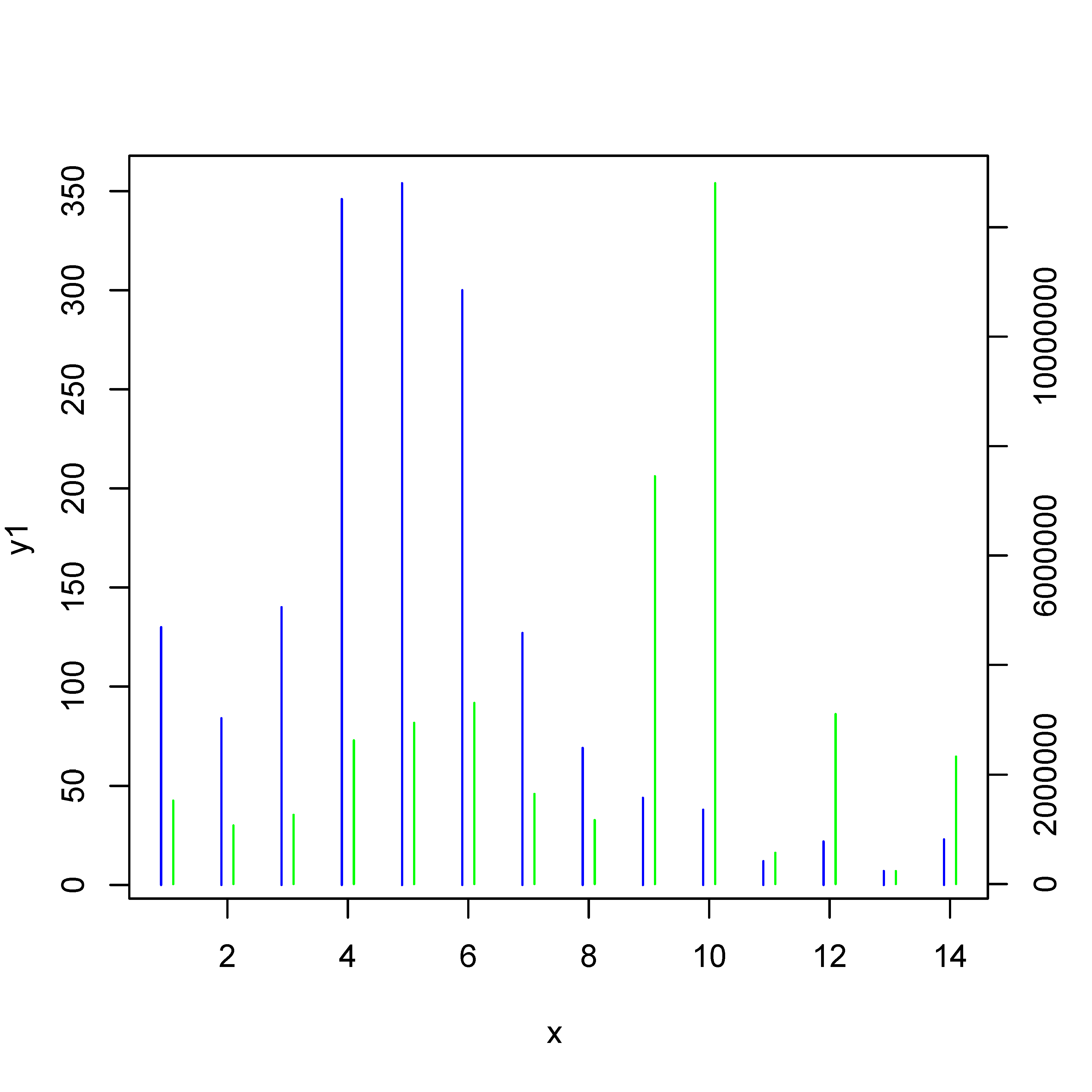
我需要将这些线条显示为条形图。
有人能帮我解决这个问题吗。
谢谢你的帮助。
回答 2
Stack Overflow用户
发布于 2017-12-21 11:19:04
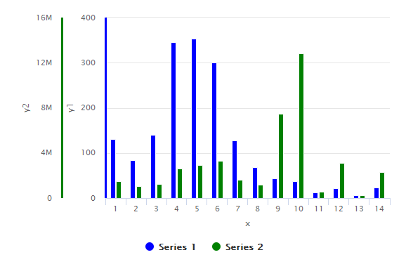
使用highcharter,您可以添加任意多个Y轴。只需在hc_yAxis_multiples & hc_add_series中添加另一个条目即可。
library(highcharter)

highchart() %>%
  hc_yAxis_multiples(
    list(lineWidth = 3, lineColor='blue', title=list(text="y1")),
    list(lineWidth = 3, lineColor="green", title=list(text="y2"))
  ) %>%
  hc_add_series(data = df$y1, color='blue', type = "column") %>%
  hc_add_series(data = df$y2, color='green', type = "column", yAxis = 1) %>%
  hc_xAxis(categories = df$x, title = list(text = "x"))
输出图:
#sample data
> dput(df)
structure(list(x = 1:14, y1 = c(130L, 84L, 140L, 346L, 354L,
300L, 127L, 69L, 44L, 38L, 12L, 22L, 7L, 23L), y2 = c(1525157L,
1070393L, 1263374L, 2620949L, 2939962L, 3303101L, 1647361L, 1168261L,
7447573L, 12804778L, 570379L, 3100184L, 236046L, 2322048L)), .Names = c("x",
"y1", "y2"), class = "data.frame", row.names = c(NA, -14L))Stack Overflow用户
发布于 2017-12-21 11:55:36
正如问题的最后一句所示,实际的问题是“我如何得到更宽的条形线?”我回答的是这个问题,而不是问题标题中的问题。
您可以使用参数lwd使线条变粗。要获得条形条/行的好末端:请查看此answer to 'Increasing the width of type “h” R plot'并使用lend=1。
# data
x <- c(1,2,3,4,5,6,7,8,9,10,11,12,13,14)
y1 <- c(130,84,140,346,354,300,127,69,44,38,12,22,7,23)
y2 <- c(1525157,1070393,1263374,2620949,2939962,3303101,1647361,1168261,7447573,12804778,570379,3100184,236046,2322048)

# what-ever ...
options(scipen=10000000)

# first set of bars
plot(x = x-0.1, y = y1, col = "blue", type = "h", xlab = "x", ylab = "y1", main = "", xlim = range(x), lwd = 4, lend = 1)
# new:
#  xlim = range(x) :: we need it so that the x-axis is not shifted
#  lwd = 4         :: thicker lines
#  lend = 1        :: flat line ends
#  please note 'x-0.1'

# add second set of bars
par(new = T)
plot(x = x + 0.1, y = y2, col = "green", type = "h", xaxt = "n", yaxt = "n", xlab = "", ylab = "", xlim = range(x), lwd = 4, lend=1)

# second y-axis
axis(4)
mtext("y2", side = 4, line = 3)页面原文内容由Stack Overflow提供。腾讯云小微IT领域专用引擎提供翻译支持
原文链接:
https://stackoverflow.com/questions/47918842
复制相关文章
相似问题
腾讯云开发者

Copyright © 2013 - 2026 Tencent Cloud. All Rights Reserved. 腾讯云 版权所有
深圳市腾讯计算机系统有限公司 ICP备案/许可证号:粤B2-20090059 ![]() 粤公网安备44030502008569号
粤公网安备44030502008569号
腾讯云计算(北京)有限责任公司 京ICP证150476号 | 京ICP备11018762号