
放大Safari中SVG甜甜圈图时的问题
放大Safari中SVG甜甜圈图时的问题
提问于 2017-12-06 19:20:48
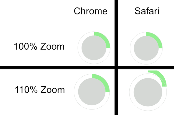
我试图使用SVG创建一个甜甜圈图,在Safari中查看它时遇到了问题。下面是一个显示问题的小提琴,我将在下面详细描述它:
https://jsfiddle.net/nijhazer/phy2ossh/
这把小提琴显示了一个由两个圆圈组成的图形,两个圆圈重叠在一起。当Safari用户增加浏览器中的缩放大小时,问题就很明显了:
示例中的相关HTML:
<div class="donut-chart">
    <svg width="200" height="200">
        <circle class="backdrop" cx="100" cy="100" r="65" fill="#d5d8d5" stroke="none" stroke-width="0"></circle>
        <circle class="progress" cx="100" cy="100" r="75" fill="none" stroke="lightgreen" stroke-width="20" style="stroke-dashoffset: 353.428875px;"></circle>
        <circle class="outer-ring" cx="100" cy="100" r="85" fill="none" stroke="#d5d8d5" stroke-width="1"></circle>
    </svg>
</div>
示例中的相关CSS:
body {
    background-color: white;
}
.donut-chart {
    width: 200px;
    height: 200px;
    position: relative;
}
svg {
    width: 200px;
    height: 200px;
}
.progress {
    stroke-dasharray: 471.24;
    transform: rotate(-90deg);
    transform-origin: 50% 50%;
    background-color: transparent;
}回答 2
Stack Overflow用户
发布于 2022-06-23 10:13:46
我不知道这是否有帮助,但我可以从评论中看到人们将CSS属性转换为原来的原因。在本例中,我将样式移动到循环元素的属性中。我还添加了pathLength,以便更容易地控制进度条。
body {
  background-color: white;
}

.donut-chart {
  width: 200px;
  height: 200px;
  position: relative;
}

svg {
  width: 200px;
  height: 200px;
}<div class="donut-chart">
<svg viewBox="0 0 200 200" xmlns="http//www.w3.org/2000/svg">
<circle class="backdrop" cx="100" cy="100" r="65" fill="#d5d8d5"
stroke="none" stroke-width="0" />
<circle class="progress" cx="100" cy="100" r="75" fill="none"
stroke="lightgreen" stroke-width="20" stroke-dasharray="25 100"
transform="rotate(-90 100 100)" pathLength="100" />
<circle class="outer-ring" cx="100" cy="100" r="85" fill="none"
stroke="#d5d8d5" stroke-width="1" />
</svg>
</div>
Stack Overflow用户
发布于 2022-06-23 17:51:46
我可以确认chrwahl's approach正在工作(至少在我测试过的MacOS/IOS safari版本(15.4)中是这样的--不幸的是,不同版本对函数的支持可能有所不同)
另一个解决方法可以是在像这样旋转之前添加一个translateX偏移量:
.donut-chart {
  width: 200px;
  height: 200px;
  position: relative;
  display: block;
}

svg {
  width: 200px;
  height: 200px;
}

.progress {
  stroke-dasharray: 471.24;
  background-color: transparent;
  transform: translate(0px, 200px) rotate(-90deg);
}<div class="donut-chart">
<svg width="200" height="200" viewBox="0 0 200 200">
<circle class="backdrop" cx="50%" cy="50%" r="65" fill="#d5d8d5" stroke="none" stroke-width="0"></circle>
<circle class="progress" cx="50%" cy="50%" r="75" fill="none" stroke="lightgreen" stroke-width="20" style="stroke-dashoffset: 353.428875px;"></circle>
<circle class="outer-ring" cx="100" cy="100" r="85" fill="none" stroke="#d5d8d5" stroke-width="1"></circle>
</svg>
</div>
这种“黑客”不能与transform-origin: 50% 50%结合使用
页面原文内容由Stack Overflow提供。腾讯云小微IT领域专用引擎提供翻译支持
原文链接:
https://stackoverflow.com/questions/47681945
复制相关文章
相似问题
腾讯云开发者

Copyright © 2013 - 2026 Tencent Cloud. All Rights Reserved. 腾讯云 版权所有
深圳市腾讯计算机系统有限公司 ICP备案/许可证号:粤B2-20090059  粤公网安备44030502008569号
腾讯云计算(北京)有限责任公司 京ICP证150476号 | 京ICP备11018762号