
图表Js V2在垂直条形图上绘制水平条(平均值)
图表Js V2在垂直条形图上绘制水平条(平均值)
提问于 2017-12-05 13:47:46
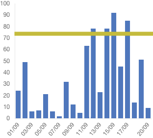
我想画一个单杠以上的垂直条(绿条)。我使用的是角为4的图表JS V2。
我找到了一些代码来画线,但它不能在角4中工作。
我也尝试过使用annotation,但它不起作用。添加注释的命令:npm安装chartjs-plugin-注释-保存
下面是我的代码,只绘制垂直条很好。有人能帮我画一条水平线吗。
答案:
安装npm install chartjs-plugin-annotation --save
然后是import 'chartjs-plugin-annotation';
this.ctx = document.getElementById("myChart");
    this.myChart = new Chart(this.ctx, {
        type: 'bar',
        data: {
            labels: this.barData.getLabels(),
            datasets: [{
                label: this.barData.actualLegendLabel,
                data: this.barData.getLineData(),
                backgroundColor: this.backgroundColorBarOne,
                borderColor: [
                    'rgba(81,117, 194,1)',
                ]}]
        },
        options: {
            scales: {
                responsive: true,
                scaleBeginAtZero: false,
                barBeginAtOrigin: true,
                yAxes: [{
                    ticks: {
                        beginAtZero: true
                    },
                    gridLines: {
                        display: false
                    }
                }],
                xAxes: [{
                    ticks: {
                        beginAtZero: true
                    },
                    gridLines: {
                        display: false
                    }
                }]
            },
            legend: {
                cursor: "line",
                position: 'top',
                labels: {
                    fontSize: 10,
                }
            },
            layout: {
                padding: {
                    left: 3,
                    right: 3,
                    top: 5,
                    bottom: 5
                }
            }, annotation: {
                annotations: [{
                    drawTime: 'afterDraw', // overrides annotation.drawTime if set
                    id: 'a-line-1', // optional
                    type: 'line',
                    mode: 'horizontal',
                    scaleID: 'y-axis-0',
                    value: '25',
                    borderColor: 'red',
                    borderWidth: 2,
                    // Fires when the user clicks this annotation on the chart
                    // (be sure to enable the event in the events array below).
                    onClick: function(e) {
                        // `this` is bound to the annotation element
                    }
                }]
            }
        }
}); 回答 1
Stack Overflow用户
发布于 2017-12-11 12:29:18
您可以添加一个插件到您的图表,可以绘制任何您想在图表上,例如绿色线。您可以在ChartJS文档中阅读有关插件的内容。因为您希望绿线出现在垂直条上方,所以应该使用afterDraw方法。
一旦您设置了插件,完成这一任务的步骤如下:
- 计算图表中所有条形图的平均值(把它们加起来,除以条数)
- 根据前面的计算:确定直线的Y位置,并在此基础上画出画布上的绿色线。
如果您对浏览器画布的工作方式还不熟悉,请查看CanvasRenderingContext2D。
页面原文内容由Stack Overflow提供。腾讯云小微IT领域专用引擎提供翻译支持
原文链接:
https://stackoverflow.com/questions/47655173
复制相关文章
相似问题
腾讯云开发者

Copyright © 2013 - 2026 Tencent Cloud. All Rights Reserved. 腾讯云 版权所有
深圳市腾讯计算机系统有限公司 ICP备案/许可证号:粤B2-20090059 ![]() 粤公网安备44030502008569号
粤公网安备44030502008569号
腾讯云计算(北京)有限责任公司 京ICP证150476号 | 京ICP备11018762号