
如何用百分比绘制R中的密度曲线?
如何用百分比绘制R中的密度曲线?
提问于 2017-11-25 20:53:06
我不确定我所问的是否在概念上是正确的,主要是因为密度本身的定义,但无论如何.
我试图用R绘制一个密度图,但在y轴上使用百分比。在下面的图片中,我成功地绘制了我需要的曲线,但在我看来,这并不是y轴中的百分比。
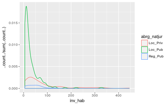
我用来制作它的代码如下:
ggplot(data = base_15
           , aes(x = inv_hab, y = ..count../sum(..count..)
           , colour = abrg_natjur)
           ) + geom_density()
我已经搜过很多地方了,比如:
(ggplot2)/
Use hist() function in R to get percentages as opposed to raw frequencies
但我还是失败了。当我用
geom_histogram(aes(y = ..count../sum(..count..)))它工作,y轴改变成百分比,但它不适用于geom_density。我想用线条,而不是列来描绘它。
提前谢谢。
回答 1
Stack Overflow用户
回答已采纳
发布于 2017-11-25 21:17:27
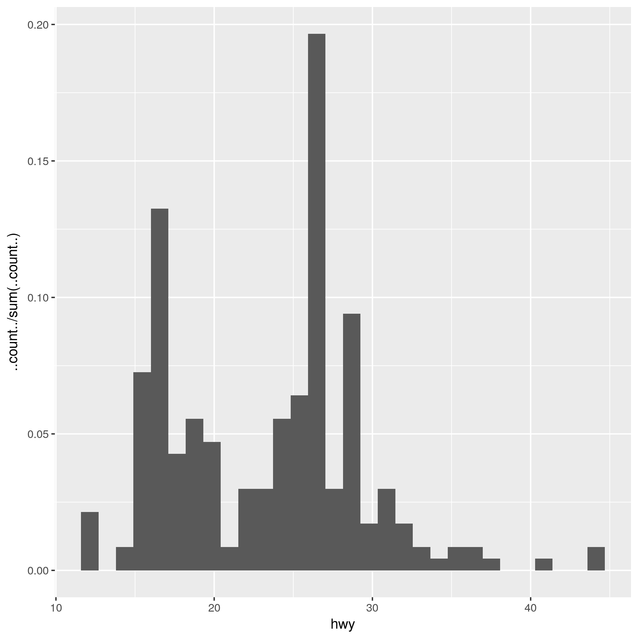
您可以更改由stat使用的geom_*以获得所需的输出。
在本例中,我将使用来自mpg包的ggplot2数据集。
就像你说的,
library(ggplot2)
ggplot(mpg) + aes(x = hwy, y = ..count../sum(..count..)) + geom_histogram()
生成想要的输出作为直方图:
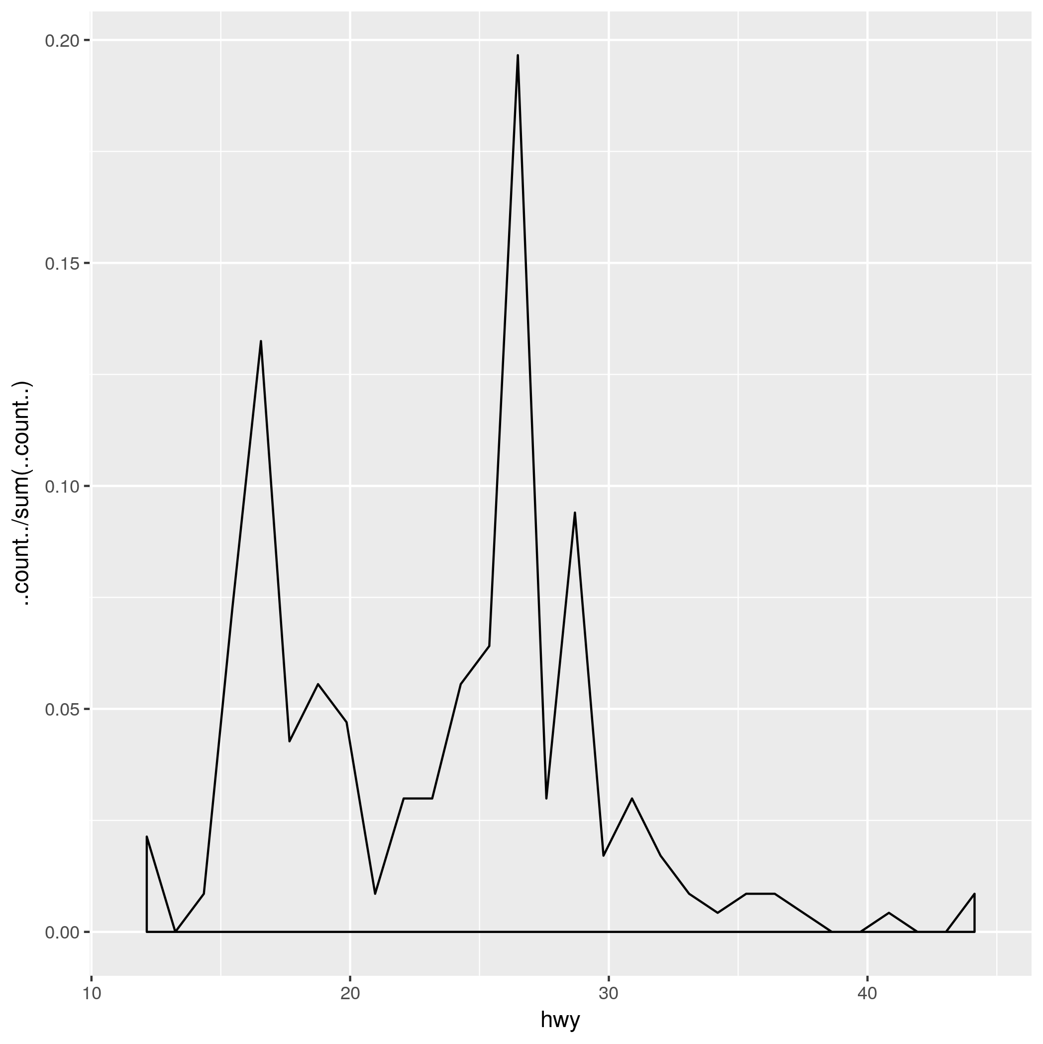
通过调用与geom_density相同的stat = 'bin' (与geom_histogram相同的stat ),而不是默认的geom_density stat = 'density',您将得到我认为您正在寻找的东西:
ggplot(mpg) + aes(x = hwy, y = ..count../sum(..count..)) + geom_density(stat = 'bin')
页面原文内容由Stack Overflow提供。腾讯云小微IT领域专用引擎提供翻译支持
原文链接:
https://stackoverflow.com/questions/47490416
复制相关文章
相似问题
腾讯云开发者

Copyright © 2013 - 2026 Tencent Cloud. All Rights Reserved. 腾讯云 版权所有
深圳市腾讯计算机系统有限公司 ICP备案/许可证号:粤B2-20090059 ![]() 粤公网安备44030502008569号
粤公网安备44030502008569号
腾讯云计算(北京)有限责任公司 京ICP证150476号 | 京ICP备11018762号