
带有反应的progress[value]风格
我想要一个进度条,它是多条的。看起来是这样的:
[----------][----50% ][ ]
[---20% ][ ][ ]
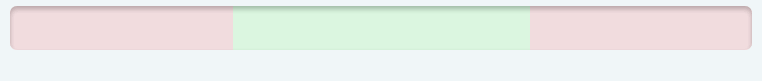
[----------][-----------][---80% ]它有三个独特的部分,红-绿-红:
[ RED RED ][GREEN GREEN][ RED RED]这是实时的,该值来自远程的json,如果该值位于绿色区域,则一切都很好,否则需要同事采取行动(如果它位于所需的区域之下,或者在此区域之上)。
到目前为止,我实现了html+css,在火狐和Chrome中运行良好。下面是关于jsfiddle的演示项目:
- 20% - https://jsfiddle.net/jws0jh6w/1/
- 50% - https://jsfiddle.net/0458cbgw/1/
- 80% - https://jsfiddle.net/4cLa8kra/
现在我需要“激活”代码,才能活着:)
问题是,我不能内联样式如下的CSS规则:
    progress[value]::-webkit-progress-value { /* Chrome */
  background-image:
    -webkit-linear-gradient(
      135deg,
      transparent 33%,
      rgba(0, 0, 0, 0.1) 33%,
      rgba(0, 0, 0, 0.1) 66%,
      transparent 66%
    ),
    -webkit-linear-gradient(
      top,
      rgba(255, 255, 255, 0.25),
      rgba(0, 0, 0, 0.25)
    ),
    -webkit-linear-gradient(
      left,
      rgba(255,0,0,0.8),
      rgba(255,0,0,0.8) 37.5%,
      rgba(0,255,0,0.8) 37.5%,
      rgba(0,255,0,0.8) 87.5%,
      rgba(255,0,0,0.8) 87.5%
    );
}
反应化的Progressbar.js相当简单:
const Progressbar = ({percent, min, max}) => {

  let styleProgress = {  backgroundImage:
    `linear-gradient(
      90deg,
      rgba(255,0,0,0.1),
      rgba(255,0,0,0.1) ${min}%,
      rgba(0,255,0,0.1) ${min}%,
      rgba(0,255,0,0.1) ${max}%,
      rgba(255,0,0,0.1) ${max}%)`
  };

  return(
      <div className="wrapper-progressbar">
        <progress style={styleProgress} max="100" value={percent}>
        </progress>
      </div>
  );
};
我可以设置微弱的回溯(所以min和max总是可见的),但不是实际的进度条。
有没有人知道,如何做出动态css选择器的反应?
ps:只需要Chrome和Firefox支持,因为它最终会成为控制室中的电视(Kiosk模式)。所以根本不需要IE支持。html5 <progress>元素将是正确的解决方案。
更新:下面是一个演示反应项目:https://jsfiddle.net/ave0x0nb/3/
进度条是单色(红色0-30%),有两种颜色(红色0-30%,绿色30-70%),或三色(红色0-30%,绿色30-70%,红色70-100%)取决于实际值。因此,如果数值是50%,它是两种颜色(0-30%的红色和30-50%的绿色)。
现在的问题(因此问题),它总是三色(上述反应演示项目),不尊重背景进度条的限制。参见20%,50%,80%的小提琴演示项目,以供参考。
Update2:我添加了一个动画作为参考。
回答 2
Stack Overflow用户
发布于 2017-11-20 21:44:36
function updateValue(){
	const progress = document.querySelector('progress');
  progress.value = Math.round(Math.random()*100) + 1;
  console.log(progress.value);
}

const interval = setInterval(updateValue, 500);

setTimeout(function () {
	clearInterval(interval);
}, 4000);.wrapper-progressbar {
flex: 1;
}
progress {
width: 100%;
background-image:
linear-gradient(
90deg,
rgba(255,0,0,0.1),
rgba(255,0,0,0.1) 30%,
rgba(0,255,0,0.1) 30%,
rgba(0,255,0,0.1) 70%,
rgba(255,0,0,0.1) 70%);
border: 0;
height: 2em;
border-radius: 9px;
box-shadow: 0 2px 3px rgba(0, 0, 0, 0.25) inset;
}
progress[value]::-webkit-progress-bar {
width: 100%;
background: transparent;
background-image:
-webkit-linear-gradient(
left,
rgba(255,0,0,0.1),
rgba(255,0,0,0.1) 30%,
rgba(0,255,0,0.1) 30%,
rgba(0,255,0,0.1) 70%,
rgba(255,0,0,0.1) 70%);
border: 0;
height: 2em;
border-radius: 9px;
box-shadow: 0 2px 3px rgba(0, 0, 0, 0.25) inset;
}
progress[value] {
background-color: transparent;
border-radius: 5px;
box-shadow: 0 2px 3px rgba(0, 0, 0, 0.25) inset;
position: relative;
/* Reset the default appearance */
-webkit-appearance: none;
-moz-appearance: none;
appearance: none;
/* Get rid of default border in Firefox. */
/*border: none;*/
}
progress[value]::-moz-progress-bar { /* Firefox */
border-radius: 2px;
background-size: 65px, 100%, 100%;
background-color: transparent;
background-image:
-moz-linear-gradient(
135deg,
transparent 33%,
rgba(0, 0, 0, 0.1) 33%,
rgba(0, 0, 0, 0.1) 66%,
transparent 66%
),
-moz-linear-gradient(
top,
rgba(255, 255, 255, 0.25),
rgba(0, 0, 0, 0.25)
),
-moz-linear-gradient(
left,
rgba(255,0,0,0.8),
rgba(255,0,0,0.8) 100%,
rgba(0,255,0,0.8) 100%,
rgba(0,255,0,0.8) 100%,
rgba(255,0,0,0.8) 100%
);
}
progress[value]::-webkit-progress-value { /* Chrome */
border-radius: 2px;
background-size: 65px, 100%, 100%;
background-color: transparent;
background-image:
-webkit-linear-gradient(
135deg,
transparent 33%,
rgba(0, 0, 0, 0.1) 33%,
rgba(0, 0, 0, 0.1) 66%,
transparent 66%
),
-webkit-linear-gradient(
top,
rgba(255, 255, 255, 0.25),
rgba(0, 0, 0, 0.25)
),
-webkit-linear-gradient(
left,
rgba(255,0,0,0.8),
rgba(255,0,0,0.8) 100%,
rgba(0,255,0,0.8) 100%,
rgba(0,255,0,0.8) 100%,
rgba(255,0,0,0.8) 100%
);
} <div className="wrapper-progressbar">
<progress style={styleProgress} max="100" value="90"></progress>
</div>
Stack Overflow用户
发布于 2017-11-21 10:21:42
使用类名 npm软件包。您可以在组件中发送进度(例如20%、50%、80%),并在组件中相应地将类名应用为:
progressBarClass = classNames('defaultClass', {
        'green': props.progress < PROGRESS_VALUE.green,
        'yellow': PROGRESS_VALUE.green < props.progress < PROGRESS_VALUE.yellow,
        'red': props.progress > PROGRESS_VALUE.red
      }),
在渲染中:
render(){
   return (
       <div classNames={progressBarClass}>{'progress-bar'}</div>
   );
}
在css文件中:
.green {
  //...green styles
}

.yellow {
  //...yellow styles
}


.red {
  //...red styles
}
我还没有编写确切的代码,但是您可以有条件地应用这样的类。而不是做内联css,因为它使您的代码不可读,我个人不喜欢内联风格。
https://stackoverflow.com/questions/47400637
复制相似问题
腾讯云开发者

Copyright © 2013 - 2026 Tencent Cloud. All Rights Reserved. 腾讯云 版权所有
深圳市腾讯计算机系统有限公司 ICP备案/许可证号:粤B2-20090059  粤公网安备44030502008569号
腾讯云计算(北京)有限责任公司 京ICP证150476号 | 京ICP备11018762号