
Flex基础: 0%会导致IE11中的不正确溢出
我遇到的问题涉及到flex-basis: 0%;,以及当用户减少窗口宽度时IE11如何处理它。可能与箱形尺寸的错误有关。
我有可变数量的弹性孩子,每个孩子的宽度都是未知的.每个子程序都有任意动态生成的内容。但是,其中一些内容必须具有包装文本的能力。
弹性容器本身必须有100%的宽度,并且必须能够包装它的子容器(即flex-wrap: wrap)。
让我们假设有三个弹性子,最后一个需要文本包装:
<div class="flex-container">
  <div class="flex-child">
    <div>This text should not overlay other flex-children.</div>
  </div>
  <div class="flex-child">
    <div>This text should not overlay other flex-children.</div>
  </div>
  <div class="flex-child">
    <div class="text-break">This text should break on new lines when the container shrinks down</div>
  </div>
</div>
CSS的定义如下:
.flex-container {
  display: flex;
  flex-wrap: wrap;
  width: 100%;
}

.flex-child {
  flex-grow: 1;
  flex-shrink: 0;
  flex-basis: 0%;
  white-space: nowrap;
  padding: 5px;
}

.text-break {
  white-space: pre-wrap;
}
当窗口足够宽时,每个弹性子应该并排并排,文本不折叠:

当窗口水平缩小时,最右边框中的文本应开始插入新行:

当文本不能再分解成更多的线条时,挠性框本身就应该开始中断:

这在大多数现代浏览器中都很好,但我们的朋友IE11却不行。在IE11中,当更改屏幕大小时,文本包装得很好,但是flex-子程序根本不包装。因为flex-子程序没有包装,所以它们的内容会溢出到彼此之间:
将flex基础更改为flex-basis: auto;会产生相反的效果:文本不会被包装,但是flex-子程序会这样做,但是没有内容溢出(在这个屏幕截图中,绿色框中的文本应该是断线,而不是跳入新行):

我见过的大多数解决方案都需要有固定长度的弹性儿童,我在这里负担不起,因为它们是动态生成的。我故意不使用flex快捷方式属性,因为它有其他一些无关的问题。这个答案建议使用_:-ms-fullscreen, :root .IE11-only-class { /* IE11 specific properties */ },如果我能够解决文本包装问题,它可能会起作用,但我无法解决这一点。
我还应该说,我只需要在最新的浏览器上工作(技术上只适用于某些版本的Chrome和IE11,但其他浏览器和版本也可以工作)。
下面是一个代码笔,完整地显示了这个问题(在IE11和Chrome中查看不同之处)。
有没有人对如何绕过这个问题有任何想法?
请记住,要求是:
- 未知的弯曲数-宽度未指定的子级
- 某些文本必须在弹性框包装之前包装。
- flex-当文本不能再多包装时,孩子必须包装。
- Chrome (我使用59.0.3071.109)和IE11 (我使用11.0.9600.18816CO)应该以同样的方式运行。
- 首选CSS专用解决方案。
谢谢。
更新:
我的一位同事建议对不包含可包装文本的弹性子类使用单独的类。以下HTML和CSS是他所使用的:
<!--HTML-->
<div class="flex-container">
  <div class="flex-child child-1">
    <div>This text should not overlay other flex-children.</div>
  </div>
  <div class="flex-child flex-child-without-textwrap child-2">
    <div>This text should not overlay other flex-children.</div>
  </div>
  <div class="flex-child flex-child-with-textwrap child-3">
    <div class="text-break">This text should break on new lines when the container shrinks down</div>
  </div>
</div>
和
/*CSS*/
.flex-container {
  display: flex;
  flex-wrap: wrap;
}

.flex-child {
  flex-grow: 1;
  flex-shrink: 1;
  padding: 5px;
  white-space: nowrap;
}

.flex-child-without-textwrap {
  flex-basis: auto;
}

.flex-child-with-textwrap {
  min-width: 200px;
  flex-basis: 0%;
}

.text-break {
  white-space: pre-wrap;
}
他的解决方案在技术上解决了我在这里提出的问题,但我忘了提到另一个要求:
- 在弹性子文件中,可以有任意组合的可包装文本和可解压缩文本。
他的解决方案在将第三个弹性子更改为:
<div class="flex-child flex-child-with-textwrap child-3">
  <div class="text-break">This text should break on new lines when the container shrinks down</div>
  <div>This text should not break on new lines</div>
</div>
在本例中,第三个flex子容器中的第二个div中的文本流出其容器,文本开始过早包装。
这里可以看到一个显示这种几乎可以工作的解决方案的代码(注意,min-width被删除了,因为它在Chrome上引起了更多的问题)。
更新2:我认为我之前还不够清楚:任何、全部或没有一个flex-子程序可能有可包装的文本。这都取决于动态生成的内容。在我给出的例子中,只有第三个弹性子有可包装的文本,但情况可能并不总是这样。
回答 2
Stack Overflow用户
发布于 2017-10-30 17:36:17
这是,而不是,因为它使用Javascript。然而,它起作用了。
在创建所有的flex-子程序之后,每当屏幕大小发生变化时,请检查每个flex子组件的宽度是否小于其内容的宽度(要使其工作,必须用display: table-cell包装内容)。如果是的话,将最小宽度添加到flex子级,等于其内容的宽度。一旦增加了一个最小宽度,计算就不需要再做了,所以不再检查屏幕大小的变化。只在IE11上这样做。
我使用jquery来实现这个解决方案。
HTML:
<div class="flex-container">
    <div id="1" class="flex-child child-1">
        <div class="content-container">This text should not overlay other flex-children.</div>
    </div>
    <div id="2" class="flex-child child-2">
        <div class="content-container">This text should not overlay other flex-children.</div>
    </div>
    <div id="3" class="flex-child child-3">
        <div class="content-container">
            <div class="text-break">This text should break on new lines when the container shrinks down</div>
            <div>This text should not break on new lines</div>
        </div>
    </div>
</div>
CSS:
.flex-container {
    display: flex;
    flex-wrap: wrap;
    width: 100%;
}

.flex-child {
    flex-grow: 1;
    flex-shrink: 0;
    flex-basis: 0%;
    white-space: nowrap;
    padding: 5px;
}

.text-break {
    white-space: pre-wrap;
}

.content-container {
    display: table-cell;
}
Jquery:
if (!!window.MSInputMethodContext && !!document.documentMode) {//if IE11
    $(".flex-child").each(function (i, elem) {
        var $flex_child = $(elem);
        var child_id = $flex_child.attr("id");

        //add resize event to window
        $(window).on("resize." + child_id, function () {
            var width_of_flex_child = $flex_child.outerWidth();
            var content_width = $flex_child.children(".content-container").outerWidth();

            if (width_of_flex_child < content_width) {
                $flex_child.css("min-width", content_width + "px");

                //remove event
                $(window).off("resize." + child_id);
            }
        }).trigger("resize." + child_id);
    });
}查看此解决方案的代码可以找到这里。
不幸的是,由于窗口事件,此解决方案在管理资源时需要额外的开销。
Stack Overflow用户
发布于 2017-10-27 20:08:53
注意,这个答案是在问题的2次更新之前发布的,这使得它部分无效,尽管我会暂时保留它,有人可能需要它。
经过大量的尝试和错误之后,我提出了这个设置,我的目标是使IE尽可能地模仿其他浏览器的行为。
IE需要一个最小宽度,这样文本就不会在元素包装之前折叠成0宽度,并且作为柔折基通常需要是auto,但是对于可拆分对象的父级,flex增长需要在5左右。
我使用只使用IE11的选择器添加了以下规则(我在我的这个答案中显示了这一点)。
_:-ms-fullscreen, :root .flex-child {
  flex-basis: auto;
}
_:-ms-fullscreen, :root .child-3 {
  flex: 5 0 0px;
  min-width: 80px;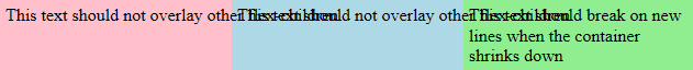
}堆栈段
.wrapper {
  width: 80%;
}

.flex-container {
  display: flex;
  flex-wrap: wrap;
  width: 100%;
}

.flex-child {
  flex: 1 0 0%;
  white-space: nowrap;
  padding: 5px;
}

_:-ms-fullscreen, :root .flex-child {
  flex-basis: auto;
}
_:-ms-fullscreen, :root .child-3 {
  flex: 5 0 0px;
  min-width: 80px;
}

.text-break {
  white-space: pre-wrap;
}

/*Add backgrounds for display*/
.child-1 {
  background-color: pink;
}
.child-2 {
  background-color: lightblue;
}
.child-3 {
  background-color: lightgreen;
}<div class="wrapper">
<div class="flex-container">
<div class="flex-child child-1">
<div>This text should not overlay other flex-children.</div>
</div>
<div class="flex-child child-2">
<div>This text should not overlay other flex-children.</div>
</div>
<div class="flex-child child-3">
<div class="text-break">This text should break on new lines when the container shrinks down</div>
</div>
</div>
</div>
https://stackoverflow.com/questions/46979743
复制相似问题
腾讯云开发者

Copyright © 2013 - 2026 Tencent Cloud. All Rights Reserved. 腾讯云 版权所有
深圳市腾讯计算机系统有限公司 ICP备案/许可证号:粤B2-20090059  粤公网安备44030502008569号
腾讯云计算(北京)有限责任公司 京ICP证150476号 | 京ICP备11018762号