
如何使我的网站响应移动
如何使我的网站响应移动
提问于 2017-10-08 08:46:04
这里是我网站的链接,笔记本电脑工作正常,但手机上它没有反应。这是链接到我的网站https://ticketsoko.co.ke/和折叠是如何显示在手机上。是否有一种方法在手机上,它可以调整图像大小,并被视为与其显示在桌面上一样。
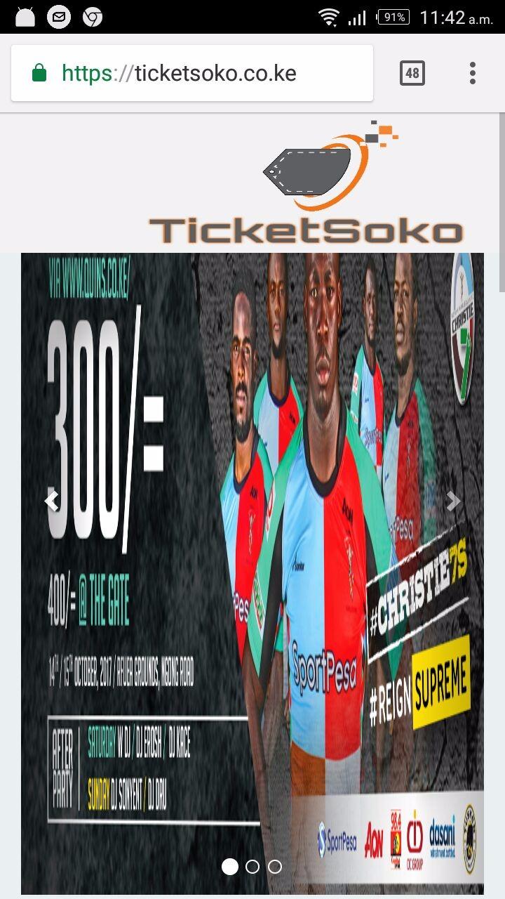
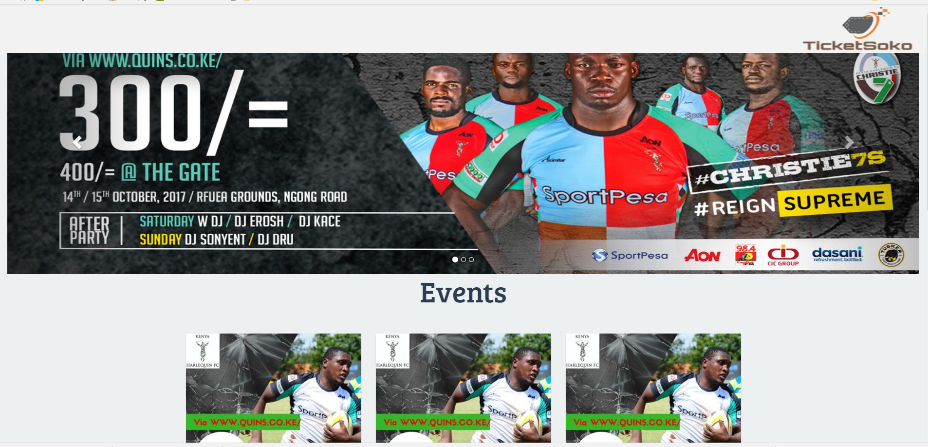
这是我从桌面上看到它的时候。
<head>
    <meta charset="utf-8">
    <!--<meta name="viewport"-->
    <!--      content="width=device-width, user-scalable=no, initial-scale=1.0, minimum-scale=1.0, maximum-scale=1.0">-->
          <meta name="viewport" content="width=device-width, initial-scale=1.0">
     <link rel="icon" type="image/png" href="img/logoo.png"/>
    <title>Click & Pay | TicketSoko</title>
    <link href="https://fonts.googleapis.com/css?family=Montserrat:400,700%7COpen+Sans" rel="stylesheet"
          type="text/css">
    <link rel="stylesheet" href="https://maxcdn.bootstrapcdn.com/bootstrap/3.3.6/css/bootstrap.min.css"
          integrity="sha384-1q8mTJOASx8j1Au+a5WDVnPi2lkFfwwEAa8hDDdjZlpLegxhjVME1fgjWPGmkzs7" crossorigin="anonymous">
          <!-- <link rel="stylesheet" href="https://maxcdn.bootstrapcdn.com/bootstrap/4.0.0-alpha.6/css/bootstrap.min.css" -->
           <!-- integrity="sha384-rwoIResjU2yc3z8GV/NPeZWAv56rSmLldC3R/AZzGRnGxQQKnKkoFVhFQhNUwEyJ" crossorigin="anonymous"> -->
    <link rel="stylesheet" href="./css/main.css">
    <link href="https://fonts.googleapis.com/css?family=Source+Sans+Pro:400,600,700" rel="stylesheet">
    <link rel="stylesheet" href="https://www.w3schools.com/w3css/4/w3.css">
    <link rel="stylesheet" href="https://maxcdn.bootstrapcdn.com/bootstrap/3.3.7/css/bootstrap.min.css">
    <link rel="stylesheet" href="css/reset.css"> <!-- CSS reset -->
    <link rel="stylesheet" href="css/style.css"> <!-- Resource style -->
    <link href="http://netdna.bootstrapcdn.com/font-awesome/4.0.3/css/font-awesome.css" rel="stylesheet">
    <link rel="stylesheet" href="css/style3.css">
    <link href="https://fonts.googleapis.com/css?family=Bree+Serif" rel="stylesheet">
    <link href="https://fonts.googleapis.com/css?family=Oswald" rel="stylesheet">
    <link rel="stylesheet" href="https://cdnjs.cloudflare.com/ajax/libs/font-awesome/4.7.0/css/font-awesome.min.css">

</head>

<body>


<nav class=" navbar-default navbar-fixed-top" style="background-color:#f2f2f2;">

     <ul>
         <img class="logo" src="img/logoo.png" alt="logo" style="height: 100px; width:250px; float:right;">
      </ul>

</nav>

<div class="container-fluid">
    <div id="myCarousel" class="carousel slide" data-ride="carousel">
        <!-- Indicators -->
        <ol class="carousel-indicators">
            <li data-target="#myCarousel" data-slide-to="0" class="active"></li>
            <li data-target="#myCarousel" data-slide-to="1"></li>
            <li data-target="#myCarousel" data-slide-to="2"></li>
        </ol>

        <!-- Wrapper for slides -->
     <div class="carousel-inner">
          <br><br><br>
            <div class="item active">
                <img src="img/image1.jpeg" alt="Los Angeles" style="width:100%; height:500px;">
            </div>

            <div class="item">
                <img src="img/2.jpg" alt="Chicago" style="width:100%; height:480px;">
            </div>

            <div class="item">
                <img src="img/3.jpg" alt="New york" style="width:100%; height:480px;">
            </div>

        </div>

        <!-- Left and right controls -->
        <a class="left carousel-control" href="#myCarousel" data-slide="prev">
            <span class="glyphicon glyphicon-chevron-left"></span>
            <span class="sr-only">Previous</span>
        </a>
        <a class="right carousel-control" href="#myCarousel" data-slide="next">
            <span class="glyphicon glyphicon-chevron-right"></span>
            <span class="sr-only">Next</span>
        </a>
    </div>
</div>回答 1
Stack Overflow用户
回答已采纳
发布于 2017-10-08 08:54:32
如我所见,你用的宽度是250 As。因此,无论是小屏幕还是大屏幕,任何屏幕都需要250像素。例如,如果您在一个只有250 it宽度的屏幕上设计了这个网站,那么它将完全呈现在屏幕上。如果你要在大屏幕上运行它,那么它只需要250像素,而rest像素就不会呈现。
所以你应该使用percentage for the widths。就像你想从左到右画一个组件,并画出屏幕的50%。然后给出宽度为50%。就像你能让它有反应。您也可以使用媒体查询。只需阅读有关媒体查询也。
希望这能帮到你。
页面原文内容由Stack Overflow提供。腾讯云小微IT领域专用引擎提供翻译支持
原文链接:
https://stackoverflow.com/questions/46629173
复制相关文章
相似问题
腾讯云开发者

Copyright © 2013 - 2026 Tencent Cloud. All Rights Reserved. 腾讯云 版权所有
深圳市腾讯计算机系统有限公司 ICP备案/许可证号:粤B2-20090059  粤公网安备44030502008569号
腾讯云计算(北京)有限责任公司 京ICP证150476号 | 京ICP备11018762号