
在R的线性回归图中插入图形表示
在R的线性回归图中插入图形表示
提问于 2017-10-06 11:01:34
嘿,我刚认识R,有个小问题
我有以下数据集,由12种不同的债券组成:
dput(Synthetic_bond_creation)
structure(list(`Days to maturity` = c(1419, 202, 1565, 1182,
2080, 1036, 811, 2436, 1296, 609, 1792, 986), `Yield to maturity` = c(2.699,

0.487, 4.019, 1.421, 2.394, 1.366, 1.107, 2.717, 1.592, 0.988,
2.151, 2.278)), .Names = c("Days to maturity", "Yield to maturity"
), class = c("tbl_df", "tbl", "data.frame"), row.names = c(NA,
-12L))
到目前为止,我得到了以下信息:
library(readxl)
Synthetic_bond_creation <- read_excel("~/UZH/Bachelorarbeit/Synthetic bond
creation.xlsx")
View(Synthetic_bond_creation)
plot(Synthetic_bond_creation$`Days to maturity`,
Synthetic_bond_creation$`Yield to maturity`, xlab = "Days to maturity", ylab
= "Yield to maturity in %", main = "Bonds of 'Societe Generale SA' on
13.03.2013")
abline(lm (Synthetic_bond_creation$`Yield to maturity` ~
Synthetic_bond_creation$`Days to maturity`))
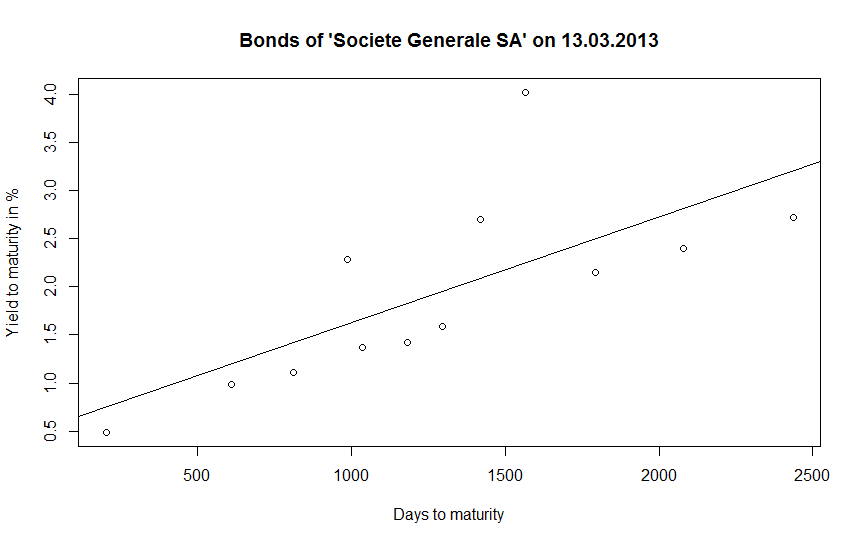
现在我想构建一个合成的5年期债券,这意味着我需要在x=1300的回归线上的价值,在到期日和相应的y值。
我试图用文字来“画”我的目标,看上去如下:
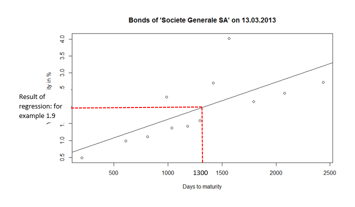
虚线应该是黑色的。
回答 1
Stack Overflow用户
回答已采纳
发布于 2017-10-06 14:20:42
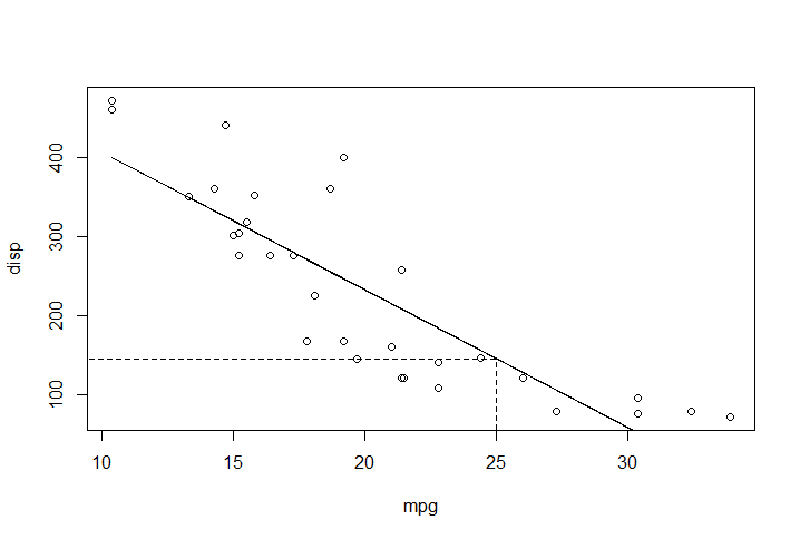
下面是一个示例(使用线性回归的预测值和一些可以适应情况的阈值)。
# data and model
df <- mtcars
model <- lm(disp ~ mpg, data = df)
summary(model)
# plot model
plot(df$mpg, df$disp, xlab = "mpg", ylab = "disp")
pred.val <- predict(model)
lines(df$mpg, pred.val, lty = 1, col = "black")
# set thresholds
xmin <- 0
ymin <-  0
xmax <-  25 # suppose x = 25
ymax <-  as.numeric(predict(model, data.frame(mpg = xmax ))) # use x to get f(x)
# add segments
segments(x0 = xmax, y0 = ymin, x1 = xmax, y1 = ymax,
         lty = 2, col = "black") # vertical segment
segments(x0 = xmin, y0 = ymax, x1 = xmax, y1 = ymax,
         lty = 2, col = "black") # horizontal segment
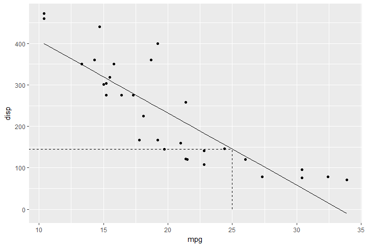
# using ggplot
library(ggplot2)
ggplot(mtcars, aes(x = mpg, y = disp))+
        geom_point() +
        geom_line(aes(y = fitted(model))) +
        geom_segment(aes(x = xmax, # vertical segment
                         xend = xmax,
                         yend = ymax),
                     y = 0,
                     linetype = "dashed") +
        geom_segment(aes(y = ymax, # horizontal segment
                         xend = xmax,
                         yend = ymax),
                     x = 0,
                     linetype = "dashed")
页面原文内容由Stack Overflow提供。腾讯云小微IT领域专用引擎提供翻译支持
原文链接:
https://stackoverflow.com/questions/46604265
复制相关文章
相似问题
腾讯云开发者

Copyright © 2013 - 2026 Tencent Cloud. All Rights Reserved. 腾讯云 版权所有
深圳市腾讯计算机系统有限公司 ICP备案/许可证号:粤B2-20090059 ![]() 粤公网安备44030502008569号
粤公网安备44030502008569号
腾讯云计算(北京)有限责任公司 京ICP证150476号 | 京ICP备11018762号