
通过绘图API将高图表数据表呈现为将容器分隔为图表?
通过绘图API将高图表数据表呈现为将容器分隔为图表?
提问于 2017-10-02 05:49:44
在HighCharts文档中,我正在研究这里给出的示例,以便能够添加和呈现数据表:
“我可以将数据表添加到导出的图表中吗?
是的,在高级图表数据和绘图API的基础上进行一些编程,您可以绘制一个表。有关源代码和实际示例,请参见http://jsfiddle.net/highcharts/z9zXM/。“
我试图找出如何将数据表呈现给与图表不同的容器。任何帮助都是非常感谢的。
来自JS Fiddle:
/**
 * Create the data table
 */
Highcharts.drawTable = function() {

    // user options
    var tableTop = 310,
        colWidth = 100,
        tableLeft = 20,
        rowHeight = 20,
        cellPadding = 2.5,
        valueDecimals = 1,
        valueSuffix = ' °C';

    // internal variables
    var chart = this,
        series = chart.series,
        renderer = chart.renderer,
        cellLeft = tableLeft;

    // draw category labels
    $.each(chart.xAxis[0].categories, function(i, name) {
        renderer.text(
            name,
            cellLeft + cellPadding,
            tableTop + (i + 2) * rowHeight - cellPadding
        )
        .css({
            fontWeight: 'bold'
        })
        .add();
    });

    $.each(series, function(i, serie) {
        cellLeft += colWidth;

        // Apply the cell text
        renderer.text(
                serie.name,
                cellLeft - cellPadding + colWidth,
                tableTop + rowHeight - cellPadding
            )
            .attr({
                align: 'right'
            })
            .css({
                fontWeight: 'bold'
            })
            .add();

        $.each(serie.data, function(row, point) {

            // Apply the cell text
            renderer.text(
                    Highcharts.numberFormat(point.y, valueDecimals) + valueSuffix,
                    cellLeft + colWidth - cellPadding,
                    tableTop + (row + 2) * rowHeight - cellPadding
                )
                .attr({
                    align: 'right'
                })
                .add();

            // horizontal lines
            if (row == 0) {
                Highcharts.tableLine( // top
                    renderer,
                    tableLeft,
                    tableTop + cellPadding,
                    cellLeft + colWidth,
                    tableTop + cellPadding
                );
                Highcharts.tableLine( // bottom
                    renderer,
                    tableLeft,
                    tableTop + (serie.data.length + 1) * rowHeight + cellPadding,
                    cellLeft + colWidth,
                    tableTop + (serie.data.length + 1) * rowHeight + cellPadding
                );
            }
            // horizontal line
            Highcharts.tableLine(
                renderer,
                tableLeft,
                tableTop + row * rowHeight + rowHeight + cellPadding,
                cellLeft + colWidth,
                tableTop + row * rowHeight + rowHeight + cellPadding
            );

        });

        // vertical lines
        if (i == 0) { // left table border
            Highcharts.tableLine(
                renderer,
                tableLeft,
                tableTop + cellPadding,
                tableLeft,
                tableTop + (serie.data.length + 1) * rowHeight + cellPadding
            );
        }

        Highcharts.tableLine(
            renderer,
            cellLeft,
            tableTop + cellPadding,
            cellLeft,
            tableTop + (serie.data.length + 1) * rowHeight + cellPadding
        );

        if (i == series.length - 1) { // right table border

            Highcharts.tableLine(
                renderer,
                cellLeft + colWidth,
                tableTop + cellPadding,
                cellLeft + colWidth,
                tableTop + (serie.data.length + 1) * rowHeight + cellPadding
            );
        }

    });


};

/**
 * Draw a single line in the table
 */
Highcharts.tableLine = function (renderer, x1, y1, x2, y2) {
    renderer.path(['M', x1, y1, 'L', x2, y2])
        .attr({
            'stroke': 'silver',
            'stroke-width': 1
        })
        .add();
}


    renderer.path(['M', x1, y1, 'L', x2, y2])
        .attr({
            'stroke': 'silver',
            'stroke-width': 1
        })
        .add();
}回答 1
Stack Overflow用户
回答已采纳
发布于 2017-10-02 07:41:49
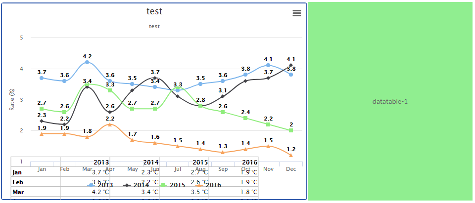
我想你想把桌子放在不同的容器里。因此,您可以在两个容器中使用图表,示例中的代码是相同的。唯一的区别是,您必须在第二个容器和加载表函数中隐藏图表。
 window.chart = new Highcharts.Chart({
    chart: {
        renderTo: 'container2',
        events: {
            load: Highcharts.drawTable,
        },
        borderWidth: 2
    },
     title: {
        text: ''
    },

    xAxis: {
        categories: ['Jan', 'Feb', 'Mar', 'Apr', 'May', 'Jun', 'Jul', 'Aug', 'Sep', 'Oct', 'Nov', 'Dec'],
        visible:false
    },

    yAxis: {
        title: {
            text: 'Temperature (°C)'
        },
        visible:false
    },

    legend: {
       enabled:false
    },

   series: [{
         name: 'Tokyo',
         data: [7.0, 6.9, 9.5, 14.5, 18.2, 21.5, 25.2, 26.5, 23.3, 18.3, 13.9, 9.6],
         visible:false
      }, {
         name: 'New York',
         data: [-0.2, 0.8, 5.7, 11.3, 17.0, 22.0, 24.8, 24.1, 20.1, 14.1, 8.6, 2.5],
         visible:false
      }, {
         name: 'Berlin',
         data: [-0.9, 0.6, 3.5, 8.4, 13.5, 17.0, 18.6, 17.9, 14.3, 9.0, 3.9, 1.0],
         visible:false
      }, {
         name: 'London',
         data: [3.9, 4.2, 5.7, 8.5, 11.9, 15.2, 17.0, 16.6, 14.2, 10.3, 6.6, 4.8],
         visible:false
      }]
    })
window.chart = new Highcharts.Chart({

    chart: {
        renderTo: 'container',
        events: {
            //load: Highcharts.drawTable
        },
        borderWidth: 2
    },

    title: {
        text: 'Average monthly temperatures'
    },

    xAxis: {
        categories: ['Jan', 'Feb', 'Mar', 'Apr', 'May', 'Jun', 'Jul', 'Aug', 'Sep', 'Oct', 'Nov', 'Dec']
    },

    yAxis: {
        title: {
            text: 'Temperature (°C)'
        }
    },

    legend: {
        //y: -300
    },

    series: [{
         name: 'Tokyo',
         data: [7.0, 6.9, 9.5, 14.5, 18.2, 21.5, 25.2, 26.5, 23.3, 18.3, 13.9, 9.6]
      }, {
         name: 'New York',
         data: [-0.2, 0.8, 5.7, 11.3, 17.0, 22.0, 24.8, 24.1, 20.1, 14.1, 8.6, 2.5]
      }, {
         name: 'Berlin',
         data: [-0.9, 0.6, 3.5, 8.4, 13.5, 17.0, 18.6, 17.9, 14.3, 9.0, 3.9, 1.0]
      }, {
         name: 'London',
         data: [3.9, 4.2, 5.7, 8.5, 11.9, 15.2, 17.0, 16.6, 14.2, 10.3, 6.6, 4.8]
      }]
});小提琴演示
做根据需求调整容器css
页面原文内容由Stack Overflow提供。腾讯云小微IT领域专用引擎提供翻译支持
原文链接:
https://stackoverflow.com/questions/46520116
复制相关文章
相似问题
腾讯云开发者

Copyright © 2013 - 2026 Tencent Cloud. All Rights Reserved. 腾讯云 版权所有
深圳市腾讯计算机系统有限公司 ICP备案/许可证号:粤B2-20090059 ![]() 粤公网安备44030502008569号
粤公网安备44030502008569号
腾讯云计算(北京)有限责任公司 京ICP证150476号 | 京ICP备11018762号