
使ggplot面板-背景类似于gtable
使ggplot面板-背景类似于gtable
提问于 2017-09-20 14:16:53
我试着做这样的图形:
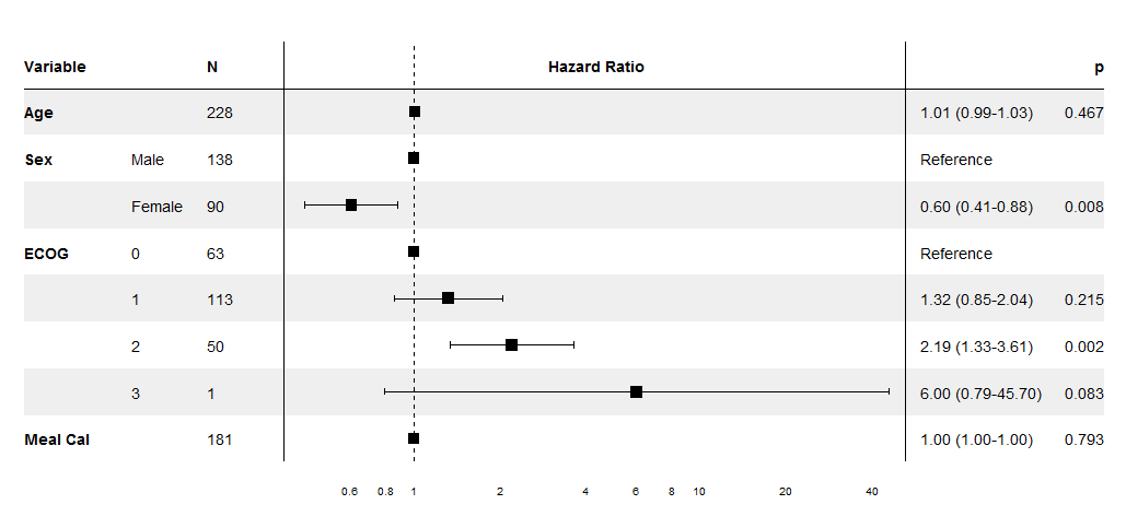
Optimal/efficient plotting of survival/regression analysis results
这里是我的示例代码:
library(gtable)
library(grid)
library(gridExtra)
library(ggplot2)

tg <- tableGrob(iris[1:5,1:3], rows = NULL, cols=NULL)
tg$heights <- unit(rep(1,nrow(tg)), "null")

p <- qplot(1:5,1:5) + ggtitle("Title", subtitle = "another line") +
theme_grey(12) +
scale_y_continuous(expand=c(0,0.5))
g <- ggplotGrob(p)
g <- gtable::gtable_add_cols(g, widths = sum(tg$widths), pos = 0)
g <- gtable::gtable_add_cols(g, widths = sum(tg$widths), pos = -1)
g <- gtable::gtable_add_grob(g, list(tg, tg), t = 6, l=c(1,ncol(g)), r=c(1,ncol(g)))
grid.newpage()
grid.draw(g)
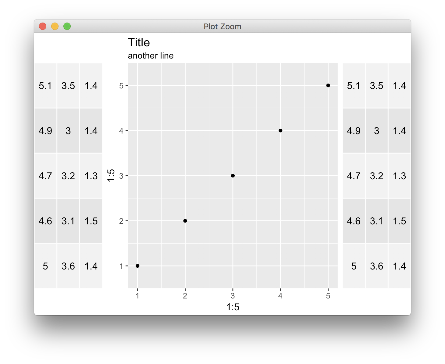
是否可以使用ggplot和gtable更改gtables的背景色并将斑马样式设置为它,就像其他两个gtable类似于第一个示例?
谢谢,
回答 1
Stack Overflow用户
回答已采纳
发布于 2017-09-20 15:24:46
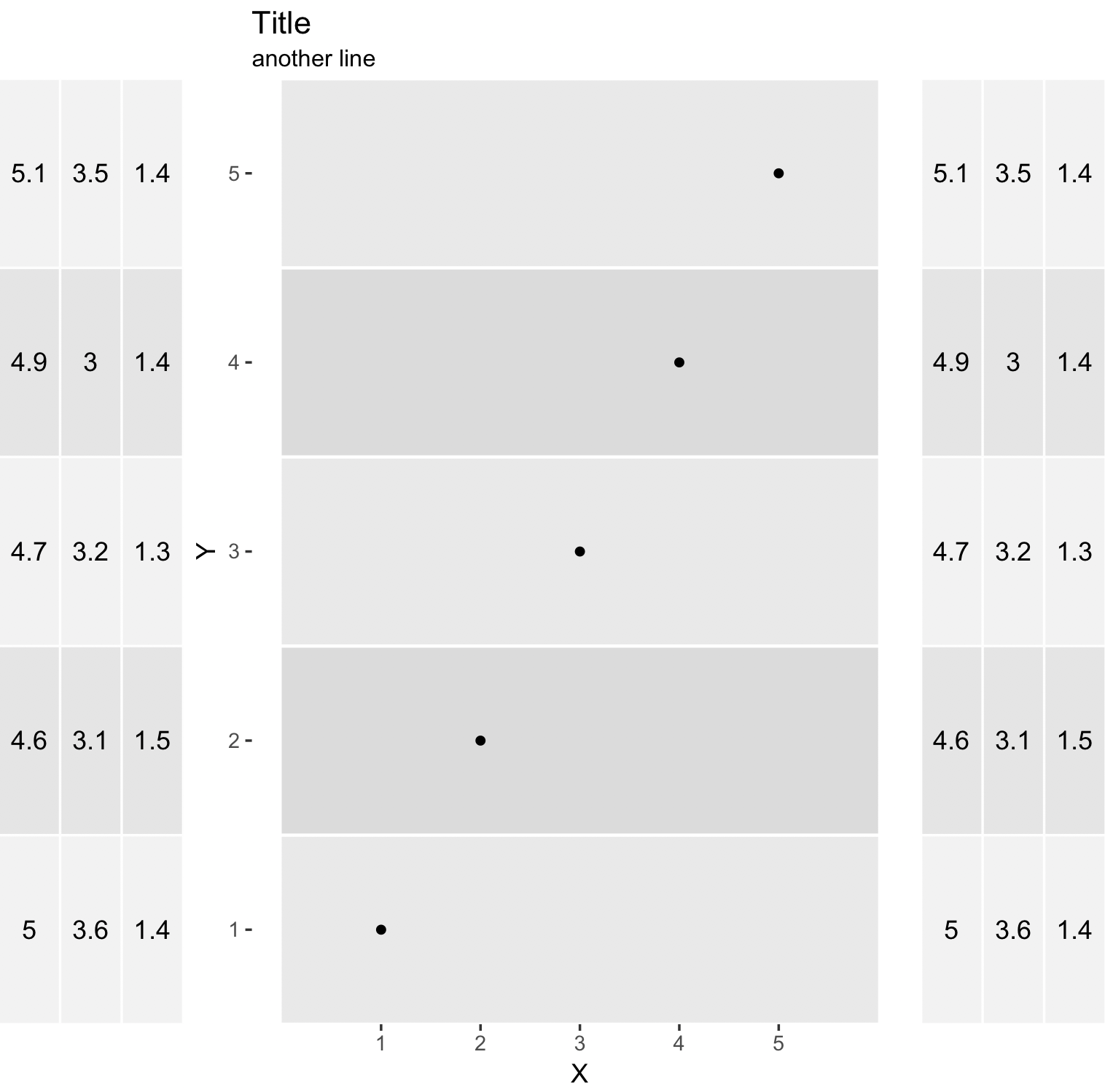
正如@MrFlick所说,您必须在后台添加一些geom层。这是我的方法:
创建两个数据帧,一个用于点,另一个用于分段,并调整段大小以匹配表行。
tg <- tableGrob(iris[1:5,1:3], rows = NULL, cols=NULL)
tg$heights <- unit(rep(1,nrow(tg)), "null")
dSegment <- data.frame(X = 0, XE = 6, Y = 1:5, YE = 1:5)
dPoint <- data.frame(X = 1:5, Y = 1:5)

p <- ggplot() +
    geom_segment(data = dSegment,
                 aes(x = X, xend = XE, y = Y, yend = YE, color = factor(Y %% 2)),
                 size = 40) +
    geom_point(data = dPoint, aes(X, Y)) +
    ggtitle("Title", subtitle = "another line") +
    scale_y_continuous(expand = c(0, 0.5)) +
    scale_x_continuous(breaks = c(1:5)) +
    scale_color_manual(values = c("#dbdbdb", "#e9e9e9")) +
    theme_grey(12) +
    theme(panel.grid.major = element_blank(),
          panel.grid.minor = element_blank(),
          panel.background = element_blank(),
          legend.position = "none")
g <- ggplotGrob(p)
g <- gtable::gtable_add_cols(g, widths = sum(tg$widths), pos = 0)
g <- gtable::gtable_add_cols(g, widths = sum(tg$widths), pos = -1)
g <- gtable::gtable_add_grob(g, list(tg, tg), t = 6, l=c(1,ncol(g)), r=c(1,ncol(g)))
grid.newpage()
grid.draw(g)
页面原文内容由Stack Overflow提供。腾讯云小微IT领域专用引擎提供翻译支持
原文链接:
https://stackoverflow.com/questions/46324520
复制相关文章
相似问题
腾讯云开发者

Copyright © 2013 - 2026 Tencent Cloud. All Rights Reserved. 腾讯云 版权所有
深圳市腾讯计算机系统有限公司 ICP备案/许可证号:粤B2-20090059 ![]() 粤公网安备44030502008569号
粤公网安备44030502008569号
腾讯云计算(北京)有限责任公司 京ICP证150476号 | 京ICP备11018762号