
带有图例的Matplotlib Venn图
带有图例的Matplotlib Venn图
提问于 2017-09-14 16:31:14
我正在使用matplotlib-venn包来绘制python中的venn图。这个包可以很好地绘制两组或三组的Venn图。然而,当其中一个集合比其他集合大得多时,小圆圈中的计数就会变得接近或重叠。下面是一个例子。
from collections import Counter
import matplotlib.pyplot as plt
from matplotlib_venn import venn2, venn3

sets = Counter()
sets['01'] = 3000
sets['11'] = 3
sets['10']  = 5
setLabels = ['set1', 'set2']

plt.figure()
ax = plt.gca()
v = venn2(subsets = sets, set_labels = setLabels, ax = ax)
plt.title('Venn Diagram')
plt.show()
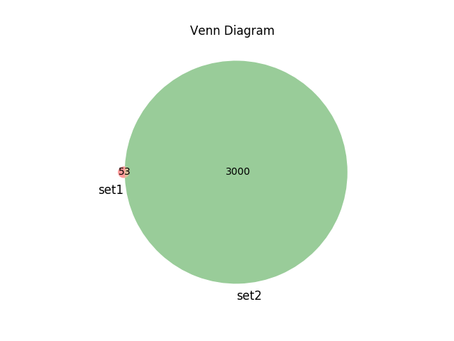
我想要做的是将计数(在本例中是3000、3和5)移动到一个图例中,其颜色与图表中的颜色相匹配。我不知道如何用matplotlib_venn来做这件事。
回答 1
Stack Overflow用户
回答已采纳
发布于 2017-09-14 16:43:43
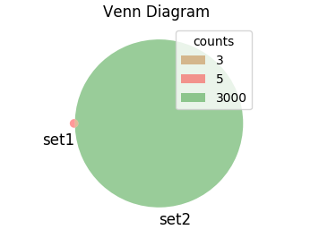
您可以用空字符串替换venn图的标签,而是从venn的修补程序和相应的计数中创建一个图例,如下所示:
from collections import Counter
import matplotlib.pyplot as plt
from matplotlib_venn import venn2, venn3

sets = Counter()
sets['01'] = 3000
sets['11'] = 3
sets['10']  = 5
setLabels = ['set1', 'set2']

plt.figure()
ax = plt.gca()
v = venn2(subsets = sets, set_labels = setLabels, ax = ax)

h, l = [],[]
for i in sets:
    # remove label by setting them to empty string:
    v.get_label_by_id(i).set_text("")
    # append patch to handles list
    h.append(v.get_patch_by_id(i))
    # append count to labels list
    l.append(sets[i])

#create legend from handles and labels
ax.legend(handles=h, labels=l, title="counts")

plt.title('Venn Diagram')
plt.show()
页面原文内容由Stack Overflow提供。腾讯云小微IT领域专用引擎提供翻译支持
原文链接:
https://stackoverflow.com/questions/46224235
复制相关文章
相似问题
腾讯云开发者

Copyright © 2013 - 2026 Tencent Cloud. All Rights Reserved. 腾讯云 版权所有
深圳市腾讯计算机系统有限公司 ICP备案/许可证号:粤B2-20090059 ![]() 粤公网安备44030502008569号
粤公网安备44030502008569号
腾讯云计算(北京)有限责任公司 京ICP证150476号 | 京ICP备11018762号