
ggplot版本的dotplot
ggplot版本的dotplot
提问于 2017-09-14 04:24:05
想知道如何使用ggplot或巧妙的库函数来绘制这个点图。同时将mpg值标记在单个点上。
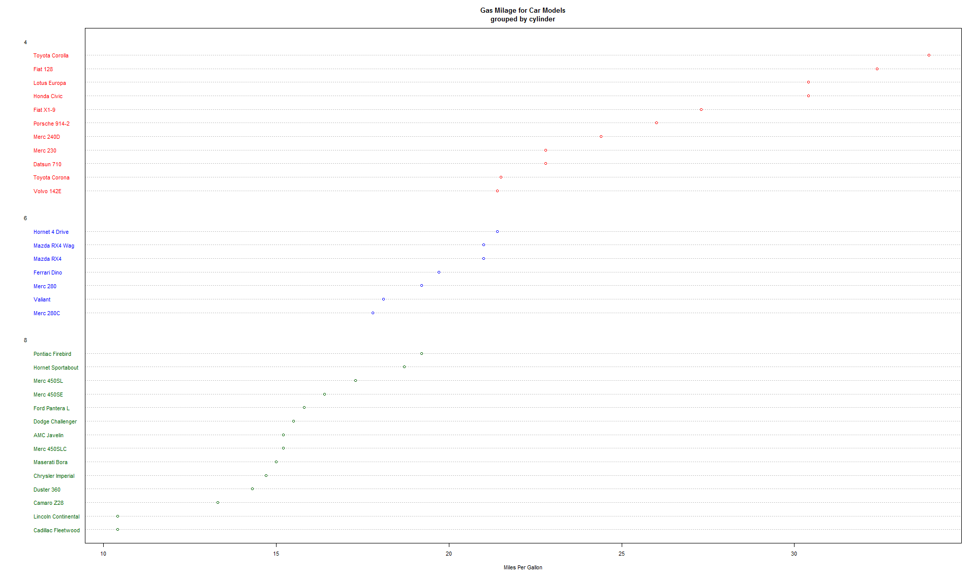
# Dotplot: Grouped Sorted and Colored
# Sort by mpg, group and color by cylinder
x <- mtcars[order(mtcars$mpg),] # sort by mpg
x$cyl <- factor(x$cyl) # it must be a factor
x$color[x$cyl==4] <- "red"
x$color[x$cyl==6] <- "blue"
x$color[x$cyl==8] <- "darkgreen"
dotchart(x$mpg,labels=row.names(x),cex=.7,groups= x$cyl,
         main="Gas Milage for Car Models\ngrouped by cylinder",
         xlab="Miles Per Gallon", gcolor="black", color=x$color)
回答 2
Stack Overflow用户
回答已采纳
发布于 2017-09-14 04:41:40
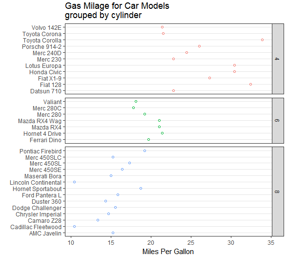
通过快速清除行名作为列,您可以执行以下操作。
我们使用factor()作为颜色的美学,这样它就变得离散了/当看到这个外观时,您需要为scale和space指定"free_y"。
基座
library(tidyverse)
mtcars2 = rownames_to_column(mtcars, "car")
ggplot(mtcars2, aes(x = mpg, y = factor(car), color = factor(cyl))) +
  geom_point(shape = 1) +
  facet_grid(cyl ~ ., scales = "free_y", space = "free_y") +
  theme_bw() +
  theme(panel.grid = element_blank(),
        panel.grid.major.y = element_line(size=.1, color="grey90"),
        legend.position = "none") +
  ggtitle("Gas Milage for Car Models\ngrouped by cylinder") +
  xlab("Miles Per Gallon") +
  ylab("")
添加文本
ggplot(mtcars2, aes(x = mpg, y = factor(car), color = factor(cyl))) +
  geom_point(shape = 1) +
  geom_text(aes(label = mpg), colour = "grey40", size = 3, hjust = -0.3) +
  facet_grid(cyl ~ ., scales = "free_y", space = "free_y") +
  theme_bw() +
  theme(panel.grid = element_blank(),
        panel.grid.major.y = element_line(size=.1, color="grey90"),
        legend.position = "none") +
  ggtitle("Gas Milage for Car Models\ngrouped by cylinder") +
  xlab("Miles Per Gallon") +
  ylab("")
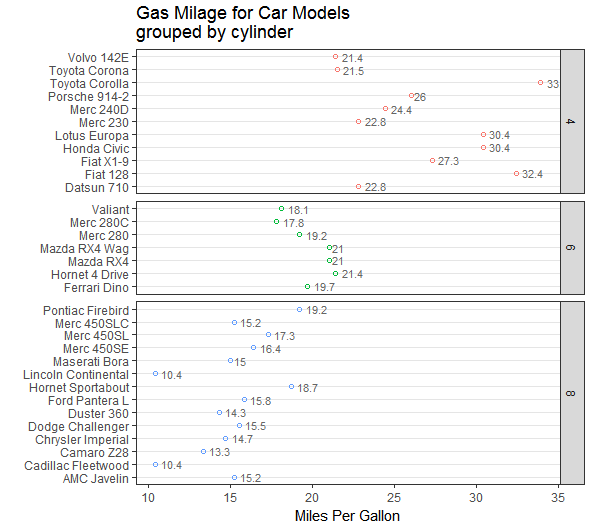
您可能可以使用geom_label,但geom_text在这里工作得很好。
Stack Overflow用户
发布于 2017-09-14 04:49:37
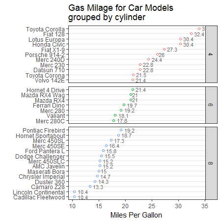
修改@zacdav的答案,使用forcats对每组中的点数排序
library(tidyverse)
library(forcats)
mtcars2 = rownames_to_column(mtcars, "car") %>%
    mutate(car_ordered = fct_reorder2(car, cyl, mpg, .desc = FALSE))

ggplot(mtcars2, aes(x = mpg, y = car_ordered, color = factor(cyl))) +
    geom_point(shape = 1) +
    geom_text(aes(label = mpg), colour = "grey40", size = 3, hjust = -0.3) +
    facet_grid(cyl ~ ., scales = "free_y", space = "free_y") +
    theme_bw() +
    theme(panel.grid = element_blank(),
          panel.grid.major.y = element_line(size=.1, color="grey90"),
          legend.position = "none") +
    ggtitle("Gas Milage for Car Models\ngrouped by cylinder") +
    xlab("Miles Per Gallon") +
    ylab("")
页面原文内容由Stack Overflow提供。腾讯云小微IT领域专用引擎提供翻译支持
原文链接:
https://stackoverflow.com/questions/46210504
复制相关文章
相似问题
腾讯云开发者

Copyright © 2013 - 2026 Tencent Cloud. All Rights Reserved. 腾讯云 版权所有
深圳市腾讯计算机系统有限公司 ICP备案/许可证号:粤B2-20090059 ![]() 粤公网安备44030502008569号
粤公网安备44030502008569号
腾讯云计算(北京)有限责任公司 京ICP证150476号 | 京ICP备11018762号