
将背景图像与第二背景图像相匹配
将背景图像与第二背景图像相匹配
提问于 2017-07-27 02:38:47
我有两个图像-一个框架和图像,应该正好适合那个框架。使它变得非常困难的是responsiveness.。
两幅图像:
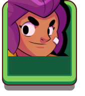
它应该是什么样子(也是在调整大小之后):

我尝试过的:
.brawler.shelly {
    background-image: url("/images/heroes/high/hero_icon_shelly.png");
    background-position: center center;
    background-size: 85%;
    padding-bottom: 75%;
    background-repeat: no-repeat;
}

.portrait {
    background-image: url("/images/icons/card_common.png");
    background-position: center top;
    background-size: 100%;
    padding-bottom: 75%;
    background-repeat: no-repeat;
}

.col-4.col-md-3.col-lg-2.mb-2
    .portrait
        .brawler.shelly

.col-4.col-md-3.col-lg-2.mb-2
    .portrait
        .brawler.shelly
JSfiddle:
回答 2
Stack Overflow用户
回答已采纳
发布于 2017-07-27 02:45:01
你就不能在background-size和padding-bottom上玩.brawler.shelly吗?
background-size: 77%和padding-bottom: 106%似乎很适合我:
.brawler.shelly {
  background-image: url("http://i.imgur.com/vuv5sdZ.png");
  background-position: center center;
  background-size: 77%;
  padding-bottom: 106%;
  background-repeat: no-repeat;
}

.portrait {
  background-image: url("http://i.imgur.com/i2IoHtw.png");
  background-position: center top;
  background-size: 100%;
  padding-bottom: 80%;
  background-repeat: no-repeat;
}<div class="container">
<div class="col-4 col-md-3 col-lg-2 mb-2">
<div class="portrait">
<div class="brawler shelly">
</div>
</div>
</div>
</div>
这在响应性方面也没有问题。我已经创建了这个到这里来的小提琴,如果您想测试它是如何调整大小的。
希望这会有帮助!)
Stack Overflow用户
发布于 2017-07-27 08:18:13
你可以试试这个,background-position
CSS
.brawler.shelly {
background-image: url(http://i.imgur.com/vuv5sdZ.png);
background-position: bottom;
background-repeat: no-repeat;
background-size: 86%;
padding-bottom: 104%;
position: sticky;
vertical-align: bottom;
}
.portrait {
background-image: url("http://i.imgur.com/i2IoHtw.png");
background-position: center top;
background-size: 100%;
padding-bottom: 80%;
background-repeat: no-repeat;
}HTML
<div class="container">
  <div class="col-4 col-md-3 col-lg-2 mb-2">
    <div class="portrait">
      <div class="brawler shelly">
      </div>
    </div>
  </div>
</div>页面原文内容由Stack Overflow提供。腾讯云小微IT领域专用引擎提供翻译支持
原文链接:
https://stackoverflow.com/questions/45340417
复制相关文章
相似问题
腾讯云开发者

Copyright © 2013 - 2026 Tencent Cloud. All Rights Reserved. 腾讯云 版权所有
深圳市腾讯计算机系统有限公司 ICP备案/许可证号:粤B2-20090059  粤公网安备44030502008569号
腾讯云计算(北京)有限责任公司 京ICP证150476号 | 京ICP备11018762号