
ggplot2:如何在一条函数曲线上和一条线下面对一个区域进行遮阳?
ggplot2:如何在一条函数曲线上和一条线下面对一个区域进行遮阳?
提问于 2017-07-25 11:23:15
所以我有这样的数据:
a_data <-
  data.frame(
    f = f,
    alpha = alpha,
    asymptote = alpha_1_est)
像这样的功能:
a_formula <- function(x) {
  0.7208959 - 0.8049132 * exp(-21.0274 * x)}
我将它们与ggplot2一起使用:
ggplot(a_data, aes(x = f, y = alpha)) +

geom_point() +

#function curve
stat_function(fun = a_formula,
              color = "red") +

#asymptote of alpha
geom_hline(
  yintercept = asymptote,
  linetype = "longdash",
  color = "blue")
产生这样的情节:
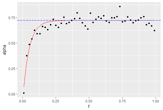
我想要但无法找到的方法是对y轴、函数曲线(红色)和渐近线(虚线)之间的区域进行阴影,如下所示:
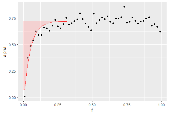
我曾试图在那里挤压一个色带或多边形,但它不能正确工作--也许是因为我想要在曲线上方,而不是在下面(下面工作得很好)。
dataframe是这样的:
> head(a_data)
     f       alpha asymptote
1 0.01 0.007246302 0.7208959
2 0.03 0.374720198 0.7208959
3 0.05 0.484362949 0.7208959
4 0.07 0.540090209 0.7208959
5 0.09 0.625383303 0.7208959
6 0.11 0.590898201 0.7208959
我对堆积如山相当陌生,所以如果我打破了任何惯例或以其他方式搞砸了这个问题,不要犹豫地指出它。
回答 1
Stack Overflow用户
回答已采纳
发布于 2017-07-25 12:52:15
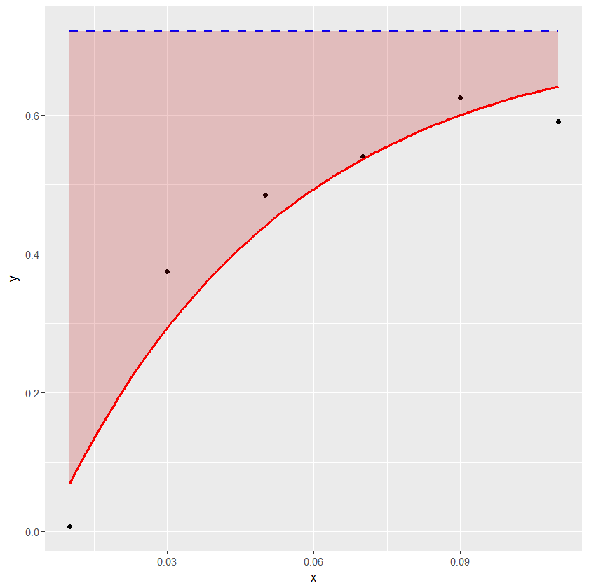
下面的示例显示了如何方便地使用geom_ribbon来着色水平线和曲线之间的区域。
df1 <- structure(list(x = c(0.01, 0.03, 0.05, 0.07, 0.09, 0.11), y = c(0.007246302,
0.374720198, 0.484362949, 0.540090209, 0.625383303, 0.590898201
), asymptote = c(0.7208959, 0.7208959, 0.7208959, 0.7208959,
0.7208959, 0.7208959)), .Names = c("x", "y", "asymptote"), class = "data.frame", row.names = c("1",
"2", "3", "4", "5", "6"))

a_formula <- function(x) { 0.7208959 - 0.8049132*exp(-21.0274*x) }

xs <- seq(min(df1$x),max(df1$x),length.out=100)
ysmax <- rep(0.7208959, length(xs))
ysmin <- a_formula(xs)
df2 <- data.frame(xs, ysmin, ysmax)

library(ggplot2)
ggplot(data=df1) + geom_point(aes(x=x, y=y)) +
geom_line(aes(x=x, y=asymptote), lty=2, col="blue", lwd=1) +
stat_function(fun = a_formula, color="red", lwd=1) +
geom_ribbon(aes(x=xs, ymin=ysmin, ymax=ysmax), data=df2, fill="#BB000033")
页面原文内容由Stack Overflow提供。腾讯云小微IT领域专用引擎提供翻译支持
原文链接:
https://stackoverflow.com/questions/45301798
复制相关文章
相似问题
腾讯云开发者

Copyright © 2013 - 2026 Tencent Cloud. All Rights Reserved. 腾讯云 版权所有
深圳市腾讯计算机系统有限公司 ICP备案/许可证号:粤B2-20090059 ![]() 粤公网安备44030502008569号
粤公网安备44030502008569号
腾讯云计算(北京)有限责任公司 京ICP证150476号 | 京ICP备11018762号