
2并排youtube视频引导3
2并排youtube视频引导3
提问于 2017-07-23 00:04:25
我有一个问题,我的反应,嵌入式youtube,我有两个视频并排。它看起来很好,直到屏幕大小是可移动的。它们不是互相堆叠在一起,而是缩小成小盒子,就像在这张照片里一样。
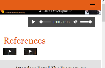
这是我的页面,在http://www.pscompetitiveedge.com/references.html上
页面顶部的HTML代码:
<h1>References</h1>

<div class="row">
<div class="col-sm-6">
<div class="embed-responsive embed-responsive-16by9">
  <iframe class="embed-responsive-item" src="https://www.youtube.com/embed/aaINOaWt938?rel=0?"></iframe>
<p>Click Above To View Testimonial Video!</p>
</div>
</div>

<div class="col-sm-6">
<div class="embed-responsive embed-responsive-16by9">
  <iframe class="embed-responsive-item" src="https://www.youtube.com/embed/e6UWqeLaMm4?rel=0?"></iframe>
<p>Click Above To View Peter In Seminar Action!</p>

</div>
</div></div>
<div class="clearfix"></div>
回答 3
Stack Overflow用户
回答已采纳
发布于 2017-07-23 00:10:32
你有这些密码。在"custom.css:335“
@media (max-width: 500px)
.col-sm-6 {
    width: 20% !important;
    float: left;
}
改为:
@media (max-width: 500px)
.col-sm-6 {
    float: left;
}Stack Overflow用户
发布于 2017-07-23 00:39:41
下面的响应嵌入适用于Bootstrap流体网格布局的任何安排(实际上也适用于任何非内联元素)。在web上的任何灵活容器中,我们所需要做的就是包括这个最初来自http://embedresponsively.com/的CSS。此外,我们需要从视频iframe或嵌入容器中删除固定的width和height属性。
.embed-container {
    position: relative;
    padding-bottom: 56.25%;
    height: 0;
    overflow: hidden;
    max-width: 100%;
    margin-bottom: 1em;
}

.embed-container iframe, .embed-container object, .embed-container embed {
    position: absolute;
    top: 0;
    left: 0;
    width: 100%;
    height: 100%;
}<link rel="stylesheet" href="https://cdnjs.cloudflare.com/ajax/libs/twitter-bootstrap/3.3.7/css/bootstrap.min.css">
<div class="container-fluid">
<div class="col-sm-6">
<div class="embed-container">
<iframe src="https://www.youtube.com/embed/oAPdNKTrBYA" frameborder="0" allowfullscreen></iframe>
</div>
</div>
<div class="col-sm-6">
<div class="embed-container">
<iframe src="https://www.youtube.com/embed/fHFSX3Vd9D0" frameborder="0" allowfullscreen></iframe>
</div>
</div>
</div>
<script src="https://cdnjs.cloudflare.com/ajax/libs/jquery/3.2.1/jquery.min.js"></script>
<script src="https://cdnjs.cloudflare.com/ajax/libs/twitter-bootstrap/3.3.7/js/bootstrap.min.js"></script>
在全屏上查看此片段,以观察其响应性。
Stack Overflow用户
发布于 2017-07-23 06:18:15
尝试将其添加到以前的内容中:
.embed-responsive{
    width: 100%;
    display: block;
}页面原文内容由Stack Overflow提供。腾讯云小微IT领域专用引擎提供翻译支持
原文链接:
https://stackoverflow.com/questions/45260418
复制相关文章
相似问题
腾讯云开发者

Copyright © 2013 - 2026 Tencent Cloud. All Rights Reserved. 腾讯云 版权所有
深圳市腾讯计算机系统有限公司 ICP备案/许可证号:粤B2-20090059  粤公网安备44030502008569号
腾讯云计算(北京)有限责任公司 京ICP证150476号 | 京ICP备11018762号