
当浏览器缩小到iPhone大小时,我怎样才能让英雄文本自己调整大小呢?
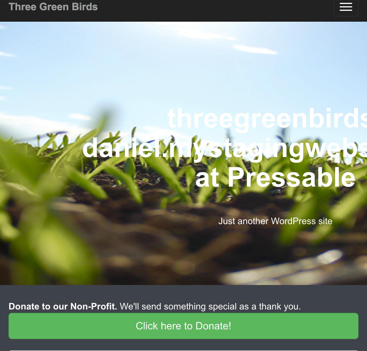
我有英雄文本,不能适当调整大小,因为我缩小了浏览器的大小。就像这样:
我在这里尝试了SO帖子的建议:How can I make text wrap down to the next line, when a user reduces the size of the browser?
但这对我没有用。这是关于英雄部分的我的style.css文件部分:
/* === HERO === */

#hero
{
    background: url("/wp-content/themes/threegreenbirds-daniel/images/grass-ground-new.jpg") 50% 0 repeat fixed;
    min-height: 500px;
    padding: 40px 0;
    color: white;
    -webkit-font-smoothing: antialiased;
    text-rendering: optimizeLegibility;
}

.col-sm-7 {
    text-align: center;
}

.hero-text {
    position: absolute;
    top: 50%;
    left: 20%;
    margin-top: -150px;
}
这是内容-her.php文件:
<!-- HERO
==========================================================================  -->
<section id="hero" data-type="background" data-speed="5">
   <article>
      <div class="container clearfix">
         <div class="row">
            <div class="col-sm-7 hero-text">
              <h1><?php bloginfo('name'); ?></h1>
              <p class="lead"><?php bloginfo('description'); ?></p>
            </div>
         </div>
      </div><!-- container -->
   </article>
</section><!-- hero -->
我尝试过一个类-sm-7和单词包装:normal,我尝试过一个. class 7-英雄文本{word-环绕:normal}的类,但这两种方法都不适合我。
我试了一下平板电脑的尺寸:
@media screen and (max-width: 991px) {
    .hero-text {
        left: 0;
        right: 0;
        margin: 0 auto;
        text-align: center;
        margin-top: 130px;
        position: relative;
        background: none;
    }
}
这是可行的,但是对于iphone大小,尽管有这样的功能,这些字母还是被切断了:
@media screen and (max-width: 568px) {
    .hero-text {
        left: 0;
        right: 0;
        margin: 0 auto;
        text-align: center;
        margin-top: 130px;
        position: relative;
        background: none;
      }
}
568 Is不是合适的尺寸吗?为什么它在智能手机尺寸上不起作用?
然后,我决定按照下面的建议将.英雄文本保留在布局流中,并开发了以下内容:
#hero
{
    background: url("/wp-content/themes/threegreenbirds-daniel/images/grass-ground-new.jpg") 50% 0 repeat fixed;
    min-height: 500px;
    padding: 40px 0;
    color: white;
    position: relative;
    -webkit-font-smoothing: antialiased;
    text-rendering: optimizeLegibility;
}

.container-clearfix {
    position: relative;
}

.col-sm-7 {
    text-align: center;
}

.hero-text {
    top: 50%;
    left: 20%;
    margin-top: 90px;
}

/* === MEDIA QUERIES === */

@media screen and (max-width: 991px) {
    .hero-text {
        left: 0;
        right: 0;
        margin: 0 auto;
        text-align: center;
        margin-top: 130px;
        margin-left: 100px;
        position: relative;
        background: none;
    }
}

@media screen and (max-width: 600px) {
    .logged-in .navbar-fixed-top {
        top: 42px;
    }
    .hero-text {
        left: 0;
        right: 0;
        margin: 0 auto;
        text-align: center;
        margin-top: 130px;
        margin-left: 100px;
        position: relative;
        background: none;
    }
}

@media screen and (max-width: 568px) {
    .hero-text {
        left: 0;
        right: 0;
        margin: 0 auto;
        text-align: center;
        margin-top: 130px;
        position: relative;
        background: none;
      }
}
但是,当我将屏幕尺寸缩小到991px以下时,上面的内容就行不通了。
回答 2
Stack Overflow用户
发布于 2017-06-21 23:25:37
我了解了使用ems (或rems)来调整屏幕大小或调整自身大小的好处。这里是我的意思的一个例子:
/* === MEDIA QUERIES === */

@media screen and (max-width: 991px) {
    .hero-text {
        left: 0;
        right: 0;
        margin: 0 auto;
        text-align: center;
        font-size: 90%;
        margin-top: 130px;
        margin-left: 100px;
        position: relative;
        background: none;
    }
}
@media screen and (max-width: 728px) {
    .hero-text {
        font-size: 75%;
    }
}

@media screen and (max-width: 648px) {
    .logged-in .navbar-fixed-top {
        top: 42px;
    }
    .hero-text {
        left: 0;
        right: 0;
        margin: 0 auto;
        text-align: center;
        font-size: 75%;
        margin-top: 130px;
        margin-left: 100px;
        position: relative;
        background: none;
    }
}

@media screen and (max-width: 568px) {
    .hero-text {
        left: 0;
        right: 0;
        margin: 0 auto;
        text-align: center;
        font-size: 50%;
        margin-top: 130px;
        background: none;
      }
}
通过选择字体大小: 90%,并为其他视口大小重复此操作并进行适当调整,我能够在更改视口大小时使文本自身进行调整。
Stack Overflow用户
发布于 2017-06-21 15:44:14
这是因为您将.hero-text从position:absolute的常规布局流中删除。
不完全确定你的文本最终会是什么样子,但你有两个选择:
- 将
position: relative添加到#hero或.container中。这将使绝对定位层相对于这些层定位。现在,我假设它是相对于body定位的,因为在任何.hero-text的父级上都没有position: relative
或
- 不要将
.hero-text从布局流中提取出来,尝试在不使用position: absolute的情况下获得所需的样式。
https://stackoverflow.com/questions/44680250
复制相似问题
腾讯云开发者

Copyright © 2013 - 2026 Tencent Cloud. All Rights Reserved. 腾讯云 版权所有
深圳市腾讯计算机系统有限公司 ICP备案/许可证号:粤B2-20090059  粤公网安备44030502008569号
腾讯云计算(北京)有限责任公司 京ICP证150476号 | 京ICP备11018762号