
R中无齐次方差的重复测度anova?
我有一个动物物种多样性的数据,每个月观察3条(略多于)2年。我的问题是找出这些横断面是否有明显的不同的动物多样性彼此。对于这样一个简单的问题,单因素方差几乎就是答案,然而,我认为,为了控制相当大的季节波动,可能需要反复测量变异系数,以纳入动物每月多样性的变化。
我的数据集在下面,还附有一幅随时间变化的动物群多样性图。
  transect<-c(rep("transA",26),rep("transB",25),rep("transC",25))
  months<-as.numeric(c(1:26,1:11,13:26,0,2,4:26))
  animal_species<-c(2,2,2,4,5,1,5,6,14,8,7,5,5,3,1,2,5,9,8,9,10,10,9,9,7,3,1,3,2,2,3,3,3,7,5,6,5,4,2,2,4,4,5,7,4,5,2,4,2,4,1,1,1,1,3,2,2,3,2,2,1,3,5,3,2,4,2,4,3,6,3,2,2,1,2,1)
  animal_df<-data.frame(transect,months,animal_species)

library(ggplot2)
  ggplot(animal_df,aes(months,animal_species))+geom_bar(stat='identity')+theme_bw()+facet_grid(transect~.)
但是有两个问题进一步违反了方差分析的假设!
首先,我的数据在横断面之间的物种数量上有很大的差异,根据Levene(中值)检验,差异是不一样的。
animal_AOV<-aov(animal_species~transect, data=animal_df)
 leveneTest(animal_AOV)

# Levene's Test for Homogeneity of Variance (center = median)
#        Df F value    Pr(>F)
# group  2  10.783 7.889e-05 ***
#      73
第二种情况是,数据似乎遵循不同的分布,很可能从每个样带的多样性直方图中可以很容易地看到,其中TransA的倾斜程度似乎小于其他两个样本。
par(mfrow=c(3,1))
  hist(TransA$animal_species,breaks=14,xlim=c(0,14))
  hist(TransB$animal_species,breaks=10,xlim=c(0,14))
  hist(TransC$animal_species,breaks=10,xlim=c(0,14))
我向社会人士提出的问题是:
- 我是否正确地认为,重复测量方法是最明智的分析途径?
- 对ANOVA假设的偏离是否足以让人担心?既然有20多个观测,而观测的数量相对较好,那么呢?
- 如何对这种分析进行编码以得出一个可行的答案(可能考虑到违反情况),如何在网上收集关于重复措施的信息-阿诺瓦-在如何将这种分析放在一起的问题上似乎有点矛盾?
本质上,我有一个简单的问题,我的预感是,当这三条截面彼此之间有显著差异时(至少trackA比另外两条具有更高的多样性),它就会消失。有人对如何解决这个问题有什么建议吗?
回答 2
Stack Overflow用户
发布于 2017-12-01 00:20:52
两个一般性问题:
- @Koot6133是正确的,您应该考虑一个计数数据模型,该模型通常在日志规模上运行(从而减少了偏差和差异)。
- 您需要考虑的是数据的条件分布(即,一旦将日期的影响等因素考虑在内),而不是边际分布--这意味着,在大多数情况下,您在拟合模型之后才会担心分布的情况。
个人对线条图的偏好--然后你可以覆盖这些数据并更有效地比较它们:
ggplot(animal_df,aes(months,animal_species,colour=transect))+
    geom_line()+theme_bw()+scale_y_log10()
ggsave("animal1.png")
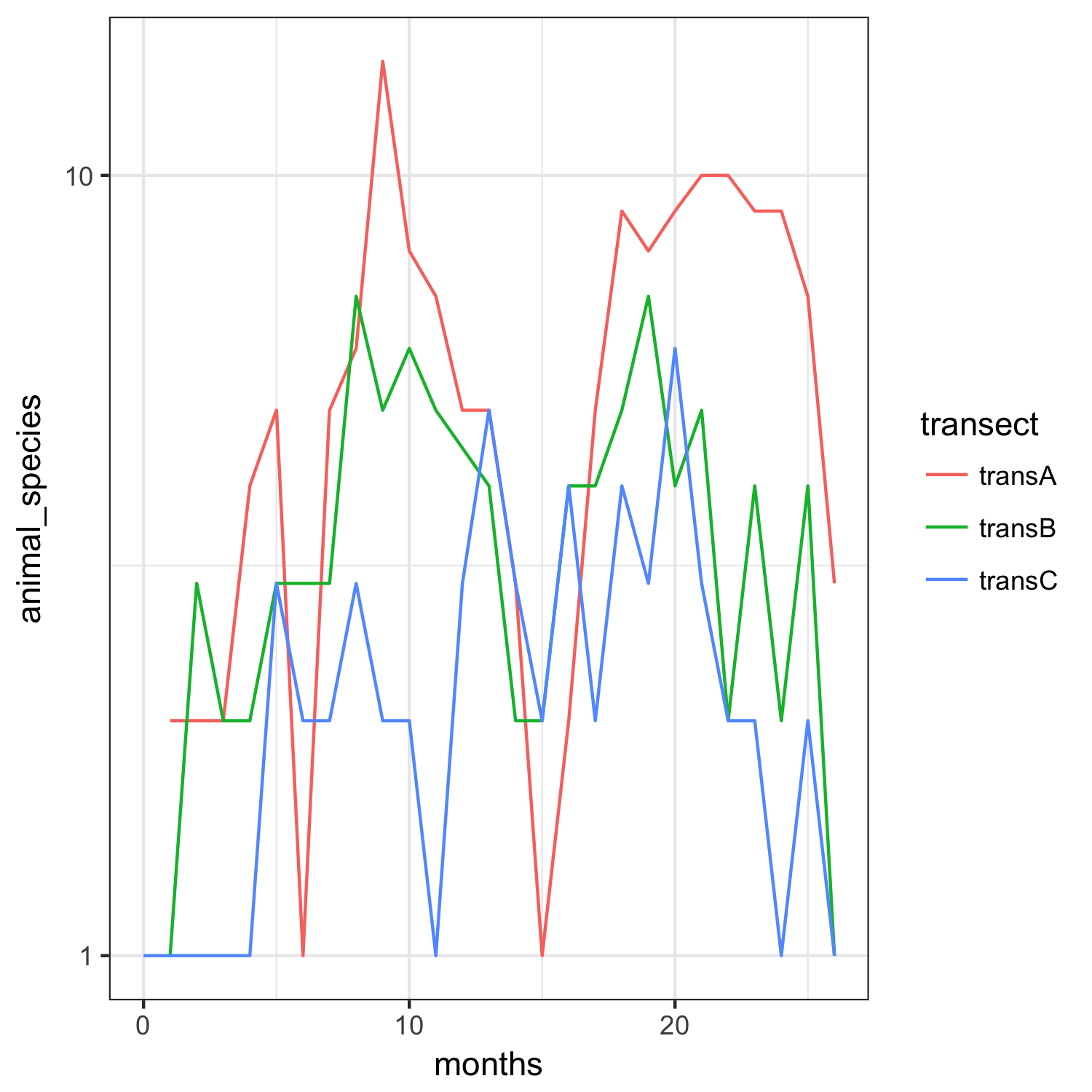
零计数数据已经消失了,因为我们绘制了一个日志标度,但这确实使我们更清楚地知道,在这个尺度上,横截面并没有太大的差异。
使用lme4包来适应重复测量/纵向泊松GLMM:
library(lme4)
m1 <- glmer(animal_species~transect+(1|months),
            family=poisson,data=animal_df)
检查过分散度(<1,所以没有问题)
deviance(m1)/df.residual(m1) ## 0.65结果:
# Generalized linear mixed model fit by maximum likelihood (Laplace Approximation) [
#   glmerMod]
# Family: poisson  ( log )
# Formula: animal_species ~ transect + (1 | months)
# Data: animal_df
# AIC       BIC    logLik  deviance  df.resid
# 319.3219  328.6449 -155.6610  311.3219        72
# Random effects:
#   Groups Name        Std.Dev.
# months (Intercept) 0.3003
# Number of obs: 76, groups:  months, 27
# Fixed Effects:
#   (Intercept)  transecttransB  transecttransC
# 1.7110         -0.4792         -0.8847
查看地标地块:
png("animal2.png")
plot(m1,sqrt(abs(resid(.)))~fitted(.),
     type=c("p","smooth"),col=animal_df$transect)
dev.off()
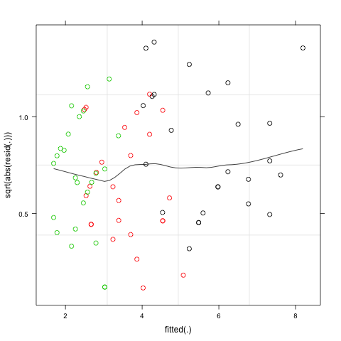
各组间的差异没有明显的变化/计数的数量.
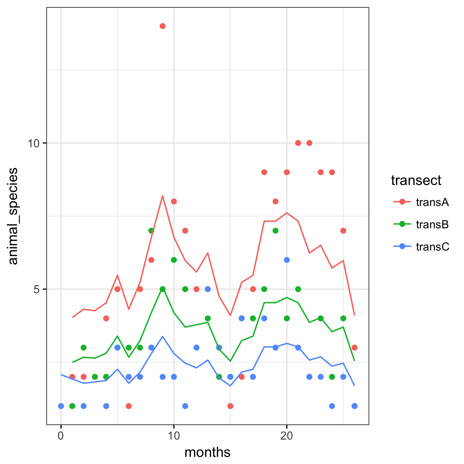
将结果叠加在数据上(这次是原始比例):
pp <- animal_df
pp$animal_species <- predict(m1,type="response")
ggplot(animal_df,aes(months,animal_species,colour=transect))+
  geom_point()+
  geom_line(data=pp)+theme_bw()
ggsave("animal3.png")
Stack Overflow用户
发布于 2017-05-19 12:34:25
偏斜可以通过使用计数数据这一事实来解释。计数数据大部分时间遵循泊松分布,而不是正态分布。因此,理想情况下,您可以使用某种泊松回归和随机效应的重复措施。
关于更广泛的信息,我建议你去找统计学家或谷歌的“混合效应泊松回归模型”。
https://stackoverflow.com/questions/44061493
复制相似问题
腾讯云开发者

Copyright © 2013 - 2026 Tencent Cloud. All Rights Reserved. 腾讯云 版权所有
深圳市腾讯计算机系统有限公司 ICP备案/许可证号:粤B2-20090059 ![]() 粤公网安备44030502008569号
粤公网安备44030502008569号
腾讯云计算(北京)有限责任公司 京ICP证150476号 | 京ICP备11018762号