
带有双轴的matplotlib中的线图(轴上的字符串)
带有双轴的matplotlib中的线图(轴上的字符串)
提问于 2017-05-04 16:24:15
我正在尝试从Excel表中的数据创建一个使用python的图表。数据如下所示
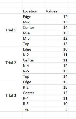
       Location Values
Trial 1 Edge    12
         M-2    13
       Center   14
         M-4    15
         M-5    12
         Top    13
Trial 2 Edge    10
        N-2     11
      Center    11
        N-4     12
        N-5     13
        Top     14
Trial 3 Edge    15
        R-2     13
     Center     12
       R-4      11
       R-5      10
Top 3我希望我的图形看起来像这样:图表-1 .The图表应该有X轴的位置列值,即string对象。这可以很容易地完成(通过使用/创建位置作为数组),
import numpy as np
import pandas as pd
import matplotlib.pyplot as plt
datalink=('/Users/Maxwell/Desktop/W1.xlsx')
df=pd.read_excel(datalink,skiprows=2)
x1=df.loc[:,['Location']]
x2=df.loc[:,['Values']]
x3=np.linspace(1,len(x2),num=len(x2),endpoint=True)
vals=['Location','Edge','M-2','Center','M-4','M-5','Top','Edge','N-2','Center','N-4','N-5','Top','Edge','R-2']
plt.figure(figsize=(12,8),dpi=300)
plt.subplot(1,1,1)
plt.xticks(x3,vals)
plt.plot(x3,x2)
plt.show()
但是,我也想展示审判-1,审判-2 .在X轴上。到目前为止,我一直在使用Excel生成图表,但是,我有很多类似的数据,并且希望使用python来实现任务的自动化。
回答 1
Stack Overflow用户
回答已采纳
发布于 2017-05-04 17:20:41
对于包含以下数据的excel工作表,
,
您可以使用matplotlib创建所需的情节。这不是直截了当的,但可以做到。见下文:
编辑:前面我提出了因子图,但是它不适用,因为每个试用版的location值都不是常数。
df = pd.read_excel(r'test_data.xlsx', header = 1, parse_cols = "D:F",
names = ['Trial', 'Location', 'Values'])
'''
Trial Location Values
0 Trial 1 Edge 12
1 NaN M-2 13
2 NaN Center 14
3 NaN M-4 15
4 NaN M-5 12
5 NaN Top 13
6 Trial 2 Edge 10
7 NaN N-2 11
8 NaN Center 11
9 NaN N-4 12
10 NaN N-5 13
11 NaN Top 14
12 Trial 3 Edge 15
13 NaN R-2 13
14 NaN Center 12
15 NaN R-4 11
16 NaN R-5 10
17 NaN Top 3
'''
# this will replace the nan with corresponding trial number for each set of trials
df = df.fillna(method = 'ffill')
'''
Trial Location Values
0 Trial 1 Edge 12
1 Trial 1 M-2 13
2 Trial 1 Center 14
3 Trial 1 M-4 15
4 Trial 1 M-5 12
5 Trial 1 Top 13
6 Trial 2 Edge 10
7 Trial 2 N-2 11
8 Trial 2 Center 11
9 Trial 2 N-4 12
10 Trial 2 N-5 13
11 Trial 2 Top 14
12 Trial 3 Edge 15
13 Trial 3 R-2 13
14 Trial 3 Center 12
15 Trial 3 R-4 11
16 Trial 3 R-5 10
17 Trial 3 Top 3
'''
from matplotlib import rcParams
from matplotlib import pyplot as plt
import matplotlib.ticker as ticker
rcParams.update({'font.size': 10})
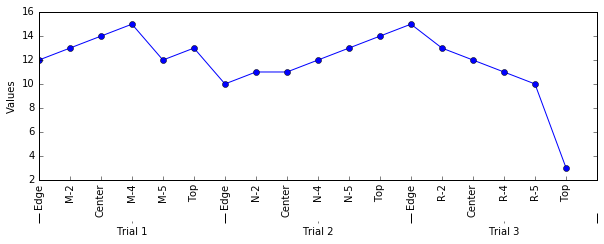
fig1 = plt.figure()
f, ax1 = plt.subplots(1, figsize = (10,3))
ax1.plot(list(df.Location.index), df['Values'],'o-')
ax1.set_xticks(list(df.Location.index))
ax1.set_xticklabels(df.Location, rotation=90 )
ax1.yaxis.set_label_text("Values")
# create a secondary axis
ax2 = ax1.twiny()
# hide all the spines that we dont need
ax2.spines['top'].set_visible(False)
ax2.spines['bottom'].set_visible(False)
ax2.spines['right'].set_visible(False)
ax2.spines['left'].set_visible(False)
pos1 = ax2.get_position() # get the original position
pos2 = [pos1.x0 + 0, pos1.y0 -0.2, pos1.width , pos1.height ] # create a new position by offseting it
ax2.xaxis.set_ticks_position('bottom')
ax2.set_position(pos2) # set a new position
trials_ticks = 1.0 * df.Trial.value_counts().cumsum()/ (len(df.Trial)) # create a series object for ticks for each trial group
trials_ticks_positions = [0]+list(trials_ticks) # add a additional zero. this will make tick at zero.
trials_labels_offset = 0.5 * df.Trial.value_counts()/ (len(df.Trial)) # create an offset for the tick label, we want the tick label to between ticks
trials_label_positions = trials_ticks - trials_labels_offset # create the position of tick labels
# set the ticks and ticks labels
ax2.set_xticks(trials_ticks_positions)
ax2.xaxis.set_major_formatter(ticker.NullFormatter())
ax2.xaxis.set_minor_locator(ticker.FixedLocator(trials))
ax2.xaxis.set_minor_formatter(ticker.FixedFormatter(list(trials_label_positions.index)))
ax2.tick_params(axis='x', length = 10,width = 1)
plt.show()结果:
页面原文内容由Stack Overflow提供。腾讯云小微IT领域专用引擎提供翻译支持
原文链接:
https://stackoverflow.com/questions/43788223
复制相关文章
相似问题
腾讯云开发者

Copyright © 2013 - 2026 Tencent Cloud. All Rights Reserved. 腾讯云 版权所有
深圳市腾讯计算机系统有限公司 ICP备案/许可证号:粤B2-20090059 ![]() 粤公网安备44030502008569号
粤公网安备44030502008569号
腾讯云计算(北京)有限责任公司 京ICP证150476号 | 京ICP备11018762号