
geom_label_repel()高于geom_line()
geom_label_repel()高于geom_line()
提问于 2017-04-26 08:33:24
因此,我有了这个ggplot,标签是由geom_label_repel()方法定位的。这是相当好的,但我希望标签都在geom_line()之上,而不是在下面,这在某些情况下是这样的。
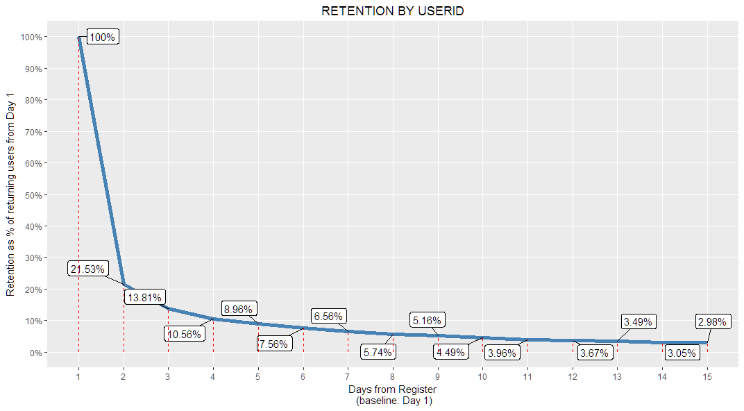
这是生成图形的代码:
    ggplot(data,
   aes(x=daydelta,y=day1ret)
   ) +
  geom_line(color='steelblue',size=2) +
  geom_label_repel(aes(label = paste0(round(day1ret*100,2),"%")),box.padding = unit(0.6, "lines"),label.size = 0.1)+
  scale_x_continuous(limits = c(1,15),breaks=1:15,minor_breaks = 1:15) +
  scale_y_continuous(limits = c(0,1),breaks=seq(0,1,0.1),minor_breaks = seq(0,1,0.1),labels = paste0(seq(0,1,0.1)*100,"%")) +
  ggtitle("RETENTION BY USERID") +
  theme(plot.title = element_text(hjust = 0.5))+
  xlab("Days from Register\n (baseline: Day 1)")+
  ylab("Retention as % of returning users from Day 1")+
geom_segment(mapping=aes(x=daydelta,y=0,xend=daydelta,yend=day1ret),size=0.5,color="red",linetype=2)回答 1
Stack Overflow用户
回答已采纳
发布于 2017-04-26 13:15:24
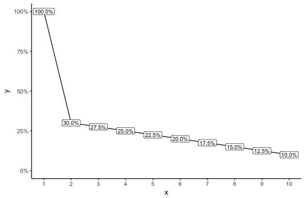
与其用与数据线偏移的标签来乱搞地块,不如将标签放在实际的x值和y值上?这在视觉上要干净得多,不会通过在数据值以外的位置放置标签来分散观众的注意力或误导观众。例如:
library(ggplot2)
library(scales)

dat = data.frame(x=1:10, y=c(1, seq(.3,.1,length=9)))

ggplot(dat, aes(x,y)) +
  geom_line() +
  geom_label(aes(label=paste0(sprintf("%1.1f",y*100),"%")), size=3, label.padding=unit(2,"pt")) +
  scale_y_continuous(labels=percent, limits=c(0,1)) +
  scale_x_continuous(breaks=dat$x) +
  theme_classic()
页面原文内容由Stack Overflow提供。腾讯云小微IT领域专用引擎提供翻译支持
原文链接:
https://stackoverflow.com/questions/43628889
复制相关文章
相似问题
腾讯云开发者

Copyright © 2013 - 2026 Tencent Cloud. All Rights Reserved. 腾讯云 版权所有
深圳市腾讯计算机系统有限公司 ICP备案/许可证号:粤B2-20090059 ![]() 粤公网安备44030502008569号
粤公网安备44030502008569号
腾讯云计算(北京)有限责任公司 京ICP证150476号 | 京ICP备11018762号