
Matplotlib xticks为天
Matplotlib xticks为天
提问于 2017-04-20 17:07:46
所以我有一个简单的问题。我有一个模拟商店一个星期/一个月生活的程序。现在它负责收银台(我不知道我是否正确地把它从我的语言中移植过来),因为它们有时会失败,一些专家必须到商店来修理它们。在模拟结束时,程序绘制出如下所示的图形:
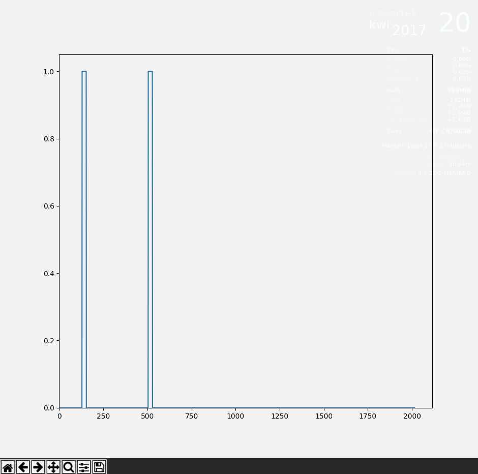
当收款台出现一些错误/故障时,就会出现1.0状态,然后等待技术人员修复它,然后返回到0,工作状态。
我或者更确切地说,我的项目负责人宁愿在x轴上看到其他东西而不是分钟。我该怎么做呢?我的意思是,我希望它像Day 1,然后是一个间隔,Day 2等等。
我知道pyplot.xticks()方法,但是它将标签分配给第一个参数列表中的滴答,所以我必须用分钟来制作类似2000个标签,我只想要7天,上面写了几天。
回答 2
Stack Overflow用户
回答已采纳
发布于 2017-04-20 17:27:05
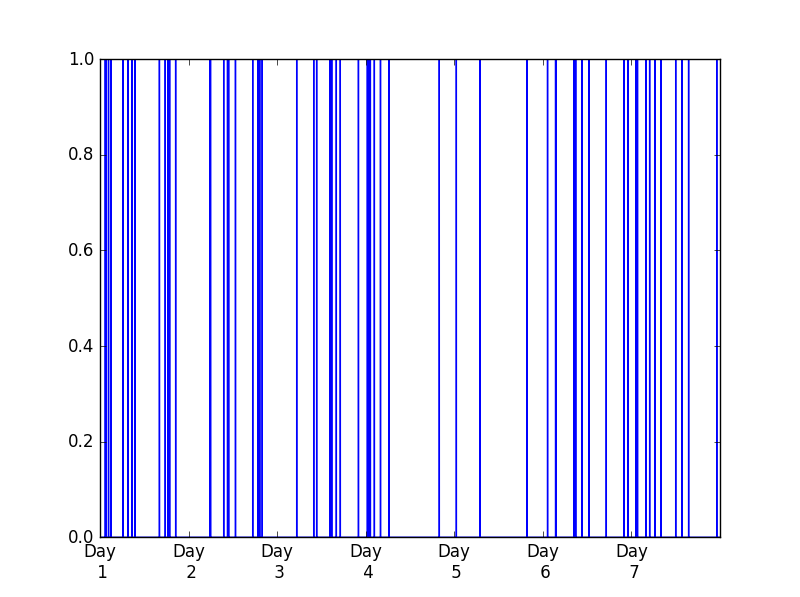
您可以使用matplotlib set_ticks和get_xticklabels()方法的ax,灵感来自于this和this问题。
import pandas as pd
import numpy as np
import matplotlib.pyplot as plt

minutes_in_day = 24 * 60

test = pd.Series(np.random.binomial(1, 0.002, 7 * minutes_in_day))

fig, ax = plt.subplots(1)
test.plot(ax = ax)

start, end = ax.get_xlim()
ax.xaxis.set_ticks(np.arange(start, end, minutes_in_day))

labels = ['Day\n %d'%(int(item.get_text())/minutes_in_day+ 1) for item in ax.get_xticklabels()]
ax.set_xticklabels(labels)
我看到了下面的照片。
Stack Overflow用户
发布于 2017-04-20 17:36:57
你和plt.xticks()走在正确的轨道上。试试这个:
import matplotlib.pyplot as plt

# Generate dummy data
x_minutes = range(1, 2001)
y = [i*2 for i in x_minutes]

# Convert minutes to days
x_days = [i/1440.0 for i in x_minutes]

# Plot the data over the newly created days list
plt.plot(x_days, y)

# Create labels using some string formatting
labels = ['Day %d' % (item) for item in range(int(min(x_days)), int(max(x_days)+1))]

# Set the tick strings
plt.xticks(range(len(labels)), labels)

# Show the plot
plt.show()页面原文内容由Stack Overflow提供。腾讯云小微IT领域专用引擎提供翻译支持
原文链接:
https://stackoverflow.com/questions/43525767
复制相关文章
相似问题
腾讯云开发者

Copyright © 2013 - 2026 Tencent Cloud. All Rights Reserved. 腾讯云 版权所有
深圳市腾讯计算机系统有限公司 ICP备案/许可证号:粤B2-20090059 ![]() 粤公网安备44030502008569号
粤公网安备44030502008569号
腾讯云计算(北京)有限责任公司 京ICP证150476号 | 京ICP备11018762号