
使文本浮动:左边和图片浮动:右边,以及移动友好。
使文本浮动:左边和图片浮动:右边,以及移动友好。
提问于 2017-04-08 14:39:08
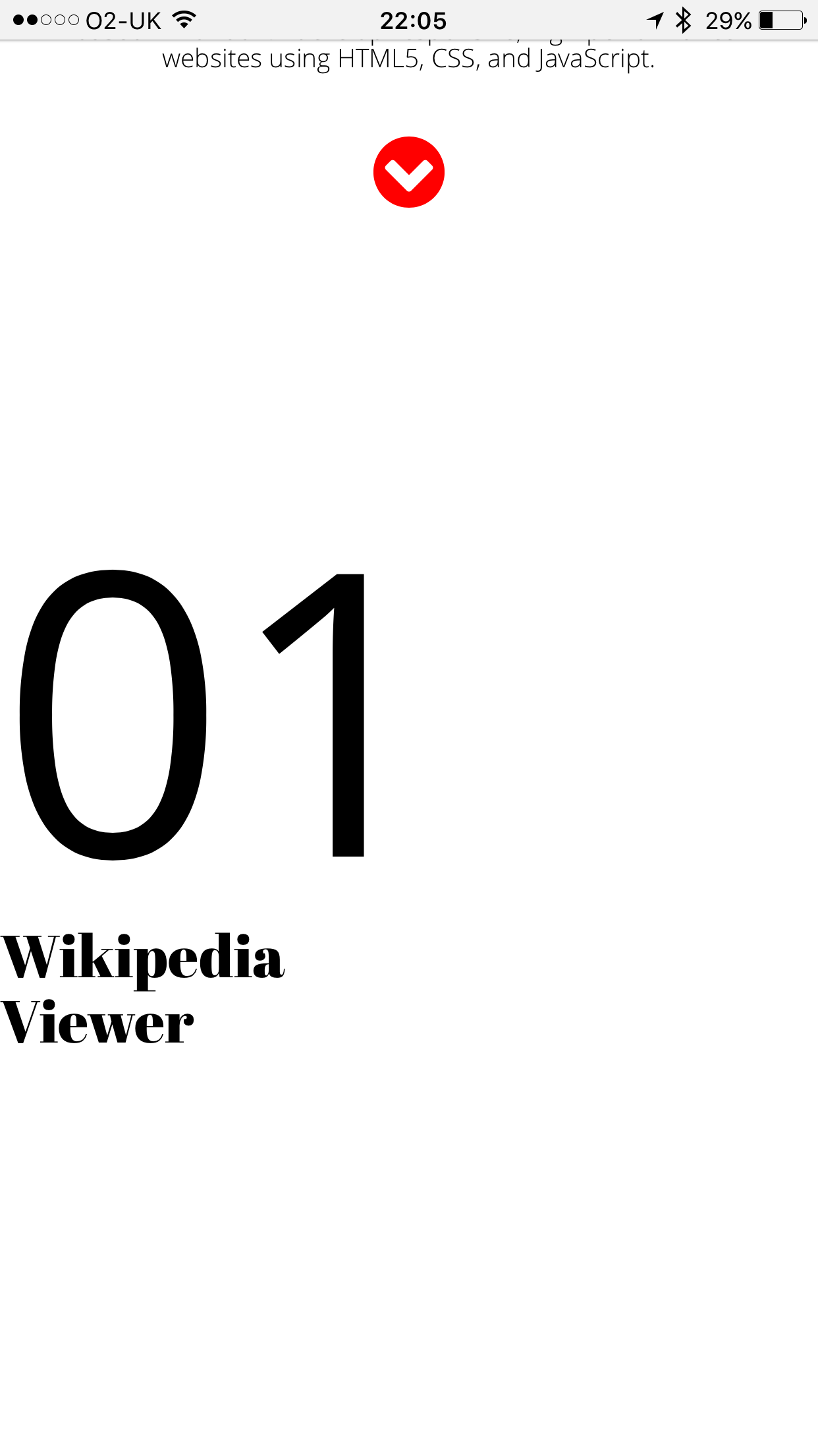
想要添加我的大学和免费代码营项目在我的网站上。我试图使文字浮动向左和图片浮动的权利,以及移动友好。出于某种原因,我只能在桌面版上看到图片,而不能在手机上看到。图片不显示在手机上。只有右边的文字。起初,我一直在尝试给出文本-xs-2 col 2和img src=“col 8 col 8”,但它没有起作用。现在,我正试图通过将这幅图片作为section=projects的背景来获得理想的结果,但仍然无法工作。我怎样才能把照片包括在右边呢?不知道我做错了什么?请帮帮忙。
请找附图。
这是我的网站:http://www.kiljakandweb.com
Here is my **HTML**:
<!DOCTYPE html>
<html lang="en">
<head>
<meta charset="utf-8">
<meta http-equiv="X-UA-Compatible" content="IE=edge">
<meta name="viewport" content="width=device-width, initial-scale=1">
<title></title>
<link rel="stylesheet" href="https://maxcdn.bootstrapcdn.com/bootstrap/3.3.5/css/bootstrap.min.css">
<link rel="stylesheet" href="https://maxcdn.bootstrapcdn.com/font-awesome/4.4.0/css/font-awesome.min.css">
<link rel="stylesheet" href="main.css">
<script src="https://ajax.googleapis.com/ajax/libs/jquery/1.12.4/jquery.min.js"></script>
<script src="javascript/main.js" type="text/javascript"></script>
<script src="https://maxcdn.bootstrapcdn.com/bootstrap/3.3.5/js/bootstrap.min.js"></script>
</head>
<body>
<section id="header" class="text-center">
<h1>Kiljak<br> + Web </h1>
<br>
<br>
<br>
<h3> I'm a freelance front-end web developer <br> based in London. I develop responsive, high-performance <br>websites using HTML5, CSS, and JavaScript.
</h3>
<br>
<a href="#googleMap"><i class="fa fa-chevron-circle-down fa-3x" aria-hidden="true"></i></a>
</section>
<section class="projects">
<div class="row">
<div class="col-sm-4 col-xs-4 col-md-5 col-lg-5">
<h2><span style="font-family: 'Open Sans';
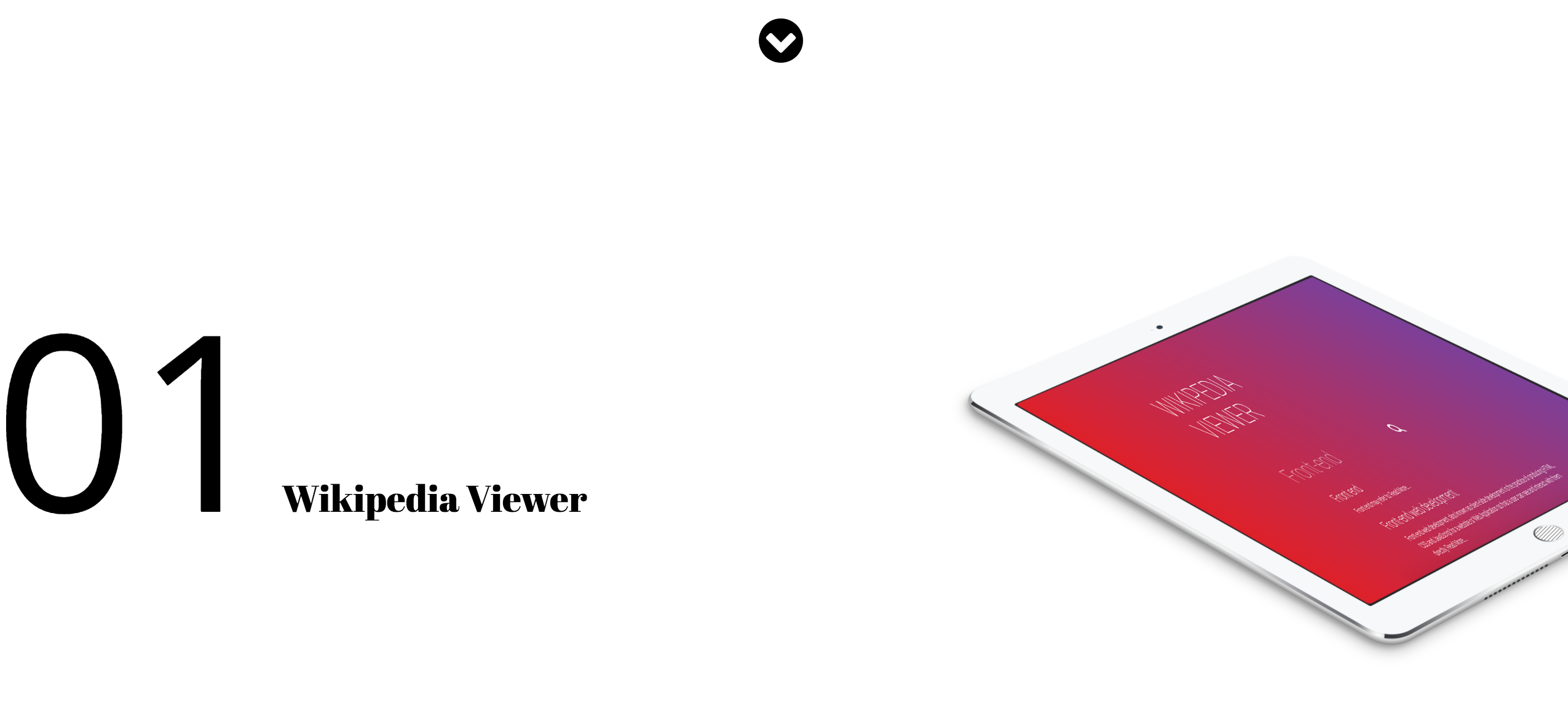
font-size: 200px">01</span> Wikipedia Viewer </h2>
</div>
</div>
</section>
<div id="googleMap">
<footer>
<div class="container">
<div class="text-center">
<h4><strong>KILJAK + WEB</strong>
</h4>
<p>Ace Hotel Shoreditch
<br>London, UK E1 6JQ</p>
<ul class="list-unstyled">
<li><i class="fa fa-phone fa-fw"></i> (44) 7568599454</li>
<li><i class="fa fa-envelope-o fa-fw"></i> <a href="mailto:edgar.kiljak@kiljakandweb.com">edgar.kiljak@kiljakandweb.com</a>
</li>
</ul>
<br>
<ul class="list-inline">
<li>
<a href="#"><i class="fa fa-facebook fa-fw fa-3x"></i></a>
</li>
<li>
<a href="#"><i class="fa fa-twitter fa-fw fa-3x"></i></a>
</li>
</ul>
<hr class="small">
<p class="text-muted">Copyright © KILJAK + WEB 2016</p>
</div>
</div>
<a id="to-top" href="#top" class="btn btn-dark btn-lg"><i class="fa fa-chevron-up fa-fw fa-1x"></i></a>
</footer>
</body>
</html>和CSS:
@import url('https://fonts.googleapis.com/css?family=Abril+Fatface');
@import url('https://fonts.googleapis.com/css?family=Oswald:300');
@import url('https://fonts.googleapis.com/css?family=Open+Sans:300,400');
@import url('https://fonts.googleapis.com/css?family=Roboto:300');


#header{
    width: 100%;
    height: 300px;
    position: absolute;
    top:  50%;
    left: 50%;
    transform: translate(-50%,-50%);
    background-color: white;


}
h1 {
    font-family: 'Abril Fatface', cursive;
    font-size: 92px;
    line-height: 90px;
    color: black;
}

h2 {
    margin-top:250px;
    float: left;
    font-family: 'Abril Fatface', cursive;
    font-size: 30px;
    font-weight: normal;;
    color: black;
}

h3 {
    font-family: 'Open Sans';
    font-size: 13px;
    font-weight: lighter !important;
    color: black;
}


hr {

    color: black !important;

}

.fa {
    color: black !important;
}

.fa:hover {
    color: red !important;
}

.projects {
    float: right;
    background-image: url('images/ipad.png');
    -webkit-background-size: cover;
    -moz-background-size: cover;
    background-size: cover;
    -o-background-size: cover;
    margin-top:500px;
    width: 100%; /* Span the entire width of the screen */
    height: 800px;
}

#googleMap {
    padding-top: 100px !important;
    margin-top: -10px;
    width: 100%; /* Span the entire width of the screen */
    height: 400px; /* Set the height to 400 pixels */
    -webkit-filter: grayscale(100%);
    filter: grayscale(100%); /* Change the color of the map to black and white */
}

footer {
    position: static;
    background-color: white;
    padding: 100px 0;
    font-family: 'Open Sans';
    font-size: 13px !important;
    font-weight: lighter;
    line-height: 15px;
}

/* Really small phones */
@media screen and (max-width:320px) {}

/* Regular smart phones, including iPhone 6 + with 414px viewport! */
@media screen and (min-width: 321px) {}

/* Regular Tablets from 480 to 800px including Galaxy tablets - 768px is only good for iPad */
@media screen and (min-width: 481px) {}

/* Desktops and Laptops */
@media screen and (min-width: 801px) {}回答 1
Stack Overflow用户
回答已采纳
发布于 2017-04-08 14:57:41
尝试有2列的行,并将文本和图片放在单独的列中,如下所示:
<div class="row">
<div class="col-sm-12 col-xs-12 col-md-4">
        <h2><span style="font-family: 'Open Sans';
        font-size: 200px">01</span> Wikipedia Viewer </h2>
</div>
<div class="col-sm-12 col-xs-12 col-md-8">
<img class="img-responsive" src="images/ipad.png">
</div>
</div>您可以在以下链接中找到演示代码:https://jsfiddle.net/Djav/m93p7ove/1/
页面原文内容由Stack Overflow提供。腾讯云小微IT领域专用引擎提供翻译支持
原文链接:
https://stackoverflow.com/questions/43295404
复制相关文章
相似问题
腾讯云开发者

Copyright © 2013 - 2026 Tencent Cloud. All Rights Reserved. 腾讯云 版权所有
深圳市腾讯计算机系统有限公司 ICP备案/许可证号:粤B2-20090059  粤公网安备44030502008569号
腾讯云计算(北京)有限责任公司 京ICP证150476号 | 京ICP备11018762号