
生成热图,颜色作为两个拦截器之间的实例数量。
生成热图,颜色作为两个拦截器之间的实例数量。
提问于 2017-02-18 16:55:18
我有很多数据几乎无法用肉眼来解释为xy散点图。对于麻省理工学院来说,更令人感兴趣的是,在哪里建立了星系团,这就是为什么我选择了一个热图的想法:
heatmap, yedges, xedges = np.histogram2d(y, x, bins=(10,10))
extent = [xedges[0], xedges[-1], yedges[0], yedges[-1]]
生成以下图
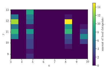
挺好的。然而,我不知道这个颜色表示什么,但它不是某个范围之间的数据点的数量(例如,4>x>5 & 11>y>12)。
问题
我知道我可以编写一个程序来合并适当的数据点,计算单元格的实例,并由我自己绘制所需的热图,但是在数据科学中,难道还没有这样一个整洁工具的实现吗?
回答 2
Stack Overflow用户
回答已采纳
发布于 2017-02-20 20:19:18
我决定自己键入它,这里是所有寻找基本解决方案(感谢)的人。如块中心的X-值所需:
import numpy as np
import matplotlib.pyplot as plt

def makeOwnHeatMap(x,y,bins):
    #shift +/- for the axes labels and
    xMin = float(int(min(x)))-0.5
    xMax = float(int(max(x)))+0.5
    yMin = float(int(min(y)))-0.5
    yMax = float(int(max(y)))+0.5
    yStep = float(yMax-yMin)/bins[0]
    xStep = float(xMax-xMin)/bins[1]


    downscaledGraph = np.zeros((bins[0],bins[1]))

    #make heatmap
    for i in range(0,len(y)):
        curY = y[i] #current y-value from data
        curX = x[i] #current x-value from data

        yetY = 0 #current y compare value within a stepsize
        yetX = 0 #current x compare value within a stepsize
        cntY = 0 #counter y for matrix coordinates
        cntX = 0 #counter x for matrix coodrinates
        while (yetY < curY-yMin):
            yetY += yStep
            cntY += 1

        while (yetX < curX-xMin):
            yetX += xStep
            cntX += 1

        #ends up with incrementing 1 x too much
        cntY -= 1
        cntX -= 1

        downscaledGraph[cntY,cntX] += 1


    #make axes labels
    xbar = []
    ybar = []
    thisY = yMin
    while thisY <= yMax:
        ybar.append(thisY)
        thisY += yStep

    thisX = xMin
    while thisX <= xMax:
        xbar.append(thisX)
        thisX += xStep

    #draw heatmap
    xbar, ybar = np.meshgrid(xbar, ybar)
    intensity = np.array(downscaledGraph)
    plt.pcolormesh(xbar, ybar, intensity)
    plt.show()


    for i in range(0,bins[0]):
        for j in range(0, bins[1]):
            print downscaledGraph[i,j],"\t",
        print "|"
    print "_______"
结果出来了。
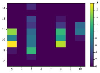
和
0.0     0.0     0.0     0.0     0.0     0.0     0.0     0.0     |
0.0     0.0     1.0     0.0     0.0     0.0     0.0     0.0     |
1.0     0.0     12.0    0.0     0.0     0.0     0.0     0.0     |
18.0    0.0     7.0     0.0     0.0     16.0    0.0     0.0     |
8.0     0.0     7.0     0.0     0.0     10.0    0.0     1.0     |
15.0    0.0     6.0     0.0     0.0     12.0    0.0     7.0     |
0.0     0.0     3.0     0.0     0.0     3.0     0.0     6.0     |
0.0     0.0     4.0     0.0     0.0     1.0     0.0     0.0     |
0.0     0.0     0.0     0.0     0.0     0.0     0.0     0.0     |
0.0     0.0     2.0     0.0     0.0     0.0     0.0     0.0     |
注:我不能保证这是否是正确的结果。使用行打印验证其正确性。
Stack Overflow用户
发布于 2017-02-18 17:25:56
您可以使用matplotlib己宾作为一种简单的方法,或者检查海运中的kde地块。我不确定我是否听了你对计票的评论。你觉得他们放错地方了吗?由于矩阵取向与其他语言的不同,在轴的起源或需要转换矩阵时经常会出现混淆。除此之外,在~(8,12)处的二维垃圾桶应该有大约14个元素,如色条所示。
页面原文内容由Stack Overflow提供。腾讯云小微IT领域专用引擎提供翻译支持
原文链接:
https://stackoverflow.com/questions/42317964
复制相关文章
相似问题
腾讯云开发者

Copyright © 2013 - 2026 Tencent Cloud. All Rights Reserved. 腾讯云 版权所有
深圳市腾讯计算机系统有限公司 ICP备案/许可证号:粤B2-20090059  粤公网安备44030502008569号
腾讯云计算(北京)有限责任公司 京ICP证150476号 | 京ICP备11018762号