
如何在R中有条件地填充区域
如何在R中有条件地填充区域
提问于 2017-02-13 03:05:56
我试着用R绘制美国2016年选举结果的地图,数据看起来是这样的-
` >head(data)
       long      lat group order   State subregion Clinton Trump other
1 -87.46201 30.38968     1     1 alabama      <NA>    34.4  62.1   3.6
2 -87.48493 30.37249     1     2 alabama      <NA>    34.4  62.1   3.6
3 -87.52503 30.37249     1     3 alabama      <NA>    34.4  62.1   3.6
4 -87.53076 30.33239     1     4 alabama      <NA>    34.4  62.1   3.6
5 -87.57087 30.32665     1     5 alabama      <NA>    34.4  62.1   3.6
6 -87.58806 30.32665     1     6 alabama      <NA>    34.4  62.1   3.6`
其任务是绘制2016年美国总统大选每个州的州比比例图,这样如果特朗普(数据美元特朗普)>克林顿(克林顿数据)的选民比例被涂上红色“其他蓝色”。
此外,颜色强度与绘制的数据值成正比。
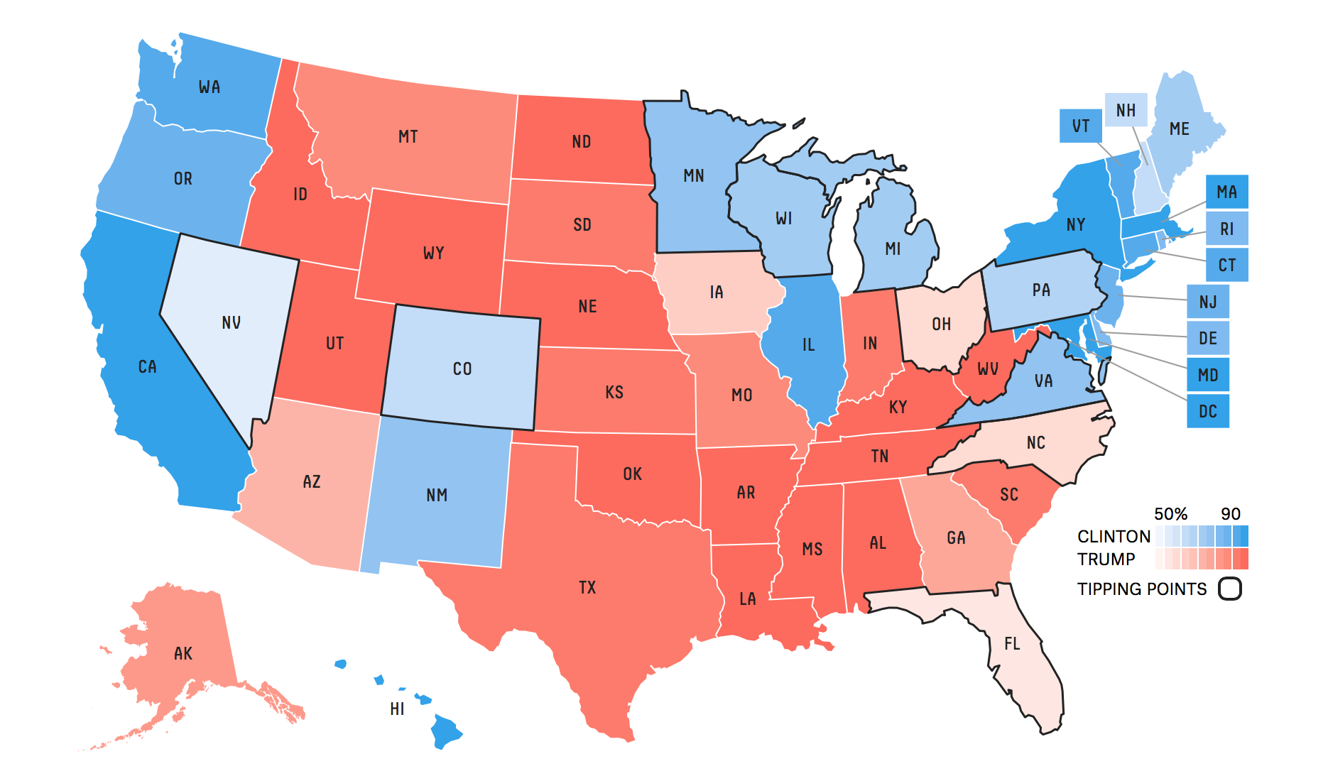
最后的地图应该是这样的
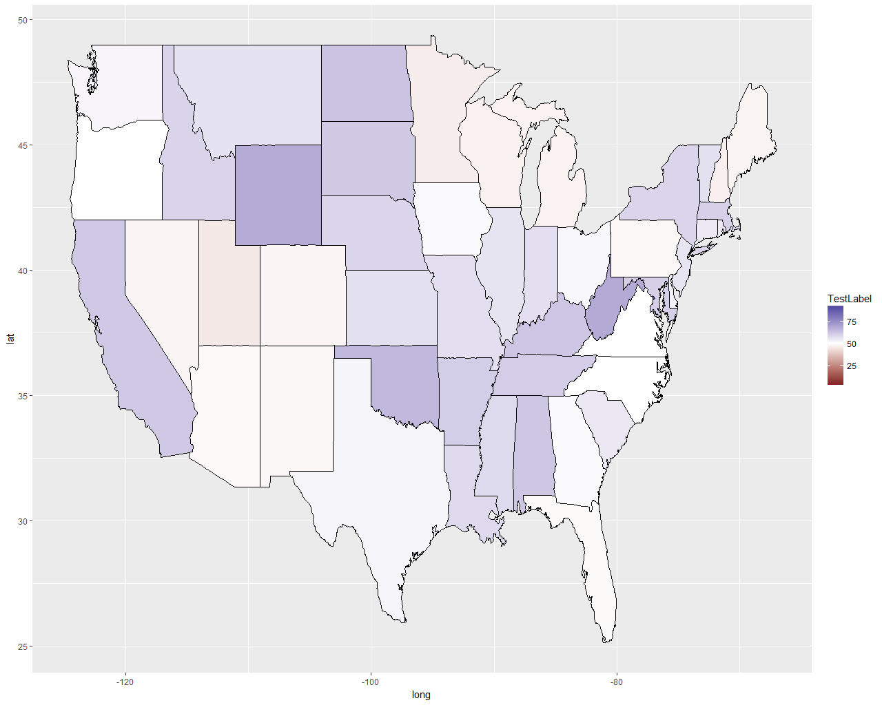
所以这就是我所能达到的-
ggplot() +
    geom_polygon(data = total,
                 aes(x = long, y = lat, group = group,
                     fill = ifelse(total$Trump > total$Clinton,
                                   yes = total$Trump,
                                   no = total$Clinton)),
                 color = "black", size = 0.15) +
    scale_fill_gradient2(low = muted("red"), mid = "white",
                         midpoint = 50, high = muted("blue"),
                         limits = c(min(total$Trump), max(total$Clinton)))+
    labs(fill = "TestLabel")
看起来就像
有人能解释我如何从这个渐变方案到2种颜色方案,并“美化”地图中的“期望”图像吗?
请注意,我是非常新的R和地图使用R,所以请原谅我任何明显的错误,我正在犯。
回答 1
Stack Overflow用户
发布于 2017-02-13 20:20:34
通过添加以下代码行并按照alistaire的建议修改dataframe,我能够在某种程度上接近目标。
>who.won<-as.numeric(total$Trump>total$Clinton)

>total$isTrump<-who.won

>total$votePercent<-ifelse(total$Trump>total$Clinton,yes = total$Trump, no = total$Clinton);

>total$color<-factor(total$isTrump, levels =c(0,1), labels = c("#F79CD4","#0FCFC0"));

>head(total)

  long      lat group order   State subregion Clinton Trump other
1 -87.46201 30.38968     1     1 alabama      <NA>    34.4  62.1   3.6
2 -87.48493 30.37249     1     2 alabama      <NA>    34.4  62.1   3.6
3 -87.52503 30.37249     1     3 alabama      <NA>    34.4  62.1   3.6
4 -87.53076 30.33239     1     4 alabama      <NA>    34.4  62.1   3.6
5 -87.57087 30.32665     1     5 alabama      <NA>    34.4  62.1   3.6
6 -87.58806 30.32665     1     6 alabama      <NA>    34.4  62.1   3.6

isTrump votePercent   color
1       1        62.1 #3182BD
2       1        62.1 #3182BD
3       1        62.1 #3182BD
4       1        62.1 #3182BD
5       1        62.1 #3182BD
6       1        62.1 #3182BD

>ggplot()+geom_polygon(data = total, aes(x = long, y = lat, group = group,fill = as.character(total$color)), color = "black", size = 0.15 )+labs(fill = "Votes")
这给了我下面的地图- 1
谁能解释一下-
- 如何使颜色透明性与投票百分比成比例(总票数为$votePercent)。
- 如何将色彩传奇的标签重命名为“克林顿”和“特朗普”。(它从$color列中提取值,即HEX代码颜色)。
页面原文内容由Stack Overflow提供。腾讯云小微IT领域专用引擎提供翻译支持
原文链接:
https://stackoverflow.com/questions/42196053
复制相关文章
相似问题
腾讯云开发者

Copyright © 2013 - 2026 Tencent Cloud. All Rights Reserved. 腾讯云 版权所有
深圳市腾讯计算机系统有限公司 ICP备案/许可证号:粤B2-20090059 ![]() 粤公网安备44030502008569号
粤公网安备44030502008569号
腾讯云计算(北京)有限责任公司 京ICP证150476号 | 京ICP备11018762号