
选择动态网格中第一行中的所有div
选择动态网格中第一行中的所有div
提问于 2017-02-09 10:01:58
我使用的网格有12列。我想给每个div一个空白点:20 in,除了第一行的div。但是我很难找出哪个div在第一行,因为它没有定义。第一行可以包含1到12个div。
我正在使用sass,并尝试了以下解决方案,但这只适用于相同宽度的div。第一个例子不起作用,因为第二个div没有一个边距。
// max. 12 rows.
@for $colWidth from 1 through 12 {
    // example: 3 divs in a row (colWidth = 4), 12/4+1 = 4.
    // Set margin from the fourth element to the last element.
    $number: (12/$colWidth) + 1;

    // set margin only for banner-component
    div.col-xs-#{$colWidth}:nth-child(n+#{$number}) section.banner-component {
        margin-top: 20px;
    }
    div.col-sm-#{$colWidth}:nth-child(n+#{$number}) section.banner-component {
        margin-top: 20px;
    }
}
Ohter css选择器也没有工作。第一个孩子,第一个孩子。知道如何在第一行中选择div吗?
下面是一些示例:
例1:第一行包含1 div (Col 12)
<div> class="col-xs-12 col-lg-12">
     <section class="banner-component"></section>
</div>
<div> class="col-xs-6 col-lg-6">
     <section class="banner-component"></section>
</div>
<div> class="col-xs-6 col-lg-6">
     <section class="banner-component"></section>
</div>
<div> class="col-xs-6 col-lg-6">
     <section class="banner-component"></section>
</div>
例2:第一行包含2个div(Col 6)
<div> class="col-xs-6 col-lg-6">
     <section class="banner-component"></section>
</div>
<div> class="col-xs-6 col-lg-6">
     <section class="banner-component"></section>
</div>
<div> class="col-xs-6 col-lg-6">
     <section class="banner-component"></section>
</div>
<div> class="col-xs-6 col-lg-6">
     <section class="banner-component"></section>
</div>
示例3:第一行包含3个div(Col 4)
<div> class="col-xs-4 col-lg-4">
     <section class="banner-component"></section>
</div>
<div> class="col-xs-4 col-lg-4">
     <section class="banner-component"></section>
</div>
<div> class="col-xs-4 col-lg-4">
     <section class="banner-component"></section>
</div>
<div> class="col-xs-6 col-lg-6">
     <section class="banner-component"></section>
</div>
例4:第一行包含3个div(col 4、col 6、col lg-2)。
<div> class="col-xs-4 col-lg-4">
     <section class="banner-component"></section>
</div>
<div> class="col-xs-4 col-lg-6">
     <section class="banner-component"></section>
</div>
<div> class="col-xs-4 col-lg-2">
     <section class="banner-component"></section>
</div>
<div> class="col-xs-6 col-lg-6">
     <section class="banner-component"></section>
</div>回答 2
Stack Overflow用户
回答已采纳
发布于 2017-02-09 10:18:20
我认为使用纯CSS是不可能的。以下是使用jQuery的一些替代方法。首先,向网格容器(cols的直接父级)提供一些特定的类/id。
在css上添加一个类。
.with-top-margin{
  margin-top: 20px;
}
jQuery
var divs = $("#dynamic-cols-container > div");
var counter = 0;

for(var i=0; i<divs.length; i++){
  var div = divs.get(i);
  if(counter < 12)
    $(div).addClass("with-top-margin");

  var divWidth = parseInt($(div).attr("class").split("col-lg-")[1].split(" ")[0]);
  counter += divWidth;
}希望这能有所帮助。这是一个小提琴
Stack Overflow用户
发布于 2017-02-09 13:43:55
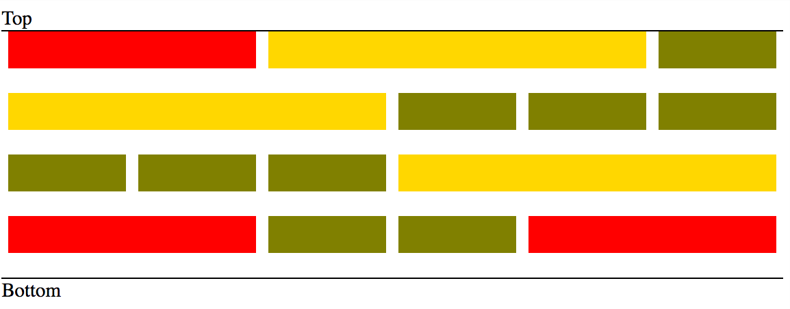
如果您可以选择将所有的col放在包装容器中*
*只有在最后一行与底部对齐时才需要。
<div class="grid">
... any number of col divs
</div>
然后你就可以:
// add top margin to all col divs and use translate to move them
// up by the same amount (making first row align with top)
[class*="col-"]{ margin-top: 20px; transform: translateY(-20px); }

// in case you want the last row to align with the bottom
// use a negative bottom margin on your container
.grid { overflow: auto; margin-bottom: -20px; }
用包装:
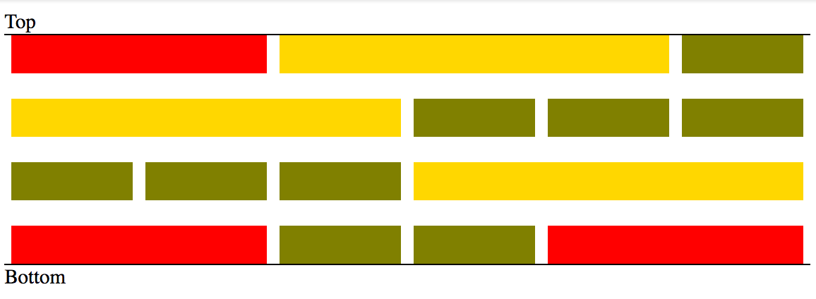
没有包装的:
页面原文内容由Stack Overflow提供。腾讯云小微IT领域专用引擎提供翻译支持
原文链接:
https://stackoverflow.com/questions/42133551
复制相关文章
相似问题
腾讯云开发者

Copyright © 2013 - 2026 Tencent Cloud. All Rights Reserved. 腾讯云 版权所有
深圳市腾讯计算机系统有限公司 ICP备案/许可证号:粤B2-20090059  粤公网安备44030502008569号
腾讯云计算(北京)有限责任公司 京ICP证150476号 | 京ICP备11018762号