
python绘图数据标记
python绘图数据标记
提问于 2017-01-29 20:29:08
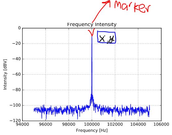
我试图在python图上创建一个数据标记,显示x和y坐标,如果可能的话最好是自动的。请记住,我是python新手,在matplotlib中没有使用标记功能的经验。我有.csv文件中的FFT图,我试图将其与理论计算进行比较,但我需要一种方法来突出显示一个特定的点,并删除一个具有与MATLAB相似的坐标值的标记。作为参考,我正在绘制一个幅值为1V的100 the正弦波的频率强度FFT,因此我试图证明在50欧姆环境下,100 the的峰值接近3.98dBm的计算值。下面是我的csv文件中有关感兴趣点的一些数据(第三列不感兴趣):
9.991250000000E+04  -8.399371E+01   0.000000E+00
9.992500000000E+04  -8.108232E+01   0.000000E+00
9.993750000000E+04  -7.181630E+01   0.000000E+00
9.995000000000E+04  -7.190387E+01   0.000000E+00
9.996250000000E+04  -7.961070E+01   0.000000E+00
9.997500000000E+04  -8.090104E+01   0.000000E+00
9.998750000000E+04  -1.479405E+01   0.000000E+00
1.000000000000E+05  3.740311E+00    0.000000E+00
1.000125000000E+05  -6.665535E-01   0.000000E+00
1.000250000000E+05  -7.868803E+01   0.000000E+00
1.000375000000E+05  -8.149953E+01   0.000000E+00
1.000500000000E+05  -7.948487E+01   0.000000E+00
1.000625000000E+05  -7.436191E+01   0.000000E+00
1.000750000000E+05  -8.068216E+01   0.000000E+00
1.000875000000E+05  -7.998886E+01   0.000000E+00
1.001000000000E+05  -8.316663E+01   0.000000E+00
以下是我如何提取数据
Frequency = data[:,0]
Intensity = data[:,1]

title("Frequency Intensity")
xlabel("Frequency [Hz]")
ylabel("Intensity [dBm]")
plot(Frequency, Intensity)
grid();
编辑:我想让我的情节看起来像这样,x表示频率,y显示dBm中的强度。我只想要我放置的标记来显示地图上的x,y坐标。
回答 2
Stack Overflow用户
回答已采纳
发布于 2017-01-29 22:31:58
你可能想要这样的东西:
import numpy as np
import matplotlib.pyplot as plt
# assuming we are in Jupyter
%matplotlib inline
frequency = np.array(
[ 99912.5, 99925. , 99937.5, 99950. , 99962.5, 99975. ,
99987.5, 100000. , 100012.5, 100025. , 100037.5, 100050. ,
100062.5, 100075. , 100087.5, 100100. ])
intensity = np.array(
[-83.99371 , -81.08232 , -71.8163 , -71.90387 , -79.6107 ,
-80.90104 , -14.79405 , 3.740311 , -0.6665535, -78.68803 ,
-81.49953 , -79.48487 , -74.36191 , -80.68216 , -79.98886 ,
-83.16663 ])
plt.title("Frequency Intensity")
plt.xlabel("Frequency [Hz]")
plt.ylabel("Intensity [dBm]")
plt.plot(frequency, intensity)
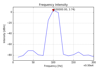
x = frequency[7]
y = intensity[7]
plt.plot([x], [y], 'v', color='red', ms=10)
plt.text(x, y, "({:0.2f}, {:0.2f})".format(x, y))
plt.grid()
Stack Overflow用户
发布于 2017-01-29 22:35:29
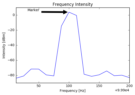
从pd.Series data创建一个
s = pd.DataFrame({
        'Frequency [Hz]': data[:, 0],
        'Intensity [dBm]': data[:, 1]
}).set_index('Frequency [Hz]')['Intensity [dBm]']然后用annotate绘图
ax = s.plot(title='Frequency Intensity')
ax.set_ylabel(s.name)
point = (s.index[7], s.values[7])
ax.annotate('Marker', xy=point, xytext=(0.1, 0.95), textcoords='axes fraction',
            arrowprops=dict(facecolor='black', shrink=0.05),
            )
页面原文内容由Stack Overflow提供。腾讯云小微IT领域专用引擎提供翻译支持
原文链接:
https://stackoverflow.com/questions/41925592
复制相关文章
相似问题
腾讯云开发者

Copyright © 2013 - 2026 Tencent Cloud. All Rights Reserved. 腾讯云 版权所有
深圳市腾讯计算机系统有限公司 ICP备案/许可证号:粤B2-20090059 ![]() 粤公网安备44030502008569号
粤公网安备44030502008569号
腾讯云计算(北京)有限责任公司 京ICP证150476号 | 京ICP备11018762号