
使用third可视化带有第三个变量分类的2x2表
使用third可视化带有第三个变量分类的2x2表
提问于 2017-01-18 15:34:16
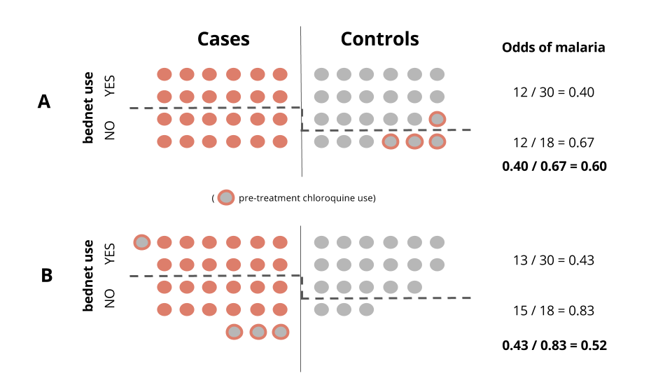
我正在创建一个闪亮的应用程序来帮助学生理解选择偏见。其背景是使用驱虫蚊帐和疟疾。混淆变量是使用氯喹进行预处理,氯喹可以清除寄生虫,导致病例被错误归类为对照组。
下面的两个面板,A和B,显示了我想动态地做什么。以0为中心的滑块将控制错误分类的数量和方向(灰色填充红色轮廓)。移动滑块>0,对于使用蚊帐的控件来说,错误分类率将更高。向另一个方向移动,错误的分类将有利于非用户。
这是我脑海中的一个编程问题,因为我正在寻找一种用闪亮的视觉化的方法。这里有一个玩具数据集,它复制了面板A中的示例。
df <- data.frame(control=c(rep(1, 24), rep(0, 24)),
                 bednet=(c(rep(1,18), rep(0,6),
                           rep(1, 12), rep(0, 12))),
                 chloro=(c(rep(0, 17), 1, 0, 0, 0, 1, 1, 1,
                           rep(NA, 24))))
有什么想法吗?
回答 1
Stack Overflow用户
回答已采纳
发布于 2017-01-18 18:01:49
您可以使用ggplot2方法。我故意保留了单独的变异调用,这样您就可以逐步地探索代码了。
library(tidyverse)

df <- data.frame(control=c(rep(1, 24), rep(0, 24)),
                 bednet=(c(rep(1,18), rep(0,6),
                           rep(1, 12), rep(0, 12))),
                 chloro=(c(rep(0, 17), 1, 0, 0, 0, 1, 1, 1,
                           rep(NA, 24))))
ncols <- 6

plot_data <- df %>%
  mutate(misclass = ifelse(chloro == 1 & control == 1, 1, 0)) %>%
  mutate(control = factor(control, c(0, 1), c("Cases","Controls"))) %>%
  arrange(control, bednet, -misclass) %>%
  group_by(control) %>%
  mutate(col = rep(1:ncols, times = n()/ncols)) %>%
  mutate(row = rep(1:4, each = ncols)) %>%
  mutate(line = max(.$row[bednet == 0]) + 0.5) %>%
  mutate(fill = case_when(misclass == 1 ~ "grey50",
                          misclass == 0 & control == "Cases" ~ "firebrick",
                          misclass == 0 & control == "Controls" ~ "grey50")) %>%
  mutate(color = case_when(misclass == 1 ~ "firebrick",
                          misclass == 0 & control == "Cases" ~ "firebrick",
                          misclass == 0 & control == "Controls" ~ "grey50"))  %>%
  mutate(divider = ifelse(control == "Cases", Inf, NA))


ggplot(plot_data, aes(x = col, y = row, fill = fill, color = color)) +
  geom_point(shape = 21, size = 4, show.legend = FALSE) +
  geom_hline(aes(yintercept = line), show.legend = FALSE, linetype = "dashed") +
  geom_vline(aes(xintercept = divider)) +
  facet_wrap(~control) +
  scale_fill_identity() +
  scale_color_identity() +
  labs(x = NULL, y = NULL) +
  coord_equal() +
  theme_minimal() +
  theme(axis.text = element_blank(),
        panel.grid = element_blank())
您可以通过shiny输入设置错误类条件,然后将plot_data创建为一个反应性数据框架。然后,您将遵循shiny中绘图输出的通常步骤。
页面原文内容由Stack Overflow提供。腾讯云小微IT领域专用引擎提供翻译支持
原文链接:
https://stackoverflow.com/questions/41723348
复制相关文章
相似问题
腾讯云开发者

Copyright © 2013 - 2026 Tencent Cloud. All Rights Reserved. 腾讯云 版权所有
深圳市腾讯计算机系统有限公司 ICP备案/许可证号:粤B2-20090059 ![]() 粤公网安备44030502008569号
粤公网安备44030502008569号
腾讯云计算(北京)有限责任公司 京ICP证150476号 | 京ICP备11018762号