
使用媒体查询来获得对图像的完美响应的正确方法是什么?
使用媒体查询来获得对图像的完美响应的正确方法是什么?
提问于 2016-12-30 21:53:08
我正在使用Bootstrap,我有一个div,它看起来是这样的:
<div class="header-back one"></div>然后,我有如下所示的@media查询:
@media (min-width: 320px) {
  .landing-page .header-back.one {
    background: asset-url('landing/320x500-View-Anywhere.jpg') 100% 0 no-repeat;
  }
}

@media(min-width: 375px) {
  .landing-page .header-back.one {
    background: asset-url('landing/375x500-View-Anywhere.jpg') 100% 0 no-repeat;
  }
}

@media(min-width: 425px) {
  .landing-page .header-back.one {
    background: asset-url('landing/425x500-View-Anywhere.jpg') 100% 0 no-repeat;
  }
}

@media(min-width: 768px) {
  .landing-page .header-back.one {
    background: asset-url('landing/768x500-View-Anywhere.jpg') 100% 0 no-repeat;
  }
}

@media(min-width: 1024px) {
  .landing-page .header-back.one {
    background: asset-url('landing/1024x500-View-Anywhere.jpg') 100% 0 no-repeat;
  }
}

@media(min-width: 1440px) {
  .landing-page .header-back.one {
    background: asset-url('landing/1440x500-View-Anywhere.jpg') 100% 0 no-repeat;
  }
}

@media(min-width: 1441px) {
  .landing-page .header-back.one {
    background: asset-url('landing/2560x500-View-Anywhere.jpg') 100% 0 no-repeat;
  }
}
问题是这不是无缝的。
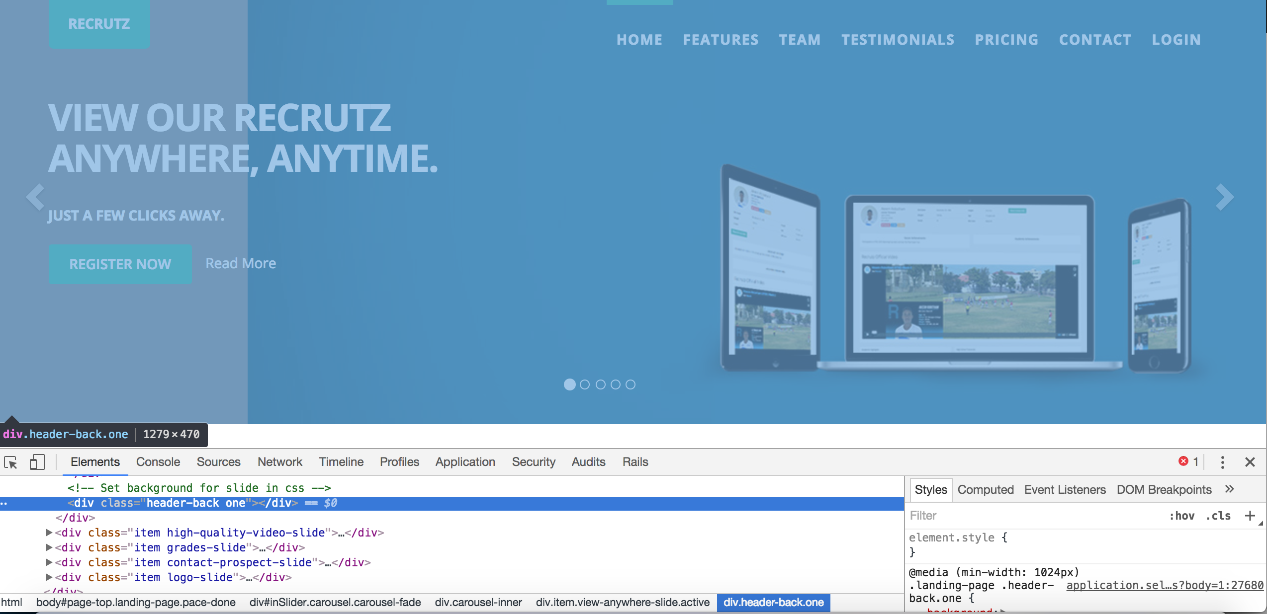
例如,这就是我的13“Macbook Pro上的样子:

注意灰色背景。不应该在那里的。整个中间区域应该是蓝色背景。
div的大小是1200+ px,因此有些规则不能正常工作:
我是否正确地使用了这些媒体查询?我真的需要这样做吗?我只想在这些breakpoints....how的所有设备上都有一个平滑的体验,我实现了吗?
编辑1
在根据Tha‘per的建议重新调整风格之后,我就是这样做的:
.landing-page .header-back.one {
background: asset-url('landing/2560x500-View-Anywhere.jpg') 100% 0 no-repeat;
// background-size: cover;
}
@media (max-width: 320px) {
.landing-page .header-back.one {
background: asset-url('landing/320x500-View-Anywhere.jpg') 100% 0 no-repeat;
// background-size: cover;
}
}
@media(max-width: 375px) {
.landing-page .header-back.one {
background: asset-url('landing/375x500-View-Anywhere.jpg') 100% 0 no-repeat;
// background-size: cover;
}
}
@media(max-width: 425px) {
.landing-page .header-back.one {
background: asset-url('landing/425x500-View-Anywhere.jpg') 100% 0 no-repeat;
// background-size: cover;
}
}
@media(max-width: 768px) {
.landing-page .header-back.one {
background: asset-url('landing/768x500-View-Anywhere.jpg') 100% 0 no-repeat;
// background-size: cover;
}
}
@media(max-width: 1024px) {
.landing-page .header-back.one {
background: asset-url('landing/1024x500-View-Anywhere.jpg') 100% 0 no-repeat;
// background-size: cover;
}
}
@media(max-width: 1440px) {
.landing-page .header-back.one {
background: asset-url('landing/1440x500-View-Anywhere.jpg') 100% 0 no-repeat;
// background-size: cover;
}
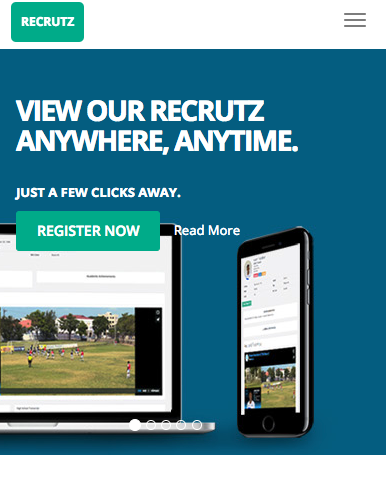
}这就是产生的结果,这是最大的图像压缩到最小的视口(这不是我想要的):
回答 2
Stack Overflow用户
发布于 2016-12-30 22:02:49
实现目标的方法是使用图像作为div背景,而不是在div中使用它。在div中添加图像并不总是会在所有大小上都会带来好的结果,使用div背景图像方法会在所有屏幕大小上给出很好的结果。
.div { background-image: url(image.jpg);背景位置:中心中心;背景尺寸:封面;
这应该会给你好的结果,在所有的屏幕大小,我想这是你正在努力实现的。
Stack Overflow用户
发布于 2016-12-30 21:59:49
尝试将所有min-width替换为max-width,例如:
@media (max-width: 320px) {
  .landing-page .header-back.one {
     background: asset-url('landing/320x500-View-Anywhere.jpg') 100% 0 no-repeat;
  }
}页面原文内容由Stack Overflow提供。腾讯云小微IT领域专用引擎提供翻译支持
原文链接:
https://stackoverflow.com/questions/41403124
复制相关文章
相似问题
腾讯云开发者

Copyright © 2013 - 2026 Tencent Cloud. All Rights Reserved. 腾讯云 版权所有
深圳市腾讯计算机系统有限公司 ICP备案/许可证号:粤B2-20090059  粤公网安备44030502008569号
腾讯云计算(北京)有限责任公司 京ICP证150476号 | 京ICP备11018762号