
创建连通圆
我需要创建这样的图像:
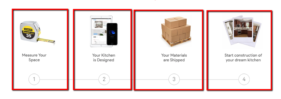
它包含有线条的圆圈。我在红色的方框中画出它们是div,因为当它在移动上显示时,应该如下所示:
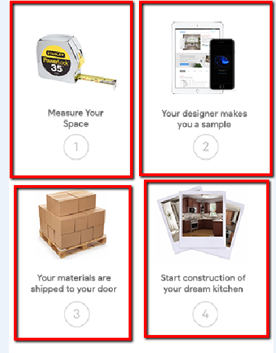
我试过做what this post says,但是它对我不起作用,因为李娜不在同一个领域。
这是我的密码:
.steps {
  max-width: 1170px;
  margin: auto;
  overflow: auto;
}
.step-1,
.step-2,
.step-3,
.step-4 {
  width: 25%;
  float: left;
}<div class="steps">
<div class="step-1">
<div class="step-image">
<img src="step1.jpg">
</div>
<div class="step-title">Measure Your Space</div>
<div class="step-number">1
</div>
</div>
<div class="step-2">
<div class="step-image">
<img src="step2.jpg">
</div>
<div class="step-title">Your Kitchen is Designed</div>
<div class="step-number">2</div>
</div>
<div class="step-3">
<div class="step-image">
<img src="step3.jpg">
</div>
<div class="step-title">Your Materials are Shipped</div>
<div class="step-number">3</div>
</div>
<div class="step-4">
<div class="step-image">
<img src="step4.jpg">
</div>
<div class="step-title">Start contruction of your dream kitchen</div>
<div class="step-number">4</div>
</div>
</div>
如何用连线来创建圆圈呢?
回答 4
Stack Overflow用户
发布于 2016-12-26 17:52:03
以下解决方案适用于带有行的版本。
若要删除行,请将content: none;放在媒体查询下。
section {
  display: inline-block;
  width: 25%;
  text-align: center;
}

div {
  margin: .5em;
  border: 1px solid red;
  padding: .5em;
  position: relative;
}

a {
  display: inline-block;
  height: 2em;
  width: 2em;
  line-height: 2em;
  text-align: center;
  border: 1px solid;
  border-radius: 50%;
  background: silver;
}

a:before, a:after {
  content: "";
  position: absolute;
  border-top: 1px solid;
  margin-top: 1em;
  z-index: -1;
}

a:before {
  margin-left: -1px;
  left: -.5em;
  right: 50%;
}

a:after {
  margin-right: -1px;
  left: 50%;
  right: -.5em;
}

section:first-child a:before,
section:last-child a:after {
  content: none;
}<main>
<section>
<div>
<p>Some content</p>
<a>1</a>
</div>
</section><section>
<div>
<p>Some content</p>
<a>2</a>
</div>
</section><section>
<div>
<p>Some content</p>
<a>3</a>
</div>
</section><section>
<div>
<p>Some content</p>
<a>4</a>
</div>
</section>
</main>
Stack Overflow用户
发布于 2016-12-26 19:08:05
下面是一个带有最小标记的示例,对于标记和行使用了::after和::before伪元素(从2:nd位置开始)
div.connected {
  counter-reset: num;
}
div.connected div {
  float: left;
  width: calc(25% - 22px);
  position: relative;
  text-align: center;
  margin: 0 10px;
  padding: 80px 0 10px 0;
  border: 1px solid #eee;
  background: url(http://placehold.it/60/f00) no-repeat top 10px center;
}
div.connected div::after {
  display: block;
  counter-increment: num;
  content: counter(num);
  width: 1.5em;
  height: 1.5em;
  text-align: center;
  line-height: 1.5em;
  border-radius: 50%;
  border: 1px solid gray;
  margin: 0 auto;
}
div.connected div ~ div::before {
  content: '';
  position: absolute;
  width: calc(100% - 1.5em + 22px);
  right: calc(50% + 0.75em);
  height: 1px;
  background-color: gray;
  bottom: calc(.75em + 10px);
  z-index: -1;
}
div.connected span {
  display: inline-block;
  padding-bottom: 10px;
}
@media screen and (max-width: 600px) {

  div.connected div {
    width: calc(50% - 22px);
  }
  div.connected div:nth-child(n+3) {
    margin-top: 20px;
  }
  div.connected div:nth-child(3)::before {
    display: none;
  }

}<div class="connected">
<div>
<span>Some text here</span>
</div>
<div>
<span>Some text here</span>
</div>
<div>
<span>Some text here</span>
</div>
<div>
<span>Some text here</span>
</div>
</div>
下面是一个更新的版本,它解决了当项有较长文本时出现的不对齐问题。
div.connected {
  display: flex;
  flex-wrap: wrap;
  counter-reset: num;
}
div.connected div {
  float: left;
  width: calc(25% - 22px);
  position: relative;
  text-align: center;
  margin: 0 10px;
  padding: 80px 0 10px 0;
  border: 1px solid #eee;
  background: url(http://placehold.it/60/f00) no-repeat top 10px center;
}
div.connected div::after {
  display: block;
  counter-increment: num;
  content: counter(num);
  position: absolute;
  left: calc(50% - 0.75em - 1px);
  bottom: 10px;
  width: 1.5em;
  height: 1.5em;
  text-align: center;
  line-height: 1.5em;
  border-radius: 50%;
  border: 1px solid gray;
}
div.connected div ~ div::before {
  content: '';
  position: absolute;
  width: calc(100% - 1.5em + 22px);
  right: calc(50% + 0.75em);
  height: 1px;
  background-color: gray;
  bottom: calc(.75em + 10px);
  z-index: -1;
}
div.connected span {
  display: inline-block;
  padding-bottom: 30px;
}
@media screen and (max-width: 600px) {

  div.connected div {
    width: calc(50% - 22px);
  }
  div.connected div:nth-child(n+3) {
    margin-top: 20px;
  }
  div.connected div:nth-child(3)::before {
    display: none;
  }

}<div class="connected">
<div>
<span>Some text here</span>
</div>
<div>
<span>Some text here</span>
</div>
<div>
<span>Some long long long text here</span>
</div>
<div>
<span>Some text here</span>
</div>
</div>
更新后,被问到如何将文本移动到圆圈下面,所以这里有一种方法(参见CSS中的注释)
注意,由于连接器/圆圈使用绝对定位,而且随着较长的文本可以包装,您可能需要使用现有的@media查询来调整底部距离(50px)。
div.connected {
  display: flex;
  flex-wrap: wrap;
  counter-reset: num;
}

div.connected div {
  float: left;
  width: calc(25% - 22px);
  position: relative;
  text-align: center;
  margin: 0 10px;

  /* padding: 80px 0 10px 0;   changed  */
  padding: 120px 0 10px 0;

  border: 1px solid #eee;
  background: url(http://placehold.it/60/f00) no-repeat top 10px center;
}

div.connected div::after {
  display: block;
  counter-increment: num;
  content: counter(num);
  position: absolute;
  left: calc(50% - 0.75em - 1px);

  /* bottom: 10px;   changed  */
  bottom: 50px;

  width: 1.5em;
  height: 1.5em;
  text-align: center;
  line-height: 1.5em;
  border-radius: 50%;
  border: 1px solid gray;
}

div.connected div~div::before {
  content: '';
  position: absolute;
  width: calc(100% - 1.5em + 22px);
  right: calc(50% + 0.75em);
  height: 1px;
  background-color: gray;

  /* bottom: calc(.75em + 10px);   changed  */
  bottom: calc(.75em + 50px);

  z-index: -1;
}

div.connected span {
  display: inline-block;
}

@media screen and (max-width: 600px) {
  div.connected div {
    width: calc(50% - 22px);
  }
  div.connected div:nth-child(n+3) {
    margin-top: 20px;
  }
  div.connected div:nth-child(3)::before {
    display: none;
  }
}<div class="connected">
<div>
<span>Some text here</span>
</div>
<div>
<span>Some text here</span>
</div>
<div>
<span>Some long long long text here</span>
</div>
<div>
<span>Some text here</span>
</div>
</div>
Stack Overflow用户
发布于 2016-12-26 18:23:26
考虑到您拥有的标记,一个简单的解决方案是将水平线( :after伪元素.step-number)相对于.step-# div对齐。下面是操作步骤:
.step-1,
.step-2,
.step-3,
.step-4 {
  ...
  /* Set position of step divs to be relative. */
  position: relative;
}

.step-number:after {
  /* Absolutely position this to the bottom center of step-#.
     15px is the radius of step-number.
     A 100% width, and a 50% left expands the line's
     length to the center of the next step-#. */
  position: absolute;
  left: 50%;
  bottom: 15px;
  margin-left: 15px;

  ...
}

.step-number {
  /* A fixed width of 30px allows us to correctly position the line. */
  border-radius: 20px;
  width: 30px;
  height: 30px;
  ...
}
.step-number {
  border-radius: 20px;
  width: 30px;
  height: 30px;
  line-height: 30px;
  border: 1px #AAA solid;
  text-align: center;
  display: inline-block;
  background-color: #FFF;
}
/*
Absolutely position this to the bottom center of step-#.
15px is the radius of step-number.

A 100% width, and a 50% left expands the line's
length to the center of the next step-#.
*/

.step-number:after {
  content: ' ';
  position: absolute;
  left: 50%;
  margin-left: 15px;
  bottom: 15px;
  width: 100%;
  height: 1px;
  background-color: #AAA;
}
/* Hide the line after the last step */

.step-4 .step-number:after {
  display: none;
}
.steps {
  max-width: 1170px;
  margin: auto;
  overflow: auto;
}
.step-title {
  min-height: 80px;
}
.step-1,
.step-2,
.step-3,
.step-4 {
  width: 22%;
  vertical-align: top;
  display: inline-block;
  text-align: center;
  /* Set position of step divs to be relative. */
  position: relative;
  border: 1px #FAA solid;
}


@media screen and (max-width: 400px) {
  .step-number:after {
    content: none;
    display: none;
  }
}<div class="steps">
<div class="step-1">
<div class="step-image">
<img src="https://placehold.it/100x100">
</div>
<div class="step-title">Measure Your Space</div>
<div class="step-number">1
</div>
</div>
<div class="step-2">
<div class="step-image">
<img src="https://placehold.it/100x100">
</div>
<div class="step-title">Your Kitchen is Designed</div>
<div class="step-number">2</div>
</div>
<div class="step-3">
<div class="step-image">
<img src="https://placehold.it/100x100">
</div>
<div class="step-title">Your Materials are Shipped</div>
<div class="step-number">3</div>
</div>
<div class="step-4">
<div class="step-image">
<img src="https://placehold.it/100x100">
</div>
<div class="step-title">Start contruction of your dream kitchen</div>
<div class="step-number">4</div>
</div>
</div>
为了跟上小屏幕,您可以添加一个媒体查询来隐藏水平线,一旦.step-#跨越多个行。
@media screen and (max-width: 400px) {
  .step-number:after {
    content: none;
    display: none;
  }
}https://stackoverflow.com/questions/41309433
复制相似问题
腾讯云开发者

Copyright © 2013 - 2026 Tencent Cloud. All Rights Reserved. 腾讯云 版权所有
深圳市腾讯计算机系统有限公司 ICP备案/许可证号:粤B2-20090059  粤公网安备44030502008569号
腾讯云计算(北京)有限责任公司 京ICP证150476号 | 京ICP备11018762号