
如何使用图表js或其他库绘制甘特图
如何使用图表js或其他库绘制甘特图
提问于 2016-12-21 09:36:20
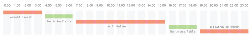
我想像下面这样画甘特图
在图表js中没有绘制甘特图的选项。有可能吗??如果不可能,请建议我一些图表库来绘制这样的图形。
回答 6
Stack Overflow用户
回答已采纳
发布于 2016-12-21 11:34:11
我建议您使用散射图。在散点图中,您可以绘制多条独立的直线。从下面的图片中可以看到。
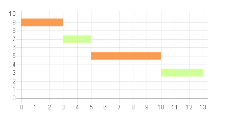
示例代码
var scatterChart = new Chart(ctx1, {
        type: 'line',
        data: {
            datasets: [
            {

                label: 'Scatter Dataset',
                backgroundColor: "rgba(246,156,85,1)",
                borderColor: "rgba(246,156,85,1)",
                fill: false,
                borderWidth : 15,
                pointRadius : 0,
                data: [
                    {
                        x: 0,
                        y: 9
                    }, {
                        x: 3,
                        y: 9
                    }
                ]
            },
            {
                backgroundColor: "rgba(208,255,154,1)",
                borderColor: "rgba(208,255,154,1)",
                fill: false,
                borderWidth : 15,
                pointRadius : 0,
                data: [
                    {
                        x: 3,
                        y: 7
                    }, {
                        x: 5,
                        y: 7
                    }
                ]
            },
            {

                label: 'Scatter Dataset',
                backgroundColor: "rgba(246,156,85,1)",
                borderColor: "rgba(246,156,85,1)",
                fill: false,
                borderWidth : 15,
                pointRadius : 0,
                data: [
                    {
                        x: 5,
                        y: 5
                    }, {
                        x: 10,
                        y: 5
                    }
                ]
            },
            {
                backgroundColor: "rgba(208,255,154,1)",
                borderColor: "rgba(208,255,154,1)",
                fill: false,
                borderWidth : 15,
                pointRadius : 0,
                data: [
                    {
                        x: 10,
                        y: 3
                    }, {
                        x: 13,
                        y: 3
                    }
                ]
            }
            ]
        },
        options: {
            legend : {
                display : false
            },
            scales: {
                xAxes: [{
                    type: 'linear',
                    position: 'bottom',
                    ticks : {
                        beginAtzero :true,
                        stepSize : 1
                    }
                }],
                yAxes : [{
                    scaleLabel : {
                        display : false
                    },
                    ticks : {
                        beginAtZero :true,
                        max : 10
                    }
                }]
            }
        }
    });
让配置像颜色一样休息,或者如果您想隐藏y轴,请按项目要求来做。
Stack Overflow用户
发布于 2017-04-25 17:48:13
编辑这种方法不能有效地工作在更复杂的情况下,需要为单个Y值显示多个条形图。
我将使用一个由两个数据集组成的叠加的水平滑块图。第一个数据集将是透明的,用于抵消第二个数据集,即您的实际数据。下面的代码也会防止工具提示出现在第一个数据集上。
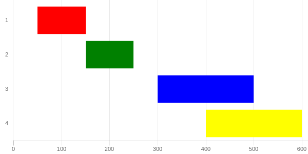
http://codepen.io/pursianKatze/pen/OmbWvZ?editors=1111
示例代码
var barOptions_stacked = {
    hover :{
        animationDuration:10
    },
    scales: {
        xAxes: [{
            label:"Duration",
            ticks: {
                beginAtZero:true,
                fontFamily: "'Open Sans Bold', sans-serif",
                fontSize:11
            },
            scaleLabel:{
                display:false
            },
            gridLines: {
            },
            stacked: true
        }],
        yAxes: [{
            gridLines: {
                display:false,
                color: "#fff",
                zeroLineColor: "#fff",
                zeroLineWidth: 0
            },
            ticks: {
                fontFamily: "'Open Sans Bold', sans-serif",
                fontSize:11
            },
            stacked: true
        }]
    },
    legend:{
        display:false
    },
};

var ctx = document.getElementById("myChart");
var myChart = new Chart(ctx, {
    type: 'horizontalBar',
    data: {
        labels: ["1", "2", "3", "4"],

        datasets: [{
            data: [50,150, 300, 400, 500],
            backgroundColor: "rgba(63,103,126,0)",
            hoverBackgroundColor: "rgba(50,90,100,0)"

        },{
            data: [100, 100, 200, 200, 100],
            backgroundColor: ['red', 'green', 'blue', 'yellow'],
        }]
    },
    options: barOptions_stacked,
});

// this part to make the tooltip only active on your real dataset
var originalGetElementAtEvent = myChart.getElementAtEvent;
myChart.getElementAtEvent = function (e) {
    return originalGetElementAtEvent.apply(this, arguments).filter(function (e) {
        return e._datasetIndex === 1;
    });
}.graph_container{
display:block;
width:600px;
}<script src="https://cdnjs.cloudflare.com/ajax/libs/Chart.js/2.1.3/Chart.js"></script>
<html>
<body>
<div class="graph_container">
<canvas id="myChart"></canvas>
</div>
</body>
</html>
Stack Overflow用户
发布于 2017-09-25 17:47:58
另一个开放源码选项是甘特。
页面原文内容由Stack Overflow提供。腾讯云小微IT领域专用引擎提供翻译支持
原文链接:
https://stackoverflow.com/questions/41259441
复制相关文章
相似问题
腾讯云开发者

Copyright © 2013 - 2026 Tencent Cloud. All Rights Reserved. 腾讯云 版权所有
深圳市腾讯计算机系统有限公司 ICP备案/许可证号:粤B2-20090059 ![]() 粤公网安备44030502008569号
粤公网安备44030502008569号
腾讯云计算(北京)有限责任公司 京ICP证150476号 | 京ICP备11018762号