
用Z分数绘制大熊猫/蟒蛇的概率密度函数
用Z分数绘制大熊猫/蟒蛇的概率密度函数
提问于 2016-12-13 14:26:56
使用此代码:
df1 = (df.ix[:,1:] - df.ix[:,1:].mean()) / df.ix[:,1:].std()我在第二列的分组数据中用项目的频率分布计算了一列的z分数。结果如下所示:
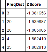
Z Score     Frequency Distribution
-2.394214       1
-2.280489       1
-2.166763       2
-2.109900       7
-2.053037       4
-1.939311       7
-1.882448      11
-1.825586       9
-1.768723       7
-1.711860       4
-1.654997      11 ..about 73 items
现在我想要创建一个概率密度图,在x轴上有z分数,y轴上有频率密度。所以我决定先试一试条形图,看看结果如何。条形图显示了如下所示:
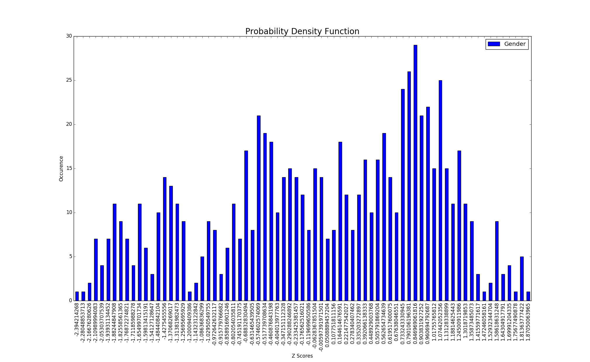
通过下面的代码:ax1 = counts1.plot(kind='bar',stacked = False),让我们看看概率密度函数是怎样的,我把条形图改成了'kde‘,得到了这样的结果:
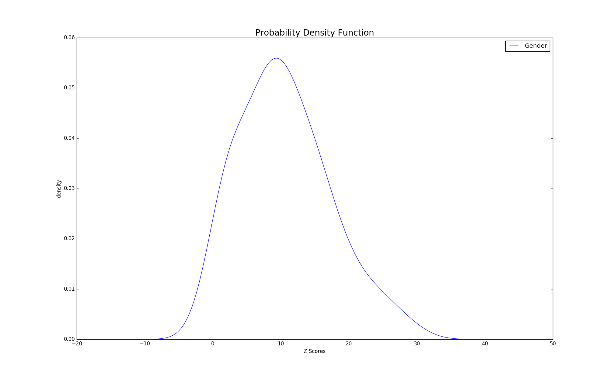
我想这个情节没问题,但我对我的x轴并不满意。是否有可能在x轴上索引每个z分数(比如我的条形图的x轴)?我是新来的熊猫/matplotlib/我正在努力学习密谋,任何帮助都是非常感谢的。
回答 1
Stack Overflow用户
回答已采纳
发布于 2016-12-13 17:19:55
准备虚拟数据:
import pandas as pd
import numpy as np
import matplotlib.pyplot as plt
plt.style.use('fivethirtyeight')

np.random.seed([314, 42])
df = pd.DataFrame(dict(ZScore=np.sort(np.random.uniform(-2, 2, 50)),
                       FreqDist=np.random.randint(1, 30, 50)))
df.head()
密谋:
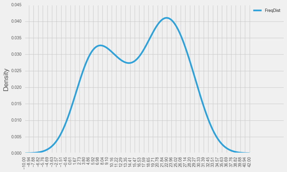
ax = df.plot(x='ZScore', y='FreqDist', kind='kde', figsize=(10, 6))
# get the x axis values corresponding to this slice (See beneath the plot)
arr = ax.get_children()[0]._x
# take the first and last element of this array to constitute the xticks and
# also rotate the ticklabels to avoid overlapping
plt.xticks(np.linspace(arr[0], arr[-1]), rotation=90)
plt.show()
儿童艺术家在情节结束后获得的list输出:
ax.get_children()
[<matplotlib.lines.Line2D at 0x1d68b5c6d68>, <--- first element in list of child artists
 <matplotlib.spines.Spine at 0x1d6895f14a8>,
 <matplotlib.spines.Spine at 0x1d6895f1f98>,
 <matplotlib.spines.Spine at 0x1d68d881828>,
 <matplotlib.spines.Spine at 0x1d68b995048>,
 <matplotlib.axis.XAxis at 0x1d689aeb978>,
 <matplotlib.axis.YAxis at 0x1d68d7ff908>,
 <matplotlib.text.Text at 0x1d689b55cf8>,
 <matplotlib.text.Text at 0x1d689b55a20>,
 <matplotlib.text.Text at 0x1d689b55c88>,
 <matplotlib.legend.Legend at 0x1d687645390>,
<matplotlib.patches.Rectangle at 0x1d689b55080>]页面原文内容由Stack Overflow提供。腾讯云小微IT领域专用引擎提供翻译支持
原文链接:
https://stackoverflow.com/questions/41123500
复制相关文章
相似问题
腾讯云开发者

Copyright © 2013 - 2026 Tencent Cloud. All Rights Reserved. 腾讯云 版权所有
深圳市腾讯计算机系统有限公司 ICP备案/许可证号:粤B2-20090059 ![]() 粤公网安备44030502008569号
粤公网安备44030502008569号
腾讯云计算(北京)有限责任公司 京ICP证150476号 | 京ICP备11018762号