
浮动网格布局子像素错误百分比
浮动网格布局子像素错误百分比
提问于 2016-12-02 09:13:01
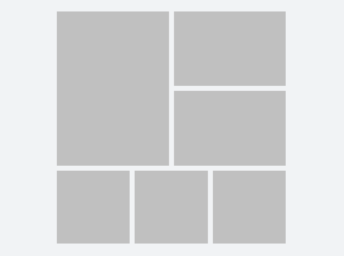
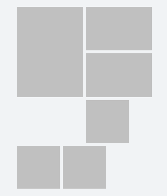
我只有一个CSS网格。宽度是百分比,高度是填充-底部(也是百分比)。
亚像素窗口宽度是个问题--在偶数宽度上,它看起来很大,在奇数上,最下面的平方项被错误地堆叠。
下面是截图,我创建了一个小提琴。
修复方法是创建环绕这两个部分的“行”,但是由于这些行是从外部源生成的,这是不可能的。
也许垫底不是做这件事的方法。愿意接受建议。我尝试过一个JS选项同位素,但是它也有同样的问题。
.grid {
  display: block;
  background-color: #fff;
  margin: 20px 200px;
}

.grid-item {
  height: 0;
  float: left;
  position: relative;

  span {
    position: absolute;
    top: 5px;
    right: 5px;
    bottom: 5px;
    left: 5px;
    background-color: #c7c7c7;
  }

  &.type-1 {
    width: 50%;
   padding-bottom: 68%;
  }

  &.type-2 {
    width: 50%;
    padding-bottom: 34%;
  }

  &.type-3 {
    width: 33.33%;
    padding-bottom: 33.33%;
  }
}


<div class="grid">
  <div class="grid-item type-1"><span></span></div>
  <div class="grid-item type-2"><span></span></div>
  <div class="grid-item type-2"><span></span></div>
  <div class="grid-item type-3"><span></span></div>
  <div class="grid-item type-3"><span></span></div>
  <div class="grid-item type-3"><span></span></div>
</div>
回答 1
Stack Overflow用户
回答已采纳
发布于 2016-12-02 09:56:00
如果网格将保持该布局,您可以尝试:
.grid-item:nth-child(4) {
  clear: both;
}
https://jsfiddle.net/bwxft9d4/
问题似乎是第一个因素。如果你给那个padding-bottom:67.9%,它也会起作用。
页面原文内容由Stack Overflow提供。腾讯云小微IT领域专用引擎提供翻译支持
原文链接:
https://stackoverflow.com/questions/40928470
复制相关文章
相似问题
腾讯云开发者

Copyright © 2013 - 2026 Tencent Cloud. All Rights Reserved. 腾讯云 版权所有
深圳市腾讯计算机系统有限公司 ICP备案/许可证号:粤B2-20090059  粤公网安备44030502008569号
腾讯云计算(北京)有限责任公司 京ICP证150476号 | 京ICP备11018762号