
用seaborn.swarmplot将数据点映射到彩色地图
用seaborn.swarmplot将数据点映射到彩色地图
提问于 2016-11-26 03:23:55
我想要生成一个seaborn.swarmplot,其中单个数据点的颜色映射到一个颜色映射。
我有一个类似于此的DataFrame:
In[48]:df
Out[48]:
      a  c   Key
   0  1  12  1st
   1  4  35  2nd
   2  5  12  2nd
   3  6  46  1st
   4  3  78  1st
   5  4  45  2nd
   6  5  34  1st
   7  6  70  2nd
我用以下代码生成一个集群图:
sns.swarmplot(x='Key', y = 'a', s=20, data = df)得到一个这样的情节:
现在,我希望数据点映射到一个颜色映射,它将根据DataFrame的'c‘列表示值。
我试图在代码中添加'hue = 'c‘,并得到以下内容:
sns.swarmplot(x='Key', y = 'a', hue='c',s=20, data = df)
这是我想要的方向,但是我更喜欢颜色图而不是颜色图,这样低的c值就会变成浅绿色,c值越高,绿色就越深。
作为一个传说,我希望有一个梯度。
我将非常感谢您的帮助!
回答 1
Stack Overflow用户
回答已采纳
发布于 2016-11-26 18:41:08
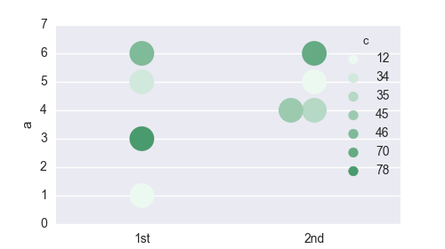
无色棒溶液
没有色条的溶液很容易解决。您需要创建一个颜色的palette (颜色和值一样多),并使用palette参数将其提供给swarmplot。
import pandas as pd
import matplotlib.pyplot as plt
import seaborn as sns
print sns.__version__ # swarmplot requires version 0.7.1

# Reconstruct the dataframe from the question (the hardest part)
a = [1,4,5,6,3,4,5,6]
c = [12,35,12,46,78,45,34,70]
key = [1,2,2,1,1,2,1,2]
key = ["{k}{a}".format(k=k, a={1:"st", 2:"nd"}[k]) for k in key]
df  =pd.DataFrame({"a":a, "c":c, "Key":key})

palette = sns.light_palette("seagreen", reverse=False,  n_colors=len(c) )
sns.swarmplot(x='Key', y = 'a',  hue='c',s=20, data = df, palette=palette)

plt.show()
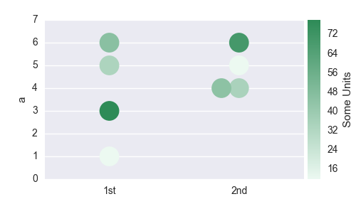
色棒溶液
带有彩色条的解决方案需要更多的工作。我们需要从海运调色板构造一个颜色映射,将这个颜色映射规范化,并创建一个颜色字典,该字典对应于df["c"] dataframe列中的相应颜色。然后,我们再次使用swarmplot关键字向palette提供此字典。
我们还需要删除自动生成的图例,但无用的图例,然后创建一个新的轴在绘图放置色条。
import pandas as pd

import matplotlib.pyplot as plt
import matplotlib.colorbar
import matplotlib.colors
import matplotlib.cm
from mpl_toolkits.axes_grid1 import make_axes_locatable

import seaborn as sns

# recreate the dataframe
a = [1,4,5,6,3,4,5,6]
c = [12,35,12,46,78,45,34,70]
key = [1,2,2,1,1,2,1,2]
key = ["{k}{a}".format(k=k, a={1:"st", 2:"nd"}[k]) for k in key]
df  =pd.DataFrame({"a":a, "c":c, "Key":key})

#Create a matplotlib colormap from the sns seagreen color palette
cmap    = sns.light_palette("seagreen", reverse=False, as_cmap=True )
# Normalize to the range of possible values from df["c"]
norm = matplotlib.colors.Normalize(vmin=df["c"].min(), vmax=df["c"].max())
# create a color dictionary (value in c : color from colormap)
colors = {}
for cval in df["c"]:
    colors.update({cval : cmap(norm(cval))})

#create a figure
fig = plt.figure(figsize=(5,2.8))
#plot the swarmplot with the colors dictionary as palette
m = sns.swarmplot(x='Key', y = 'a',  hue="c", s=20, data = df, palette = colors)
# remove the legend, because we want to set a colorbar instead
plt.gca().legend_.remove()

## create colorbar ##
divider = make_axes_locatable(plt.gca())
ax_cb = divider.new_horizontal(size="5%", pad=0.05)
fig.add_axes(ax_cb)
cb1 = matplotlib.colorbar.ColorbarBase(ax_cb, cmap=cmap,
                                norm=norm,
                                orientation='vertical')
cb1.set_label('Some Units')
plt.show()
页面原文内容由Stack Overflow提供。腾讯云小微IT领域专用引擎提供翻译支持
原文链接:
https://stackoverflow.com/questions/40814612
复制相关文章
相似问题
腾讯云开发者

Copyright © 2013 - 2026 Tencent Cloud. All Rights Reserved. 腾讯云 版权所有
深圳市腾讯计算机系统有限公司 ICP备案/许可证号:粤B2-20090059 ![]() 粤公网安备44030502008569号
粤公网安备44030502008569号
腾讯云计算(北京)有限责任公司 京ICP证150476号 | 京ICP备11018762号