
在python3 (直方图)中绘图
我正在尝试从一系列的等级创建一个直方图。所有年级都是可能的7级(-3,0,2,4,7,10,12)之一.
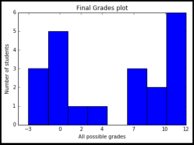
我使用下面的代码来生成绘图,但是我无法确定将x轴标签放在条形图的中间,移除图中间的空间,或者在条形图之间放置一个小空间.
import matplotlib.pyplot as plt
finalGrades = [-3, -3, 10, 2, 10, 0, 7, 7, 12, -3, 7, 0, 12, 12, 12 ,12, 12, 0, 0, 0, 4]
plt.hist(finalGrades, bins=8)
plt.xticks([-3, 0, 2, 4, 7, 10, 12])
plt.title("Final Grades plot")
plt.xlabel("All possible grades")
plt.ylabel("Number of students")
plt.show()
回答 1
Stack Overflow用户
发布于 2016-11-09 20:37:04
人们需要理解的是,这些数字不可能在标杆的中间,因为它们正好在应该在的位置上。(如果你把0等于-3等于2,数学之神就会开始哭泣。)
所以,您在这里要求的是范畴值的直方图,而不是数字值。已经有一些与范畴直方图有关的问题了。
- How to make a histogram from a list of strings in Python?
- Hist in matplotlib: Bins are not centered and proportions not correct on the axis
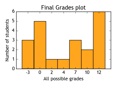
你需要做的是把等级-3、0、2等看作类别(比如red、green、yellow),现在的问题是,每个类别在list finalGrades中表示的频率有多高。因为matplotlib.hist只理解数值数据,所以我们将n类别映射到第一个n整数、-3 -> 0、0 -> 1、2 -> 2等等。
现在,而不是一个等级的列表
[-3, -3, 10, 2, 10, 0, ...]
我们有一个类别编号的列表。
[0, 0, 5, 2, 5, 1, ...]
这些类别数字是等距的,这样直方图就能理解我们想要什么。然后可以用bins = [0,1,2, ... , 6,7]绘制直方图(我们需要8个桶边才能得到7个桶)。最后,有趣的是,align='left'使垃圾箱以滴答号为中心。然后将滴答号设置为范畴值,即可能的等级。
import matplotlib.pyplot as plt

finalGrades = [-3, -3, 10, 2, 10, 0, 7, 7, 12, -3, 7, 0, 12, 12, 12 ,12, 12, 0, 0, 0, 4]
possibleGrades = [-3, 0, 2, 4, 7, 10, 12]
fin = [ possibleGrades.index(i) for i in finalGrades]
plt.hist(fin, bins=range(8), align="left")
plt.xticks(range(7), possibleGrades)

plt.title("Final Grades plot")
plt.xlabel("All possible grades")
plt.ylabel("Number of students")
plt.show()
https://stackoverflow.com/questions/40510070
复制相似问题
腾讯云开发者

Copyright © 2013 - 2026 Tencent Cloud. All Rights Reserved. 腾讯云 版权所有
深圳市腾讯计算机系统有限公司 ICP备案/许可证号:粤B2-20090059 ![]() 粤公网安备44030502008569号
粤公网安备44030502008569号
腾讯云计算(北京)有限责任公司 京ICP证150476号 | 京ICP备11018762号