
python3大熊猫的时间轮
python3大熊猫的时间轮
提问于 2016-11-01 00:42:55
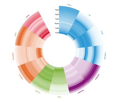
如何创建与下面类似的具有登录/注销事件时间的时间轮?具体来说,寻找相关的平均登录/注销时间与一周中的一天,以时间轮方式?下面的图片是一个例子,但我正在寻找的时间,24小时,每周的日子,时间现在在图片中。我可以使用python和包括登录时间在内的数据集。我还想将颜色与用户类型相关联,例如admins与常规用户之间的关联,或者类似的内容。任何关于如何实现这一目标的想法都将是伟大的。
以下是熊猫数据中的一些样本数据
df:
TimeGenerated        EventID  Username  Message
2012-04-01 00:00:13  4624     Matthew   This guy logged onto the computer for the first time today
2012-04-01 00:00:14  4624     Matthew   This guy authenticated for some stuff
2012-04-01 00:00:15  4624     Adam      This guy logged onto the computer for the first time today
2012-04-01 00:00:16  4624     James     This guy logged onto the computer for the first time today
2012-04-01 12:00:17  4624     Adam      This guy authenticated for some stuff
2012-04-01 12:00:18  4625     James     This guy logged off the computer for the last time today
2012-04-01 12:00:19  4624     Adam      This guy authenticated for some stuff
2012-04-01 12:00:20  4625     Adam      This guy logged off the computer for the last time today
2012-04-01 12:00:21  4625     Matthew   This guy logged off the computer for the last time today
回答 2
Stack Overflow用户
回答已采纳
发布于 2018-02-27 13:37:17
基本上,您需要执行两个不相交的任务:
- 创建一个要可视化的频率表
- 定义一个函数来可视化给定的表
对于第一个任务,我假设您只需要一个带工作日和小时的枢轴表。我产生了一个随机的:
import pandas as pd
import matplotlib.pyplot as plt
import numpy as np
import pandas as pd
import matplotlib as mpl
import matplotlib.cm as cm
import calendar
# generate the table with timestamps
np.random.seed(1)
times = pd.Series(pd.to_datetime("Nov 1 '16 at 0:42") + pd.to_timedelta(np.random.rand(10000)*60*24*40, unit='m'))
# generate counts of each (weekday, hour)
data = pd.crosstab(times.dt.weekday, times.dt.hour.apply(lambda x: '{:02d}:00'.format(x))).fillna(0)
data.index = [calendar.day_name[i][0:3] for i in data.index]
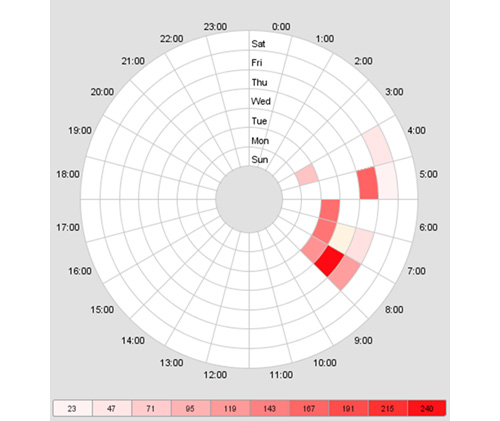
print(data.T)它看起来像这样。此时,每个数字都是登录的计数器:
       Mon  Tue  Wed  Thu  Fri  Sat  Sun
col_0
00:00   55   56   67   60   60   62   45
01:00   51   65   70   65   60   59   40
02:00   47   76   67   68   61   63   51
....
现在,让我们为这张桌子画方向盘!它将由多个饼图组成:
# make a heatmap building function
def pie_heatmap(table, cmap=cm.hot, vmin=None, vmax=None,inner_r=0.25, pie_args={}):
    n, m = table.shape
    vmin= table.min().min() if vmin is None else vmin
    vmax= table.max().max() if vmax is None else vmax

    centre_circle = plt.Circle((0,0),inner_r,edgecolor='black',facecolor='white',fill=True,linewidth=0.25)
    plt.gcf().gca().add_artist(centre_circle)
    norm = mpl.colors.Normalize(vmin=vmin, vmax=vmax)
    cmapper = cm.ScalarMappable(norm=norm, cmap=cmap)
    for i, (row_name, row) in enumerate(table.iterrows()):
        labels = None if i > 0 else table.columns
        wedges = plt.pie([1] * m,radius=inner_r+float(n-i)/n, colors=[cmapper.to_rgba(x) for x in row.values],
            labels=labels, startangle=90, counterclock=False, wedgeprops={'linewidth':-1}, **pie_args)
        plt.setp(wedges[0], edgecolor='white',linewidth=1.5)
        wedges = plt.pie([1], radius=inner_r+float(n-i-1)/n, colors=['w'], labels=[row_name], startangle=-90, wedgeprops={'linewidth':0})
        plt.setp(wedges[0], edgecolor='white',linewidth=1.5)


plt.figure(figsize=(8,8))
pie_heatmap(data, vmin=-20,vmax=80,inner_r=0.2)

plt.show();
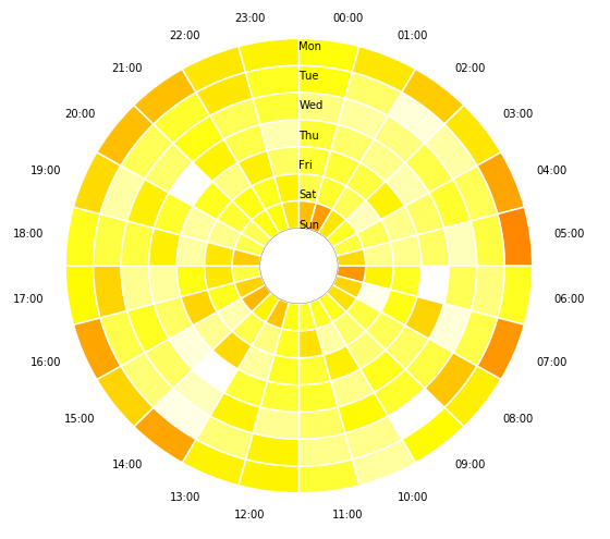
希望这能帮到你。
Stack Overflow用户
发布于 2018-02-27 22:23:45
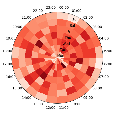
从@DavidDale的答案中生成数据,可以在极轴上绘制表的pcolormesh图。这将直接给出所需的情节。
import pandas as pd
import matplotlib.pyplot as plt
import numpy as np
import calendar

# generate the table with timestamps
np.random.seed(1)
times = pd.Series(pd.to_datetime("Nov 1 '16 at 0:42") +
                  pd.to_timedelta(np.random.rand(10000)*60*24*40, unit='m'))
# generate counts of each (weekday, hour)
data = pd.crosstab(times.dt.weekday,
                   times.dt.hour.apply(lambda x: '{:02d}:00'.format(x))).fillna(0)
data.index = [calendar.day_name[i][0:3] for i in data.index]
data = data.T

# produce polar plot
fig, ax = plt.subplots(subplot_kw=dict(projection='polar'))
ax.set_theta_zero_location("N")
ax.set_theta_direction(-1)

# plot data
theta, r = np.meshgrid(np.linspace(0,2*np.pi,len(data)+1),np.arange(len(data.columns)+1))
ax.pcolormesh(theta,r,data.T.values, cmap="Reds")

# set ticklabels
pos,step = np.linspace(0,2*np.pi,len(data),endpoint=False, retstep=True)
pos += step/2.
ax.set_xticks(pos)
ax.set_xticklabels(data.index)

ax.set_yticks(np.arange(len(data.columns)))
ax.set_yticklabels(data.columns)
plt.show()
页面原文内容由Stack Overflow提供。腾讯云小微IT领域专用引擎提供翻译支持
原文链接:
https://stackoverflow.com/questions/40352607
复制相关文章
相似问题
腾讯云开发者

Copyright © 2013 - 2026 Tencent Cloud. All Rights Reserved. 腾讯云 版权所有
深圳市腾讯计算机系统有限公司 ICP备案/许可证号:粤B2-20090059 ![]() 粤公网安备44030502008569号
粤公网安备44030502008569号
腾讯云计算(北京)有限责任公司 京ICP证150476号 | 京ICP备11018762号