
透明背景的纯css折叠效果
透明背景的纯css折叠效果
提问于 2016-10-25 06:02:18
请看图片。如何使这种折叠效果。我迫切需要透明度。
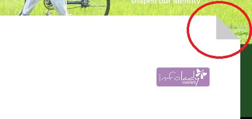
我试过这个。但这在Firefox和IE中没有浏览器支持。此解决方案只适用于Chrome。
.fold-right{
    position: relative;
}
.fold-right:before{
    content: "";
    position: absolute;
    top: -50px;
    right: 0;
    border: 25px solid #ccc;
    -webkit-clip-path: polygon(100% 100%, 0 100%, 0 0);
    clip-path: polygon(100% 100%, 0 100%, 0 0);
}
.fold-right:after{
    content: "";
    position: absolute;
    top: -49px;
    left: -49px;
    background: #fff;
    width: 100%;
    height: 49px;
    -webkit-clip-path: polygon(49px 0, 100% 0, 100% 100%, 49px 100%);
    clip-path: polygon(49px 0, 100% 0, 100% 100%, 49px 100%);
}回答 5
Stack Overflow用户
回答已采纳
发布于 2016-10-25 06:22:26
试试这个片段。希望这个片段能帮到你。
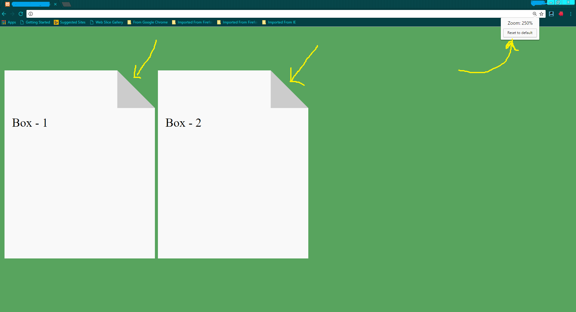
body{
background: #58A45E;
}
.fold-right{
position: relative;
width: 200px;
height: 200px;
background: #f9f9f9;
margin-top: 100px;
box-sizing: border-box;
padding: 10px;
display: inline-block;
}
.fold-right:before{
content: "";
position: absolute;
top: -50px;
right: 0;
border-left: 0px solid transparent;
border-right: 50px solid transparent;
border-bottom: 50px solid #ccc;
}
.fold-right:after{
content: "";
position: absolute;
top: -50px;
left: 0px;
background: #f9f9f9;
width: calc(100% - 50px);
height: 50px;
}<div class="fold-right">Box - 1</div>
<div class="fold-right">Box - 2</div>
Stack Overflow用户
发布于 2016-10-25 06:22:51
我使用了独立的div来创建折叠的corener效应,而不是实际的内容区域。然后,我使用了一个样式边框来创建一个三角形,它可以在所有浏览器上工作。
.folded-wrapper {
  position: relative;
}
.folded-top {
  height: 20px;
  position: absolute;
  left: 0;
  right: 20px;
  background: red;
}
.folded-top:after {
  width: 0;
  height: 0;
  content: "";
  position: absolute;
  right: -20px;
  border-style: solid;
  border-width: 20px 0 0 20px;
  border-color: transparent transparent transparent #007bff;
}
.folded-content {
  width: 100%;
  background: red;
  height: 200px;
  position: relative;
  top: 20px;
}<div class="folded-wrapper">
<div class="folded-top"></div>
<div class="folded-content"></div>
</div>
Stack Overflow用户
发布于 2016-10-25 06:31:24
下面是编辑过的代码片段版本。
html,
body {
  padding: 0;
  margin: 0;
  font: 1em/1.4 Cambria, Georgia, sans-serif;
  color: #333;
  background: #ccc;
}
header,
hgroup {
  display: block;
}
a:link,
a:visited {
  border-bottom: 1px solid #c55500;
  color: #c55500;
  text-decoration: none;
}
a:visited {
  border-bottom: 1px solid #730800;
  color: #730800;
}
a:hover,
a:focus,
a:active {
  border: 0;
  color: #fff;
  background: #c55500;
}
a:visited:hover,
a:visited:focus,
a:visited:active {
  color: #fff;
  background: #730800;
}
.container {
  width: 540px;
  padding: 0 0 10px;
  margin: 0 auto 30px;
}
.header {
  border-bottom: 1px solid #ddd;
}
.footer {
  padding: 10px 0 30px;
  border-top: 1px solid #ddd;
  margin-bottom: 0;
}
h1 {
  margin: 1em 0 0;
  font-size: 2.5em;
  font-weight: normal;
  line-height: 1.2;
  text-align: center;
}
h2 {
  margin: 0.5em 0 1.5em;
  font-size: 1.25em;
  font-weight: normal;
  font-style: italic;
  text-align: center;
}
p {
  margin: 1em 0;
  line-height: 1.4em;
}
pre {
  margin: 1.4em 0;
  font-size: 12px;
  line-height: 1.4em;
  white-space: pre-wrap;
  word-wrap: break-word;
}
.follow {
  clear: both;
  margin-top: 2em;
  font-size: 1.125em;
}
.follow span {
  font-weight: bold;
}
/* == FOLDED CORNERS */

.note {
  position: relative;
  width: 480px;
  padding: 1em 1.5em;
  margin: 2em auto;
  color: #fff;
  background: #97C02F;
  overflow: hidden;
}
.note:before {
  content: "";
  position: absolute;
  top: 0;
  right: 0;
  border-width: 0 16px 16px 0;
  /* This trick side-steps a webkit bug */
  border-style: solid;
  border-color: #ccc #ccc #658E15 #658E15;
  /* A bit more verbose to work with .rounded too */
  background: #658E15;
  /* For when also applying a border-radius */
  display: block;
  width: 0;
  /* Only for Firefox 3.0 damage limitation */
  /* Optional: shadow */
  -webkit-box-shadow: 0 1px 1px rgba(0, 0, 0, 0.3), -1px 1px 1px rgba(0, 0, 0, 0.2);
  -moz-box-shadow: 0 1px 1px rgba(0, 0, 0, 0.3), -1px 1px 1px rgba(0, 0, 0, 0.2);
  box-shadow: 0 1px 1px rgba(0, 0, 0, 0.3), -1px 1px 1px rgba(0, 0, 0, 0.2);
}
.note.red {
  background: #C93213;
}
.note.red:before {
  border-color: #ccc #ccc #97010A #97010A;
  background: #97010A;
}
.note.blue {
  background: #53A3B4;
}
.note.blue:before {
  border-color: #ccc #ccc transparent transparent;
  background: transparent;
}
.note.taupe {
  background: #999868;
}
.note.taupe:before {
  border-color: #ccc #ccc #BDBB8B #BDBB8B;
  background: #BDBB8B;
}
/* ROUNDED CORNERS VERSION
           * All modern browsers can produce this effect with a single pseudo-element.
           * However, they all have bugs (mainly to do with border-radius) that make this a bit tricky.
           * As far as I can tell, this is the only cross-browser method for the moment.
           * Can't use this method for the simple effect because Opera 11 will only show backgrounds
           * through transparent borders if there is a border-radius applied.
           */

.note.rounded {
  -webkit-border-radius: 5px 0 5px 5px;
  -moz-border-radius: 5px 0 5px 5px;
  border-radius: 5px 0 5px 5px;
}
.note.rounded:before {
  border-width: 8px;
  /* Triggers a 1px 'step' along the diagonal in Safari 5 (and Chrome 10) */
  border-color: #ccc #ccc transparent transparent;
  /* Avoids the 1px 'step' in webkit. Background colour shows through */
  -webkit-border-bottom-left-radius: 5px;
  -moz-border-radius: 0 0 0 5px;
  border-radius: 0 0 0 5px;
}
.note p {
  margin: 0;
}
.note p + p {
  margin: 1.5em 0 0;
}<div class="container header">
<header>
<hgroup>
<h1>Pure CSS folded-corner effect</h1>
</hgroup>
<p><em>Known support</em>: Firefox 3.5+, Chrome 4+, Safari 4+, Opera 10+, IE 8+.</p>
</header>
</div>
<div class="note">
<p>Lorem ipsum dolor sit amet, consectetur adipiscing elit. Mauris pulvinar rhoncus risus, vel ornare lacus sagittis sit amet. Duis vel sem magna. Proin pulvinar velit eleifend ligula ultrices vestibulum. Nunc posuere dolor eu mauris feugiat dignissim.</p>
<p>Lorem ipsum dolor sit amet, consectetur adipiscing elit. Mauris pulvinar rhoncus risus, vel ornare lacus sagittis sit amet. Duis vel sem magna. Proin pulvinar velit eleifend ligula ultrices vestibulum. Nunc posuere dolor eu mauris feugiat dignissim.</p>
</div>
<div class="note red rounded">
<p>Lorem ipsum dolor sit amet, consectetur adipiscing elit. Mauris pulvinar rhoncus risus, vel ornare lacus sagittis sit amet. Duis vel sem magna. Proin pulvinar velit eleifend ligula ultrices vestibulum. Nunc posuere dolor eu mauris feugiat dignissim.</p>
</div>
<div class="note blue">
<p>Lorem ipsum dolor sit amet, consectetur adipiscing elit. Mauris pulvinar rhoncus risus, vel ornare lacus sagittis sit amet. Duis vel sem magna. Proin pulvinar velit eleifend ligula ultrices vestibulum. Nunc posuere dolor eu mauris feugiat dignissim.</p>
</div>
<div class="note taupe">
<p>Lorem ipsum dolor sit amet, consectetur adipiscing elit. Mauris pulvinar rhoncus risus, vel ornare lacus sagittis sit amet. Duis vel sem magna. Proin pulvinar velit eleifend ligula ultrices vestibulum. Nunc posuere dolor eu mauris feugiat dignissim.</p>
</div>
<div class="container footer">
<p>Pure CSS folded-corner effect.</p>
</div>
页面原文内容由Stack Overflow提供。腾讯云小微IT领域专用引擎提供翻译支持
原文链接:
https://stackoverflow.com/questions/40232452
复制相关文章
相似问题
腾讯云开发者

Copyright © 2013 - 2026 Tencent Cloud. All Rights Reserved. 腾讯云 版权所有
深圳市腾讯计算机系统有限公司 ICP备案/许可证号:粤B2-20090059  粤公网安备44030502008569号
腾讯云计算(北京)有限责任公司 京ICP证150476号 | 京ICP备11018762号