
Flexbox布局模式1/3
Flexbox布局模式1/3
提问于 2016-10-18 00:17:38
我正在寻找一些在柔性盒中准备布局模式的帮助,问题是我将在容器中打印一组div,并且我不能更改呈现逻辑(即添加一些包装行),但是,我想得到如下内容:
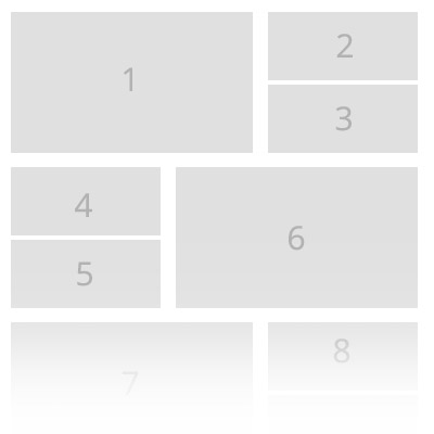
不幸的是,每次都被卡住了,结果一点也不满意:/ divs的高度是固定的,1是2+3+间隙之和。
https://jsfiddle.net/zechkgf4/
[]提前谢谢你
回答 2
Stack Overflow用户
回答已采纳
发布于 2016-10-18 02:15:30
您想要做的是不能像在link中所指出的那样,使用@Michael_B提供的flex-box。
您可以使用浮点数生成非常接近您想要的内容:
.boxed {
  width:100%;
  background:#fff;
  overflow:hidden;
}
.boxed div {
  height:50px;
  margin:4px;
  background:#f5f5f5;
  width:calc(40% - 16px);
  float: left;
}

.boxed div:nth-child(6n + 1), .boxed div:nth-child(6n + 4) {
  background:salmon;
  height:108px;
  width:60%;
}

 .boxed div:nth-child(6n + 4), div:nth-child(6n + 5),  div:nth-child(6n + 6) {
   float: right;
}<div class="boxed">
<div>1</div>
<div>2</div>
<div>3</div>
<div>4</div>
<div>5</div>
<div>6</div>
<div>1</div>
<div>2</div>
<div>3</div>
<div>4</div>
<div>5</div>
<div>6</div>
</div>
注意,右对齐的大块改为6n+4,而不是6n+6。
Stack Overflow用户
发布于 2017-04-11 23:10:37
相反,这种布局可以使用flexbox,只需稍微修改一下标记。下面是一个有用的示例:http://codepen.io/timothylong/pen/XRrBBW
HTML:
<main>
    <section class="large item">
        1 (Large)
    </section>
    <div class="small">
        <section class="item">
            2 (Small)
        </section>
        <section class="item">
            3 (Small)
        </section>
    </div>
</main>
SCSS:
main {
    display: flex;
    flex-flow: row;
    .item {
        display: flex;
        flex: 1;
    }
    .large {
        flex: 0 0 60%;
    }
    .small {
        display: flex;
        flex-direction: column;
    }
}.small包装器允许我们使用flex-direction: column垂直堆叠两个较小的模块。
页面原文内容由Stack Overflow提供。腾讯云小微IT领域专用引擎提供翻译支持
原文链接:
https://stackoverflow.com/questions/40097600
复制相关文章
相似问题
腾讯云开发者

Copyright © 2013 - 2026 Tencent Cloud. All Rights Reserved. 腾讯云 版权所有
深圳市腾讯计算机系统有限公司 ICP备案/许可证号:粤B2-20090059  粤公网安备44030502008569号
腾讯云计算(北京)有限责任公司 京ICP证150476号 | 京ICP备11018762号