
R中矩阵散点图上作为热图的叠加值
我使用read.csv函数导入了9列数据,调用了对象myData,并使用以下对函数绘制了它。
  pairs(myData[,c(1:9)],
  lower.panel = panel.smooth,
  diag.panel = NULL,
  pch=1, cex= 1,
  cex.labels = 1,
  cex.axis = 1,
  gap = 0.35,
  font.labels = NULL,
  col="Black")
我所希望的是将不同图形的人之间的相关性作为矩阵散点图上的热图,作为个人散点图的背景颜色。计算pearson相关性所需的函数如下
cor(myData, method = "pearson")这个函数给出了我需要的数字(构造一个热图),但是我不知道如何根据生成的人的值在lower.panel参数中对单个的图进行着色。
回答 3
Stack Overflow用户
发布于 2016-10-13 15:23:29
我认为我有一个答案,应该工作适度,使用基本图形。是否比我不确定的评论中提到的corrgram替代方案更好,但是.它严重依赖于其他几个帖子,如this question on adding colour to panel plot background和the answer to this question on obtaining a colour gradient.。
# Sample data to work with
data(iris)

# create a custom panel function that colours panels based on bg (taken from the first
# linked question. I've just added a line to add a loess smoother, as per your code

mypanel <- function(x, y, ...){
  count <<- count+1
  bg <- color[count]
  ll <- par("usr")
  rect(ll[1], ll[3], ll[2], ll[4], col=bg)
  lines(lowess(x, y), col = "red")
  points(x, y, cex=0.5)
}

# get the values for the pearson correlations
corres <- cor(iris[1:4], method = "pearson")[lower.tri(cor(iris[1:4])) == T]

# create a colour ramp between two colours, for as many values as you have panels.
colfunc <- colorRampPalette(c("gray90", "gray20"))
color <- colfunc(length(corres))

# reorder that colour vector based on the rank of the correlation values
# (so the "highest" colour matches the highest value etc.)
color <- color[order(corres)]

# counter used in panel function
count <- 0

# plot the pairs plot using "mypanel" on lower.panel rather than panel.smooth
pairs(iris[,c(1:4)],
      lower.panel = mypanel,
      diag.panel = NULL,
      pch=1, cex= 1,
      cex.labels = 1,
      cex.axis = 1,
      gap = 0.35,
      font.labels = NULL,
      col="Black")
这导致了这场阴谋。在colourRampPalette中摆弄颜色应该足够给你想要的东西了。
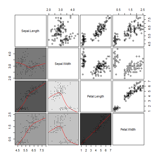
希望这有用。
Stack Overflow用户
发布于 2016-10-13 15:37:28
你可以试试护目镜。在那里,改变背景颜色相对容易。其思想是像pairs()函数那样绘制数据。然后,根据pearson系数创建一个热图颜色代码,并最终更改背景。
library(ggplot2)
library(GGally)
# iris as testdata

# The plot with smooth lines and points in the upper panel.
p <- ggpairs(iris[-5], upper=list(continuous="points"), lower=list(continuous="smooth_loess"), diag=list(continuous="barDiag"))

# Create a heatmap color map
# correlations
pr <- cor(iris[-5])
# set breaks
breaks <-  seq(-1,1.0,0.01)
# binning
pr_b <- .bincode(pr, breaks, include.lowest = T)
# transform the pearsons in colors using redblue() palette
pr_b <- matrix(factor(pr_b, levels = 1:length(breaks), labels = rev(redblue(length(breaks)))), p$nrow)
pr
             Sepal.Length Sepal.Width Petal.Length Petal.Width
Sepal.Length    1.0000000  -0.1175698    0.8717538   0.8179411
Sepal.Width    -0.1175698   1.0000000   -0.4284401  -0.3661259
Petal.Length    0.8717538  -0.4284401    1.0000000   0.9628654
Petal.Width     0.8179411  -0.3661259    0.9628654   1.0000000
pr_b
     [,1]      [,2]      [,3]      [,4]
[1,] "#FF0303" "#E0E0FF" "#FF2121" "#FF3030"
[2,] "#E0E0FF" "#FF0303" "#9191FF" "#A1A1FF"
[3,] "#FF2121" "#9191FF" "#FF0303" "#FF0A0A"
[4,] "#FF3030" "#A1A1FF" "#FF0A0A" "#FF0303"

# Update the background color using a for loop. The diagonal slots are overwritten by an empty plot
for(i in 1:p$nrow) {
  for(j in 1:p$ncol){
    p[i,j] <- p[i,j] +
      theme(panel.background= element_rect(fill=pr_b[i,j]))
    if(i == j){
      p[i,j] <-ggplot()+ annotate("text",5,5,label=colnames(iris)[i]) + theme_void()
  }
}}

# The plot
p
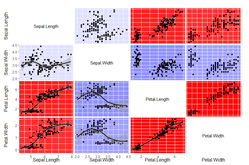
Stack Overflow用户
发布于 2017-03-28 17:18:40
这很容易使用“corrgram”包,它附带了'panel.pts‘和'panel.shade’函数。我将这两个函数合并到一个名为“panel.shadepoints”的函数中,并定义了一个颜色较浅的斜坡,以便仍然可以看到这些点。
panel.shadepoints <- function(x, y, corr=NULL, col.regions, cor.method, ...){

  # If corr not given, try to calculate it
  if(is.null(corr)) {
    if(sum(complete.cases(x,y)) < 2) {
      warning("Need at least 2 complete cases for cor()")
      return()
    } else {
      corr <- cor(x, y, use='pair', method=cor.method)
    }
  }

  ncol <- 14
  pal <- col.regions(ncol)
  col.ind <- as.numeric(cut(corr, breaks=seq(from=-1, to=1, length=ncol+1),
                            include.lowest=TRUE))
  usr <- par("usr")
  # Solid fill
  rect(usr[1], usr[3], usr[2], usr[4], col=pal[col.ind], border=NA)

  # Overlay points
  plot.xy(xy.coords(x, y), type="p", ...)

  # Boounding box needs to plot on top of the shading, so do it last.
  box(col='lightgray')
}

data(iris)
redblue<-colorRampPalette(c("pink","gray90","skyblue"))
corrgram(iris, panel=panel.shadepoints, col=redblue)
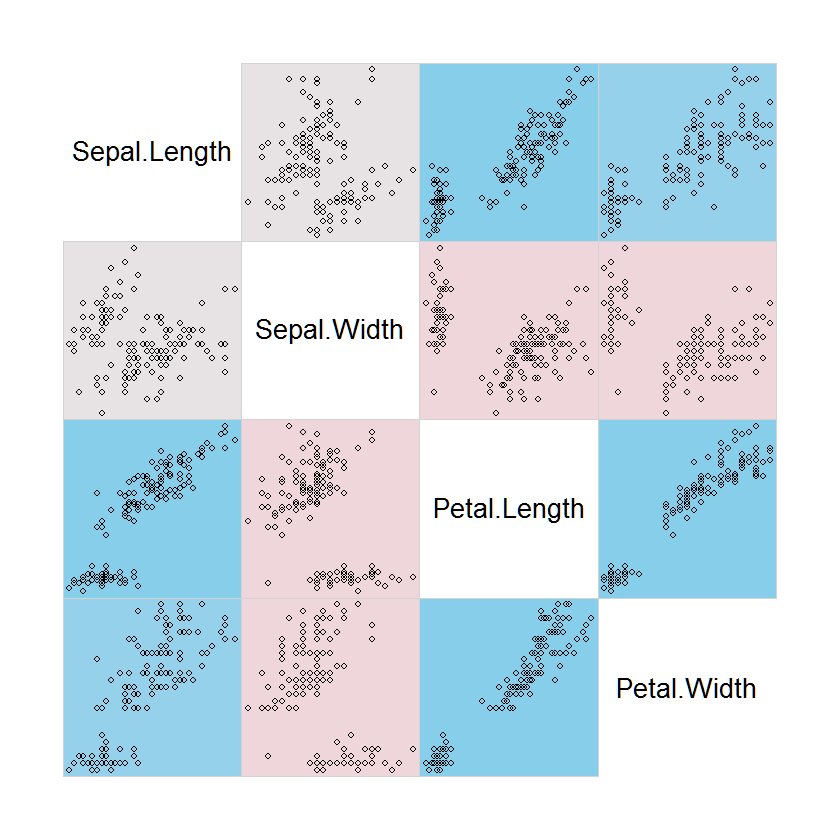
https://stackoverflow.com/questions/40023114
复制相似问题
腾讯云开发者

Copyright © 2013 - 2026 Tencent Cloud. All Rights Reserved. 腾讯云 版权所有
深圳市腾讯计算机系统有限公司 ICP备案/许可证号:粤B2-20090059  粤公网安备44030502008569号
腾讯云计算(北京)有限责任公司 京ICP证150476号 | 京ICP备11018762号