
由边界和边界半径构成的动态心电图脉冲线
我有如下代码:
.cWrapper {
  display: flex;
}
.cLine {
  width: 100px;
  height: 100px;
  border: 1px solid;
}
.cLine1 {
  background-color: transparent;
  border-color: transparent gray gray transparent;
  border-bottom-right-radius: 20px;
}
.cLine2 {
  width: 20px;
  height: 150px;
  background-color: transparent;
  border-color: gray gray transparent transparent;
  border-top-right-radius: 20px;
}
.cLine3 {
  width: 20px;
  height: 50px;
  background-color: transparent;
  border-color: transparent gray gray transparent;
  border-bottom-right-radius: 20px;
  align-self: flex-end;
}
.cLine4 {
  width: 50px;
  height: 100px;
  background-color: transparent;
  border-color: transparent transparent gray transparent;
}<div class="cWrapper">
<canvas class="cLine cLine1"></canvas>
<canvas class="cLine cLine2"></canvas>
<canvas class="cLine cLine3"></canvas>
<canvas class="cLine cLine4"></canvas>
</div>
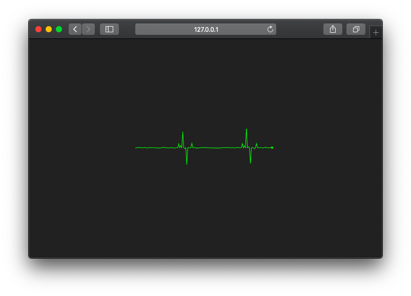
我尝试用border和border-radius建立一条心电脉冲线。这对我来说很容易(我得把它设计得有点别扭,但现在它对我有好处)。因此,下一个支柱是动画这条线,并制作一条心电图脉搏线,如本例所示:

现在我还不知道该怎么做。我在jquery和animate()以及css3 keyframes上都试过了,但是没有什么效果。有人知道怎么做吗?谢谢。
回答 2
Stack Overflow用户
发布于 2016-10-13 10:57:31
我为医疗保健开发软件解决方案,我需要一个自己的加载指示器,当我不得不等待任何数据等。所以我决定做一个心电脉搏线动画,以停留在这个软件的主题。之后,我看到了windows 8的加载指示符,它的工作方式如下:

在那之后,我有了这个想法,也可以使用这样的动画(每个动画都跟着小圆圈),因为这是现代网络解决方案的已知标准。所以我试着做一些小圆圈互相跟踪,但是以心电脉冲线的形式出现。它工作得很好,看上去也很漂亮。我用的是css3 keyframes。现在看起来是这样的:
.cWrapper {
  width: 200px;
  height: 300px;
  background-color: transparent;
  position: relative;
  display: flex;
  justify-content: flex-start;
}
.cPoint {
  width: 10px;
  height: 10px;
  border-radius: 10px;
  background-color: black;
  position: absolute;
  left: 0px;
  top: 50px;
  -webkit-animation-name: pulse;
  /* Chrome, Safari, Opera */
  -webkit-animation-duration: 2.0s;
  /* Chrome, Safari, Opera */
  -webkit-animation-timing-function: linear;
  -webkit-animation-iteration-count: infinite;
  animation-name: pulse;
  animation-duration: 2.0s;
  animation-timing-function: linear;
  animation-iteration-count: infinite;
}
.p1 {
  -webkit-animation-delay: 0s;
  animation-delay: 0s;
}
.p2 {
  -webkit-animation-delay: 0.2s;
  animation-delay: 0.2s;
}
.p3 {
  -webkit-animation-delay: 0.4s;
  animation-delay: 0.4s;
}
.p4 {
  -webkit-animation-delay: 0.6s;
  animation-delay: 0.6s;
}
.p5 {
  -webkit-animation-delay: 0.8s;
  animation-delay: 0.8s;
}
@-webkit-keyframes pulse {
  0%: {
    left: 0px;
    top: 50px;
  }
  30% {
    left: 50px;
    top: 50px;
  }
  40% {
    left: 70px;
    top: 0px;
  }
  60% {
    left: 90px;
    top: 100px
  }
  70% {
    left: 110px;
    top: 50px;
  }
  100% {
    left: 160px;
    top: 50px;
  }
}
@keyframes pulse {
  0%: {
    left: 0px;
    top: 50px;
  }
  30% {
    left: 50px;
    top: 50px;
  }
  40% {
    left: 70px;
    top: 0px;
  }
  60% {
    left: 90px;
    top: 100px
  }
  70% {
    left: 110px;
    top: 50px;
  }
  100% {
    left: 160px;
    top: 50px;
  }
}<div class="cWrapper">
<div class="cPoint p1"></div>
<div class="cPoint p2"></div>
<div class="cPoint p3"></div>
<div class="cPoint p4"></div>
<div class="cPoint p5"></div>
</div>
所以这解决了我的要求。谢谢。
Stack Overflow用户
发布于 2020-09-05 10:53:05
我认为解决这个问题的最方便的方法是使用包装在web组件中的画布。检查这 github存储库中的源代码
document.body.innerHTML += '<ecg-line></ecg-line>';
ecgLine((bang) => setInterval(() => bang(), 1000));
https://stackoverflow.com/questions/40014999
复制相似问题
腾讯云开发者

Copyright © 2013 - 2026 Tencent Cloud. All Rights Reserved. 腾讯云 版权所有
深圳市腾讯计算机系统有限公司 ICP备案/许可证号:粤B2-20090059  粤公网安备44030502008569号
腾讯云计算(北京)有限责任公司 京ICP证150476号 | 京ICP备11018762号