
创建自定义geom以计算汇总统计信息并在绘图区域外显示它们*
我是R包EnvStats的创建者。
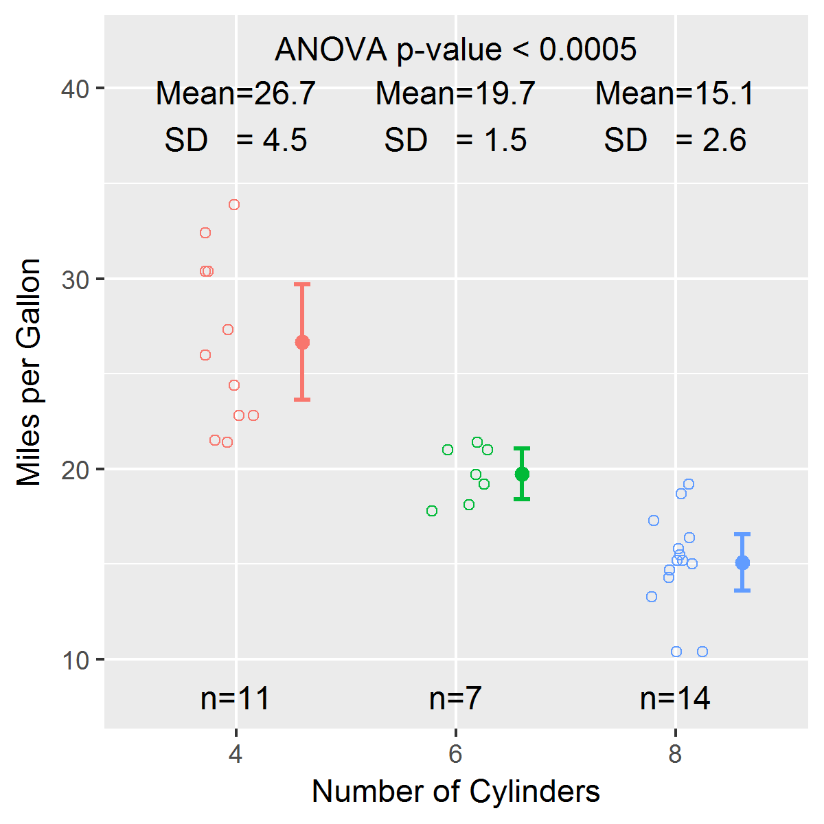
有一个函数我经常使用,叫做stripChart。我刚刚开始学习ggplot2,在过去的几天里,我一直在仔细研究哈德利的书、温斯顿的书、StackOverflow和其他资源,试图创建一个与stripChart类似的geom。我无法弄清楚如何在geom中计算汇总统计数据和测试结果,然后将它们放置在x轴勾标之下,并位于绘图区域的顶部。下面是一个使用内置数据集mtcars的简单示例
library(EnvStats)
stripChart(mpg ~ cyl, data = mtcars, col = 1:3,
  xlab = "Number of Cylinders", ylab = "Miles per Gallon", p.value = TRUE)
下面是一个geom的早期草案,试图复制stripChart的大部分功能:
geom_stripchart <-
function(..., x.nudge = 0.3,
  jitter.params = list(width = 0.3, height = 0),
  mean.params = list(size = 2, position = position_nudge(x = x.nudge)),
  errorbar.params = list(size = 1, width = 0.1,
  position = position_nudge(x = x.nudge)),
  n.text = TRUE, mean.sd.text = TRUE, p.value = FALSE) {
    params <- list(...)
    jitter.params   <- modifyList(params, jitter.params)
    mean.params     <- modifyList(params, mean.params)
    errorbar.params <- modifyList(params, errorbar.params)

    jitter <- do.call("geom_jitter", jitter.params)
    mean   <- do.call("stat_summary", modifyList(
      list(fun.y = "mean", geom = "point"),
      mean.params)
    )
    errorbar <- do.call("stat_summary", modifyList(
      list(fun.data = "mean_cl_normal", geom = "errorbar"),
      errorbar.params)
    )

    stripchart.list <- list(
      jitter,
      theme(legend.position = "none"),
      mean,
      errorbar
    )

    if(n.text || mean.sd.text) {
# Compute summary statistics (sample size, mean, SD) here?
      if(n.text) {
# Add information to stripchart.list to
# compute sample size per group and add text below x-axis
      }
      if(mean.sd.text) {
# Add information to stripchart.list to
# compute mean and SD and add text above top of plotting region
      }
    }
    if(p.value) {
# Add information to stripchart.list to
# compute p-value (and 95% CI for difference if only 2 groups)
# and add text above top of plotting region
    }
    stripchart.list
}


library(ggplot2)
dev.new()
p <- ggplot(mtcars, aes(x = factor(cyl), y = mpg, color = factor(cyl)))
p + geom_stripchart() +
    xlab("Number of Cylinders") +
    ylab("Miles per Gallon")
你可以看到情节几乎是一样的。我遇到的问题是,如何将样本大小添加到每一组下面,并在顶部添加均值和标准偏差,以及方差分析的结果(此时忽略了不等方差的问题)。我知道计算摘要统计数据并将其绘制为绘图区域内的点或文本很简单,但我不想这样做。
我已经找到了一些示例,显示了如何将文本放置在情节之外(例如,使用annotation_custom()):
问题是,当用户已经预定义了注释是什么时,这些示例说明了如何做到这一点。我的问题是,在geom_stripchart中,我必须根据调用ggplot()中定义的数据计算汇总统计数据和测试结果,然后将这些结果传递给annotation_custom()。我不知道如何获得在调用ggplot()中定义的x和y变量。
回答 1
Stack Overflow用户
发布于 2016-10-22 01:57:47
我在这里发布了一个更简单的问题:ggplot2:向x轴刻度标签添加样本大小信息
我已经更新了EnvStats包,以包括一个名为geom_stripchart的geom,它是对EnvStats函数stripChart的一种改编。有关更多信息和示例列表,请参见帮助档案 for geom_stripchart。下面是一个简单的例子:
library(ggplot2)
library(EnvStats)

p <- ggplot(mtcars, aes(x = factor(cyl), y = mpg, color = factor(cyl)))

p + geom_stripchart(test.text = TRUE) +
  labs(x = "Number of Cylinders", y = "Miles per Gallon")
https://stackoverflow.com/questions/39993117
复制相似问题
腾讯云开发者

Copyright © 2013 - 2026 Tencent Cloud. All Rights Reserved. 腾讯云 版权所有
深圳市腾讯计算机系统有限公司 ICP备案/许可证号:粤B2-20090059 ![]() 粤公网安备44030502008569号
粤公网安备44030502008569号
腾讯云计算(北京)有限责任公司 京ICP证150476号 | 京ICP备11018762号