
在条形图上叠加条纹图-如何对齐列?
在条形图上叠加条纹图-如何对齐列?
提问于 2016-09-23 01:53:10
我有一个使用stripchart的散点图覆盖的桶形图。
Barplot(data1means)
stripchart(data1, add=TRUE, vertical = TRUE)
但是,散点图上的点与条形图上的条不对齐,如下所示:
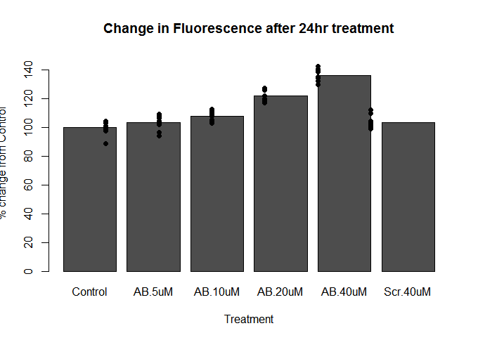
。
那么,我如何改变散点图的间距,使它们匹配起来呢?据我所知,stripchart没有像barplot那样有space或width变量。
回答 1
Stack Overflow用户
回答已采纳
发布于 2016-09-23 02:19:47
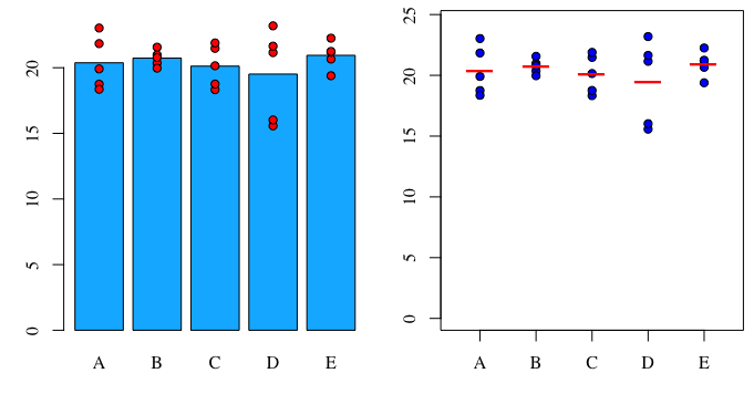
使用基本图形,您可以使用points函数在条形图的顶部绘制点。我们从条形图本身得到条子的x位置。我还包括了另一种方法,在这种方法中,方法是用点标记而不是条形图来绘制:
# Fake data
set.seed(1)
dat = data.frame(group=LETTERS[1:5], y=rnorm(25,20,2))

# Assign the barplot to x so that x will contain the bar positions.
x = barplot(tapply(dat$y, dat$group, FUN=mean), ylim=c(0,1.05*max(dat$y)), col=hcl(240,100, 70))
points(rep(x, table(dat$group)), dat$y[order(dat$group)], pch=21, bg="red")

plot(rep(1:length(unique(dat$group)), table(dat$group)),
     dat$y[order(dat$group)], pch=21, bg="blue",
     ylim=c(0,1.05*max(dat$y)), xlim=c(0.5,5.5), xaxt="n")
points(1:length(unique(dat$group)),
         tapply(dat$y, dat$group, FUN=mean),
         pch="\U2013", cex=3, col="red")
axis(side=1, at=1:5, labels=LETTERS[1:5])
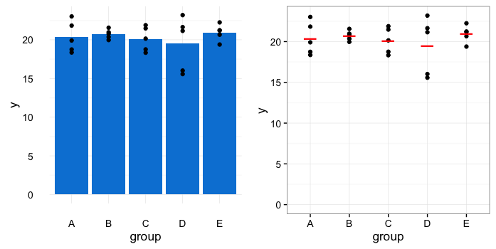
下面是使用ggplot2的两个相同情节的版本。
library(ggplot2)

ggplot(dat, aes(group, y)) +
  stat_summary(fun.y=mean, geom="bar", fill=hcl(240,100,50)) +
  geom_point() +
  theme_minimal()

ggplot(dat, aes(group, y)) +
  geom_point() +
  stat_summary(fun.y=mean, geom="point", pch="\U2013",
               size=8, colour="red") +
  scale_y_continuous(limits=c(0, max(dat$y))) +
  theme_bw()
页面原文内容由Stack Overflow提供。腾讯云小微IT领域专用引擎提供翻译支持
原文链接:
https://stackoverflow.com/questions/39651365
复制相关文章
相似问题
腾讯云开发者

Copyright © 2013 - 2026 Tencent Cloud. All Rights Reserved. 腾讯云 版权所有
深圳市腾讯计算机系统有限公司 ICP备案/许可证号:粤B2-20090059 ![]() 粤公网安备44030502008569号
粤公网安备44030502008569号
腾讯云计算(北京)有限责任公司 京ICP证150476号 | 京ICP备11018762号