
熊猫的地形图sharex=False没有像预期的那样表现
熊猫的地形图sharex=False没有像预期的那样表现
提问于 2016-09-01 04:15:56
我试图从一个数据中绘制几个系列的柱状图。系列具有不同的最大值:
df[[
    'age_sent', 'last_seen', 'forum_reply', 'forum_cnt', 'forum_exp', 'forum_quest'
]].max()
返回:
age_sent       1516.564016
last_seen       986.790035
forum_reply     137.000000
forum_cnt       155.000000
forum_exp        13.000000
forum_quest 10.000000当我尝试图直方图时,我使用了sharex=False, subplots=True,但是看起来sharex属性被忽略了:
df[[
    'age_sent', 'last_seen', 'forum_reply', 'forum_cnt', 'forum_exp', 'forum_quest'
]].plot.hist(figsize=(20, 10), logy=True, sharex=False, subplots=True)
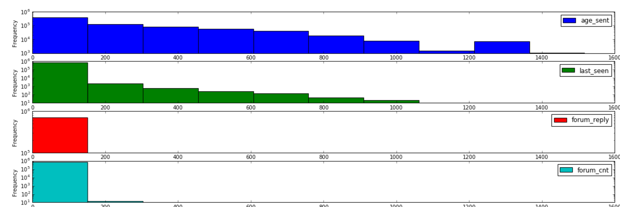
我可以清楚地分别画出其中的每一个,但这是不可取的。我也想知道我做错了什么。
我拥有的数据也太大了,但是很容易创建类似的内容:
ttt = pd.DataFrame({'a': pd.Series(np.random.uniform(1, 1000, 100)), 'b': pd.Series(np.random.uniform(1, 10, 100))})现在我有:
ttt.plot.hist(logy=True, sharex=False, subplots=True)检查x轴。我希望是这样的(但是使用一个带有子图的命令)。
ttt['a'].plot.hist(logy=True)
ttt['b'].plot.hist(logy=True)回答 1
Stack Overflow用户
发布于 2019-12-05 05:37:32
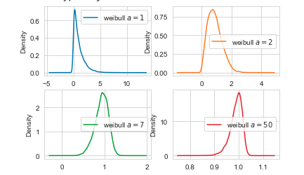
目前的答案是可行的,但在最近的版本中有一个更容易解决的方法。
虽然df.plot.hist不尊重sharex=False,但df.plot.density尊重。
dist = [1, 2, 7, 50]
col_names = ['weibull $a={}$'.format(alpha) for alpha in dist]
test_df = pd.DataFrame(np.random.weibull(dist,
                                         (10000, len(dist))),
                       columns=col_names)

test_df.plot.density(subplots=True, sharex=False, sharey=False, layout=(-1, 2))
页面原文内容由Stack Overflow提供。腾讯云小微IT领域专用引擎提供翻译支持
原文链接:
https://stackoverflow.com/questions/39262630
复制相关文章
相似问题
腾讯云开发者

Copyright © 2013 - 2026 Tencent Cloud. All Rights Reserved. 腾讯云 版权所有
深圳市腾讯计算机系统有限公司 ICP备案/许可证号:粤B2-20090059 ![]() 粤公网安备44030502008569号
粤公网安备44030502008569号
腾讯云计算(北京)有限责任公司 京ICP证150476号 | 京ICP备11018762号