
能否在Excel图表上同时绘制一条水平线和一条垂直线?
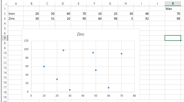
我有一些散点图值作为我的主要数据系列,例如:
锌(Ppm),X值: 20,50,60,70, 铁(Ppm),Y值: 30,51,10,90,
锌和铁对它们的极限值都有上限,例如铁50 ppm,锌100 ppm。我希望这些能直观地显示铁的水平线和锌的垂直线。
分别在第一个X轴或第二个Y轴上显示一条水平线或一条垂直线是非常容易的(参见Peltier的博客,堆栈溢出上的数千个线程,等等)。但是,同时展示两者似乎是不可能的。例如,要显示一条垂直线,您可以指定一个新的数据序列为“用直线散布”的图表类型,将两个X值设置为100,并将两个Y值设置为0和1。瞧!
同时显示垂直线和水平线的根本问题似乎是,不能将单个数据序列的X值和Y值拆分到主轴和次轴之间。单个数据序列的X值和Y值必须同时位于主轴或次轴上。当在我的例子中引入一条水平线时,这就成了问题,因为这需要我调整第二个X轴,这将影响100在垂直线数据序列中的显示方式。
我目前正在通过VBA控制我的图形,但是最好是使用VBA或Excel本身的解决方案。
谢谢。
回答 2
Stack Overflow用户
发布于 2016-08-30 14:26:24
@TimWilliams给出了一个很好的答案:如何在图表上画一条线。我想,您的问题可以重新表述,如如何在图上绘制两条线。
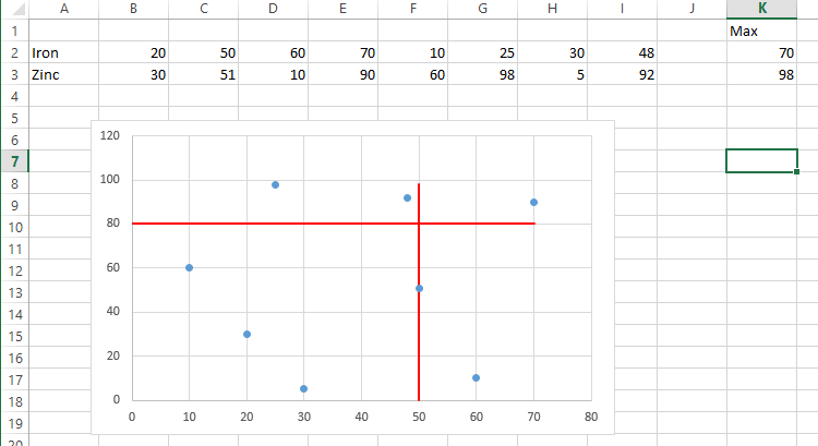
我在下面设置了您的示例,并简单地选择了范围A2:I3并插入了一个XY图,而不修改标签等。注意,我还包括了一个计算,以获得XY图的这两行的最大值。这是因为我想要有阈值线,尊重图的轴的最大值。
因此,代码是Tim示例的扩展,我们在图中引入了两个新系列,而不是一个。对于第二行,您可以切换使用XValues和Values属性来获得x-或y-阈值行。
- 对于X阈值,它位于x轴上的50点(
intThresholdX),从y轴上的0-98延伸到y轴。 - 对于Y阈值,它从x轴上的0-70扩展到y轴上的80点(
intThresholdY)。
一幅画代表了结果的千言万语:
代码:
Option Explicit

Sub DrawTwoThresholds()

    Dim ws As Worksheet
    Dim cht As ChartObject
    Dim srs As Series
    Dim intThresholdX As Integer
    Dim intThresholdY As Integer
    Dim intMaxX As Integer
    Dim intMaxY As Integer

    Set ws = ThisWorkbook.Worksheets("data") 'switch to your worksheet
    Set cht = ws.ChartObjects(1) 'assumes one chart is on the sheet
    intThresholdX = 50
    intThresholdY = 80
    intMaxX = ws.Range("K2").Value
    intMaxY = ws.Range("K3").Value

    'create x threshold line
    Set srs = cht.Chart.SeriesCollection.NewSeries()
    srs.Name = ""
    srs.XValues = Array(intThresholdX, intThresholdX)
    srs.Values = Array(intMaxY, 0)
    srs.MarkerStyle = xlMarkerStyleNone
    srs.Border.Color = vbRed

    'create y threshold line
    Set srs = cht.Chart.SeriesCollection.NewSeries()
    srs.Name = ""
    srs.XValues = Array(0, intMaxX)
    srs.Values = Array(intThresholdY, intThresholdY)
    srs.MarkerStyle = xlMarkerStyleNone
    srs.Border.Color = vbRed

End SubStack Overflow用户
发布于 2016-09-06 21:49:56
谢谢你的帮助罗宾!我在您的代码中遇到的主要问题是,用户仍然必须手动收缩轴,才能使线条看起来像延伸到无穷远处。
最后,我将我的所有数据系列设置在相同的轴上,并将X和Y阈值定义为非常高的数字(例如500000)。然后,通过将数据集的最大数量乘以1.1或用户定义的限制乘以1.1,设置轴限值。
您的解决方案可能更优雅,所需资源也更少,但在图表格式化方面,我是个整洁的怪胎:D
Horz(1) = 0
Horz(2) = 500000
Vert(1) = 0
Vert(2) = 500000

'First Example Data Series
With ActiveChart.SeriesCollection.NewSeries
    .Name = ActiveSheet.Cells(1, 2) & " Max Old"
    .ChartType = xlXYScatterLines
    .AxisGroup = xlPrimary
    .XValues = "='Graph'!$AE$3:$AE$4"
    .Values = Vert
    .Select
    .Format.Line.Weight = 2.25
    .Format.Line.Visible = True
    .Format.Line.ForeColor.RGB = RGB(195, 214, 155)     'Light Green
    .Format.Line.DashStyle = msoLineDash
    .MarkerStyle = -4142
End With

'Second Example Data Series
With ActiveChart.SeriesCollection.NewSeries
    .Name = ActiveSheet.Cells(2, 2) & " Max Old"
    .ChartType = xlXYScatterLines
    .AxisGroup = xlPrimary
    .XValues = Horz
    .Values = "='Graph'!$AE$5:$AE$6"
    .Select
    .Format.Line.Weight = 2.25
    .Format.Line.Visible = True
    .Format.Line.ForeColor.RGB = RGB(217, 150, 148)     'Light Red
    .Format.Line.DashStyle = msoLineDash
    .MarkerStyle = -4142
End With

With ActiveChart
    'Set the X axis limit
    .Axes(xlCategory, xlPrimary).MinimumScale = 0
    .Axes(xlCategory, xlPrimary).MaximumScale = WorksheetFunction.RoundUp(Application.Max(ActiveChart.SeriesCollection(1).XValues) * 1.1, 0)
    'Set the Y axis limit
    .Axes(xlValue, xlPrimary).MinimumScale = 0
    If Application.Max(ActiveChart.SeriesCollection(1).Values) >= Application.Max(ActiveChart.SeriesCollection(5).Values) Then
        .Axes(xlValue, xlPrimary).MaximumScale = WorksheetFunction.RoundUp(Application.Max(ActiveChart.SeriesCollection(1).Values) * 1.1, 0)
    Else
        .Axes(xlValue, xlPrimary).MaximumScale = WorksheetFunction.RoundUp(Application.Max(ActiveChart.SeriesCollection(5).Values) * 1.1, 0)
    End If
End With
图表
https://stackoverflow.com/questions/39229191
复制相似问题
腾讯云开发者

Copyright © 2013 - 2026 Tencent Cloud. All Rights Reserved. 腾讯云 版权所有
深圳市腾讯计算机系统有限公司 ICP备案/许可证号:粤B2-20090059 ![]() 粤公网安备44030502008569号
粤公网安备44030502008569号
腾讯云计算(北京)有限责任公司 京ICP证150476号 | 京ICP备11018762号