
如何实现二维(色调x亮度)色标?
下面是一个玩具data.frame,它说明了这个问题(最基本的版本,也就是说,稍后还会有额外的皱纹):
df <- read.table(textConnection(
"toxin  dose    x   y
A   1   0.851   0.312
A   10  0.268   0.443
A   100 0.272   0.648
B   1   0.981   0.015
B   10  0.304   0.658
B   100 0.704   0.821
C   1   0.330   0.265
C   10  0.803   0.167
C   100 0.433   0.003
D   1   0.154   0.611
D   10  0.769   0.616
D   100 0.643   0.541
"), header = TRUE)
我想对这些数据做一个散点图,其中毒素是用点的色调表示的,而剂量是用它们的亮度表示的(近似地说,低剂量应该对应于高亮度)。
这个可视化问题的特别具有挑战性的方面是,图例必须是一个二维颜色网格(而不是一维颜色条),其中行对应于toxin变量,列对应于dose (或其转换)。
我在上面提到的额外皱纹是,数据实际上包括一个对照观测,其中的剂量与所有其他观测值不同(请注意下面带有毒素= "Z“的一行):
df <- read.table(textConnection(
"toxin  dose    x   y
A   1   0.851   0.312
A   10  0.268   0.443
A   100 0.272   0.648
B   1   0.981   0.015
B   10  0.304   0.658
B   100 0.704   0.821
C   1   0.330   0.265
C   10  0.803   0.167
C   100 0.433   0.003
D   1   0.154   0.611
D   10  0.769   0.616
D   100 0.643   0.541
Z   0.001   0.309   0.183
"), header = TRUE)
控制点("Z")毒素应该是一个单一的灰色点。(如果二维彩色网格图例不包括控件值,也可以,但在这种情况下,至少应该有一个图例恰当地标识其点。)
总括而言,问题有三部分:
- 分别用色调和亮度来表示毒素和剂量。
- 制作一个二维彩色格子图例。
- 传说应该指明控制点。
下面是我迄今为止所做的工作。
我唯一能想到的解决第一个问题的方法就是给每种毒素加一个不同的层,并根据剂量使用颜色梯度。
不幸的是,似乎没有办法为每一层指定不同的梯度尺度。
更具体地说,我首先定义如下:
library(ggplot2)
hues <- RColorBrewer::brewer.pal(4, "Set1")
gradient <- function (hue_index) {
scale_color_gradient(high = hues[hue_index],
low = "white",
trans = "log",
limits = c(0.1, 100),
breaks = c(1, 10, 100))
}
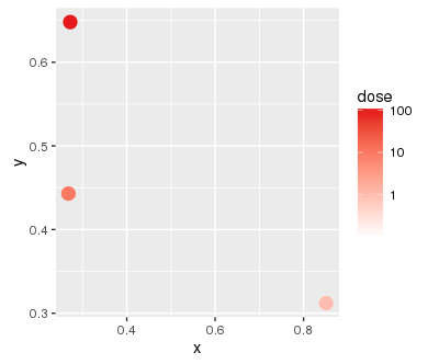
baseplot <- ggplot(mapping = aes(x = x, y = y, color = dose))第一层本身看上去很有希望:
(
 baseplot
          + geom_point(data = subset(df, toxin == "A"), size = 4)
          + gradient(1)
)
但当我加上第二层时..。
(
 baseplot
          + geom_point(data = subset(df, toxin == "A"), size = 4)
          + gradient(1)
          + geom_point(data = subset(df, toxin == "B"), size = 4)
          + gradient(2)
)
...I得到以下警告:
Scale for 'colour' is already present. Adding another scale for 'colour', which will replace the existing scale.当然,这就是我得到的情节:
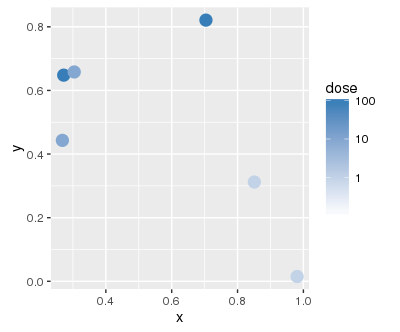
我还没有找到一种方法来定义不同的层次,每一层都有自己的色阶。
回答 2
Stack Overflow用户
发布于 2016-08-19 20:09:34
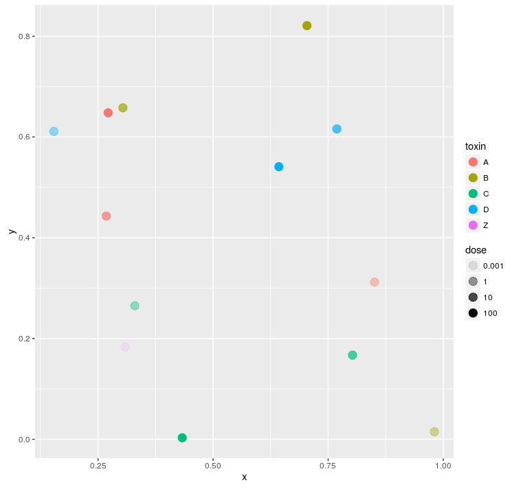
它一定是传说中的网格吗?如果您愿意有一个毒素(颜色)图例和第二个剂量(alpha)图例,您可以使用这个图例(并将您的颜色/填充设置为对您的数据有意义的内容)。
df$dose <- factor(df$dose)

ggplot(
  df
  , aes(x = x, y = y
        , col = toxin
        , alpha = dose)
) +
  geom_point(size = 4)
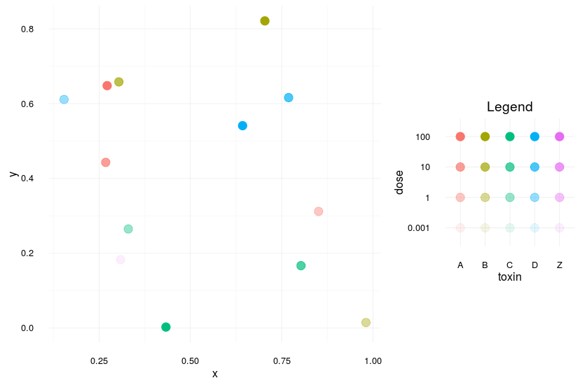
如果它真的是图例的矩阵,你可以自己做矩阵,然后把它们结合在一起。您将失去一些灵活性,并且需要仔细地设置一些东西,但这在一般情况下应该有效(请注意,我使用的是最适合传奇的最小主题--显然是个人偏好):
theme_set(theme_minimal())

mainPlot <-
  ggplot(
    df
    , aes(x = x, y = y
          , col = toxin
          , alpha = dose)
  ) +
  geom_point(size = 4)

mainPlot


allLevels <-
  expand.grid(toxin = levels(df$toxin)
              , dose = levels(df$dose))

legendPlot <-
  ggplot(
    allLevels
    , aes(x = toxin, y = dose
          , col = toxin
          , alpha = dose)
  ) +
  geom_point(size = 4)

legendPlot


library(gridExtra)

grid.arrange(
  mainPlot +
    theme(legend.position = "none")
  , legendPlot +
    theme(legend.position = "none") +
    ggtitle("Legend")
  , layout_matrix =
    matrix(c(1,1,1,NA,2,NA)
           , ncol = 2)
  , widths=c(2,1)
  , heights = c(1,2,1)
  )
Stack Overflow用户
发布于 2016-08-20 15:02:12
该解决方案是对this answer中给出的解决方案的一种适应。它并没有真正做问题所要求的事情(大部分解决方案的繁重工作不是由ggplot2完成的,传说也没有那么清楚),但这可能是解决这个问题的ggplot2所能做的最好的事情。
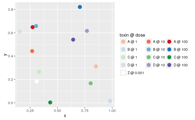
baseplot <- ggplot(data = df, mapping = aes(x = x, y = y))

palette <- function (name, indices = c(3, 5, 7)) {
  RColorBrewer::brewer.pal(9, name)[indices]
}

colors <- c(as.vector(sapply(c("Reds", "Blues", "Greens", "Purples"), palette)),
            "white")

labels <- mapply(function(toxin, dose) {
                     paste(toxin, as.character(dose), sep = " @ ")
                 },
                 df$toxin, df$dose)

(
  baseplot + geom_point(mapping = aes(color = interaction(dose, toxin)),
                        size = 4)
           + scale_color_manual(name = "toxin @ dose",
                                values = colors,
                                labels = labels)
           + guides(color = guide_legend(nrow = 5, byrow = TRUE))
)
下面是输出的样子:
https://stackoverflow.com/questions/39041852
复制相似问题
腾讯云开发者

Copyright © 2013 - 2026 Tencent Cloud. All Rights Reserved. 腾讯云 版权所有
深圳市腾讯计算机系统有限公司 ICP备案/许可证号:粤B2-20090059 ![]() 粤公网安备44030502008569号
粤公网安备44030502008569号
腾讯云计算(北京)有限责任公司 京ICP证150476号 | 京ICP备11018762号