
气泡图创建
气泡图创建
提问于 2016-07-28 18:04:14
如果我有数据集
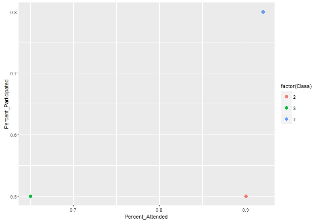
       Class        Percent Attended            Percent Participated
         3                 .8                             .6
         3                 .5                              .4
         2                 .9                             .5
         7                 .92                            .8
因此,等等,我试图创建一个气泡图,它显示了每个班级的平均百分比和参与的百分比,并由类标记。
我尝试了聚合函数和ggplot函数,但是没有运气。
回答 1
Stack Overflow用户
回答已采纳
发布于 2016-07-28 19:04:24
library(ggplot2)
library(dplyr)


df1 <- df %>% group_by(Class) %>% summarise_all(funs(mean))

ggplot(df1, aes(x = Percent_Attended, y = Percent_Participated)) +
        geom_point(aes(color = factor(Class)), size = 3)
数据
structure(list(Class = c(3L, 3L, 2L, 7L), Percent_Attended = c(0.8,
0.5, 0.9, 0.92), Percent_Participated = c(0.6, 0.4, 0.5, 0.8)), .Names = c("Class",
"Percent_Attended", "Percent_Participated"), class = "data.frame", row.names = c(NA,
-4L))页面原文内容由Stack Overflow提供。腾讯云小微IT领域专用引擎提供翻译支持
原文链接:
https://stackoverflow.com/questions/38643702
复制相关文章
相似问题
腾讯云开发者

Copyright © 2013 - 2026 Tencent Cloud. All Rights Reserved. 腾讯云 版权所有
深圳市腾讯计算机系统有限公司 ICP备案/许可证号:粤B2-20090059 ![]() 粤公网安备44030502008569号
粤公网安备44030502008569号
腾讯云计算(北京)有限责任公司 京ICP证150476号 | 京ICP备11018762号